

How can you visualize the spread of Covid-19 with a choropleth map? What data visualizations should you use for what kind of data? What are the key roles in a data science team?
If you’re wondering what connects these questions, these are among Gramener’s most-read blog posts of 2020.
In this article, I’ll walk you through Gramener’s best blogs of 2020 (Of course, since Gramener is synonymous with data science, you’ll get a few charts and numbers along the way!)
In 2020, we published 60 blogs starting on January 6 (Averaging over 1 blog a week, up to December 23). Our most productive months blog-wise were March and April, when we churned out eight and nine posts, respectively, while we lagged in July (with just one post).
Of the total number of posts, 11 of them touched upon an aspect of Data Science, while nine of them shed light on visualizing a part of Covid-19 data.
Table of Contents
Topics We Covered in 2020

A word cloud of all our blog titles in 2020, generated with this nifty tool
A dissection of the 60 blog titles after removing common “stop words” like the, and, of, etc. yielded expected results – what was our most used phrase in the title?
Data Science, of course! (No surprises there).
Other standard terms included “Storytelling”, “Visualization”, and ”Low-Code”. These are terms that reflect what Gramener stands for and what we do.
The blogs we wrote, especially towards the end of the year, touched on pivotal themes. For instance, we had a five-part blog series on how to tell data stories and a three-part blog series about leveraging our low-code platform, Gramex, to build solutions in hours or days. The last three were about the Geospatial AI solutions we created.
Here were our five most visited blog posts of 2020.
Most Visited Blog Posts in 2020
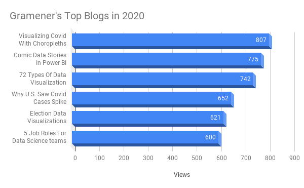
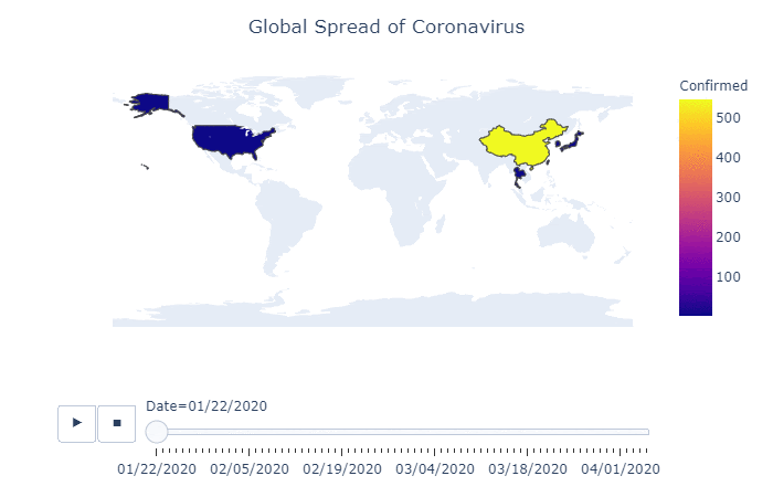
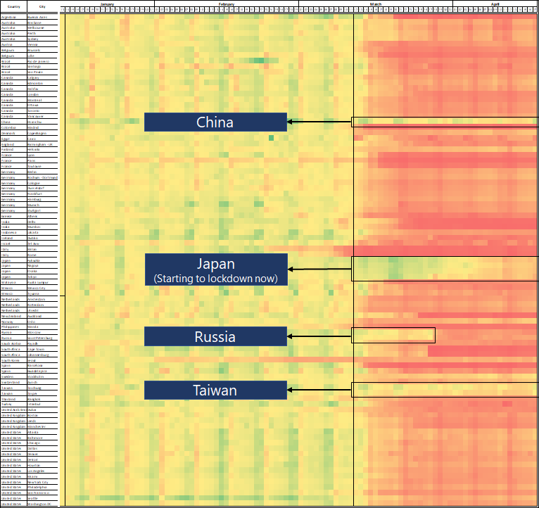
With over 800 views till December 21, 2020, our top blog spoke about how to create a choropleth map using Python to visualize the spread of Covid-19 across the globe. This post started by explaining choropleth maps and explaining how you can use the Plotly Express library to create a dynamic map to track how the virus spreads.
Our second most popular blog was about making Power BI dashboards more engaging by adding ComicGen comic characters to them. Dashboards are often filled with numbers, and using comic characters and changing their emotions and pose according to the data can help add an edge to the narration. The post explained how you could add and leverage the free ComicGen library to your Power BI dashboards.
The blog “72 types of data visualizations” is a compendium of data visualization types, indicating where you can use each.
The post, “Election data visualizations: Decoding the people’s verdict with data”, went through the types of visualizations commonly used in election coverage and the innovative ones that Gramener has successfully deployed at leading media houses. These visualizations include the “Compass” and the “Voter Matrix” visualizations.
Another top read was “5 major job roles for data science teams”. It’s a common misconception that data science teams are all about data scientists. However, other key roles include data translators and designers.
Most Engaging Blogs in 2020
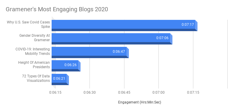
Our most engaging blog (Among those with over 100 views) was about why Covid-19 cases in the U.S. spiked. The post factors in Maps traffic data in the U.S. and Italy and draws comparisons between mobility and number of cases. People spent an average of 7 minutes and 17 seconds on this blog.

In August 2020, we took a look at gender diversity at Gramener. We are proud of our women workforce and does our bit to empower them within the organization.
Apple released a dataset on mobility trends at various locations around the globe. Vamsi, who is our Lead Data Consultant, analyzed and visualized the data to glean insights into people’s mobility amidst the COVID-19 lockdown.
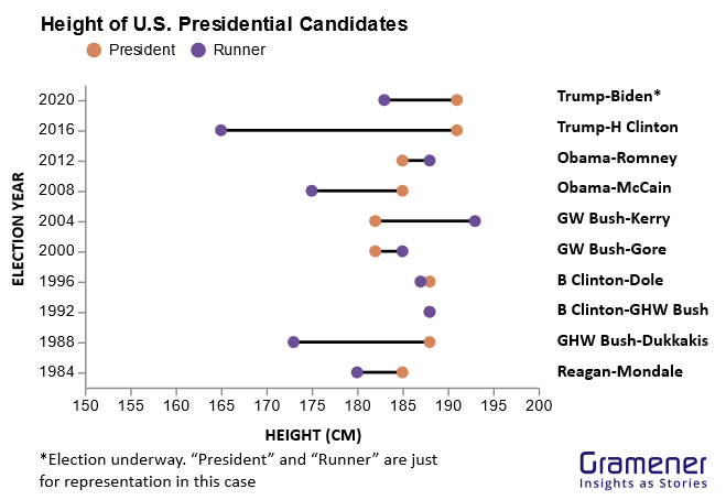
Another article analyzed the heights of U.S Presidents. It showed through data analysis that taller men usually win the U.S. Presidential election, thereby making Joe Biden an outlier with his victory over Donald Trump, who is a few inches taller.
Another engaging post on creating data story GIFS taught readers how to use a deductive structure to create data GIFs. This blog outlined the steps involved in creating an ideal data gif, starting with the context, raising a question, and eventually answering it through the GIF.
Major Data Science Themes Covered in 2020
The round-up wouldn’t be complete without highlighting our efforts to create numerous blogs on specific themes.
One of the most important themes for us in 2020 was the low code platform. Our articles show how enterprises could create data applications in days using our low-code platform, Gramex. We wrote three blogs on this topic.
- Low code analytics platform for enterprise solution building
- AI Apps built on Open source low-code platforms
- The role of low-code Machine Learning in building enterprise-grade analytics solutions
We also highlighted our Spatial Analytics solutions and case studies in three blogs. The articles talked about how we help protect millions of people from mosquito-borne diseases and how we built an AI-powered visualization tool to track climate change and build resilient cities in Canada.
- Spatial Data Science use cases and projects we built with our clients and partners.
- The rise in the trend of Geospatial AI and Analytics
- Exploring spatial data visualizations for urban planning and development
Final Word
Blogs are an essential medium for communicating our capabilities, like low-code platforms and Geospatial AI solutions. Many of our top blogs were written by our data scientists and storytellers, thereby proving their mettle. Blogs also help us keep you informed of the industry trends in the data space.
We are constantly at the cutting-edge of innovation, and blogs help us explore new ideas and communicate them to our clients and prospects. We’ll be doing more of this in 2021. See you on the other side of the 2020s!