
Urban resilience is making cities shock-proof from future calamities. Data Science is helping planners and builders by analyzing multiple data sets such as socio-economic impact and climate change through previous years. The modern age, 3-dimensional spatial data visualization, and GIS data visualizations help us visualize location data and understand how multiple variables correlate to urban locations.
Table of Contents

What is Spatial Data Science?
The adage “A picture is worth a thousand words” is even more pronounced in today’s context, when we’re constantly consuming information through the visual medium.
Spatial Data Science is the amalgamation of geographical solutions like Geographic Information Systems (GIS) and Data Science. Here’s a quick introduction to spatial analysis and how it is related to data science.

What is Spatial Data Visualization?
Visualization of spatial data is also known as cartography or geo-visualization. Spatial data visualization is a technique for designing maps for visually communicating the location data. Not just Geo Data Scientists but enterprises also use data visualization for urban planning, showcasing predictions of climatic conditions, cluster homogenous data points on a map, and more.
In fact, Satellite Imagery and Remote Sensing techniques combine with data visualizations to benefit enterprises with the right insights on sustainability problems.
But why is that?
Let’s assume you want to understand the frequency of floods or earthquakes across cities. Rather than just tables of data, a visual interpretation of this in the form of a dot density map will help you understand, with just a glance, which cities have borne the brunt of disasters.
Now that you have your disaster map, you can overlay this with a choropleth map of population density to understand which regions have a large number of people who are vulnerable to disasters.
Spatial data analytics and visualization have their use cases in multiple domains such as smart city analysis, crop yield prediction, public health analytics, and more.
Find out what is smart farming and how machine learning and AI can enable farmers to predict crop yield with Landsat and satellite imagery data.
Types of Spatial Data Visualizations
Earlier we showed a simple application of spatial data visualization. In its more advanced form, you can add real-time tracking, satellite data, geographical data, and a host of other datasets. Based on your need, you can build geospatial data visualizations or predictive models to solve problems.
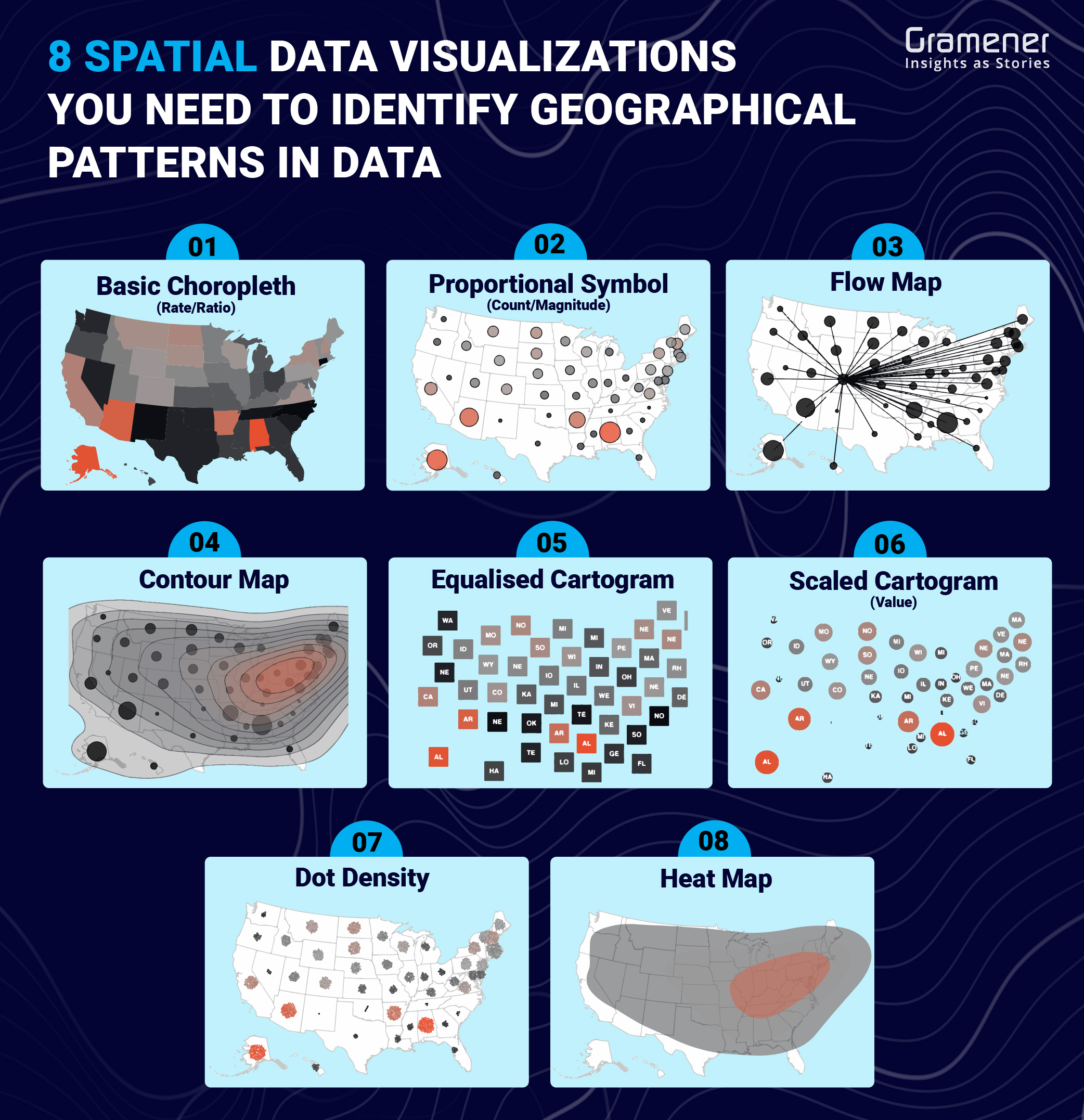
Similarly, there are GIS data visualization techniques to map land data and satellite imagery data. In fact, we’ve sorted 72 types of data visualizations to help data scientists and storytellers create map stories. Out of which, here are 8 spatial data visualization to use when geographical patterns in data are more important to the reader.
- Basic Choropleth: This is a standard approach for plotting data on a map. The approach should always follow rates and not totals and use sensible base geography.
- Proportional Symbol: Opposite to basic choropleth, this visualization shows totals rather than rates. It is difficult to see small data variations in this map.
- Flow Map: This data visualization can illustrate unambiguous movement across a map.
- Contour Map: This map shows areas of equal value. You can use deviation color schemes for showing positive and negative values.
- Equalized Cartogram: This visualization transforms each unit on a map to a regular and equally-sized shape. You can easily visualize political data such as representing voting regions with an equal share.
- Scaled Cartogram: In the case of large data values, this map can help you scale (Stretch and shrink) according to a particular value.
- Dot Density: This map is Used to plot the location of individual events. You would need to annotate patterns that you want the readers to see.
- Heat Map: Grid-based data values mapped with an intensity color scale. As choropleth map – but not snapped to an admin/political unit.
Building on the example above, in addition to the maps, you can create an AI model to identify with more accuracy the populations that are vulnerable to floods based on the housing elevation, surrounding lakes or rivers, and a ton of other factors.
In this blog, we will look at AI for Resilient Cities – a geospatial data visualization tool we built in partnership with Evergreen and Microsoft AI for Earth.
Spatial Data Visualization for Urban Planning
We spoke about floods before. Another major threat cities around the world face today is soaring temperatures. It’s important that the cities of tomorrow are capable of handling such disasters as climate change events will increase in the coming years.
What is Urban Resilience?
“Urban Resilience is the measurable ability of any urban system, with its inhabitants, to maintain continuity through all shocks and stresses, while positively adapting and transforming toward sustainability.”
Urban Resilience Hub
Now, let’s go back to the example of rising temperatures.
Have you ever wondered why the temperature is cooler and more pleasant in parks or in spaces just outside the center of the city?
Structures like buildings and roads (With materials like steel, glass, concrete) absorb and re-emit heat more than natural objects like trees or soil. Due to this, urban areas with high densities of infrastructural elements become places with higher temperatures.
These are called “Urban Heat Islands” (UHIs).
UHIs cause increased energy consumption, elevated emissions of greenhouse gases, health issues, and impaired water quality.
So how can we overcome the Urban Heat Island effect? One of the ways we can do this is using data to build a data visualization for urban planning that can factor in several data points and show us where these heat islands are. And that’s exactly what we did at Gramener.
Challenges of Making Resilient Cities
One of the critical requirements for urban planning is making cities resilient in the face of climate change disasters like heat waves and droughts. Resilience ensures that the impact on the population is minimized.
Urban mapping, data, and GeoSpatial AI can be valuable tools to tackle this, but there are a few technical and technological hurdles.
1. Disparate Sources of Information
You can use satellite data to predict weather conditions, track urban sprawl, or map land-use patterns using spatial data visualization. You can also estimate population density with the help of building footprints data. Temperature data over time can help in identifying heat waves.
However, these sources of information are disparate in nature, which makes it difficult to visualize location data. They come in different formats.
The 5 Vs of data – volume, velocity, variety, veracity, and value are different for each of these datasets. This makes it difficult to track them individually and it also makes identifying relationships between them difficult.
2. Lack of Clear Insights
Tracking the effects of activities that contribute to climate change can be difficult. How did an urban area look 10 years before the construction of new buildings started? Or what were the greenhouse gas emissions before and after a certain industry sprang up in an area?
This requires real-time tracking and often involves complex variables. Also, simply presenting numbers or data (CO2 levels are up 50% or temperature is up by 0.5 Degrees Celsius) does not enable decision-making.
The numbers need to be woven into insights that can nudge decision-makers into action. Geospatial data visualization is one of the key areas that you can leverage for this purpose.
3. Complexity Involved in Forecasting
Forecasting events using models is a Herculean task. It involves first identifying the parameters that trigger a particular event. Then the correlation between those parameters. And then factoring in historical data to achieve a working model (Which will still not be 100% accurate).
For example, there may be dozens of factors involved in predicting which areas could become urban heat islands over the next few years. It may depend on factors like the number of constructions in the area, materials used for construction, and the density of buildings.
4. Scalability
Satellite data takes up vast amounts of storage and computing power even for a single location or city owing to its visual nature. Now imagine you want to track UHIs across all cities in Canada. The amount of storage space required for the data is enormous.
Hosting a geospatial data visualization solution also takes up processing power. Hence, scaling the solution is one of the key problems.
Our Spatial Data Visualization Solution for Urban Resilience
Evergreen is a Canadian non-profit that helps build sustainable, flourishing cities. Under a Microsoft AI for Earth grant, they partnered with Gramener to provide a geographic data visualization tool that can track the effects of climate change.
You can check out the tool and take a free demo. If you want more information about the project, contact us at contact@gramener.com.
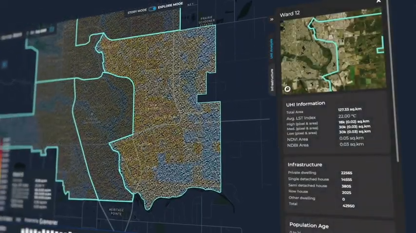
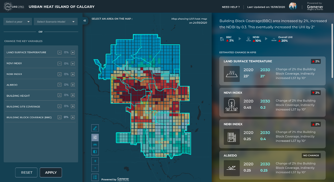
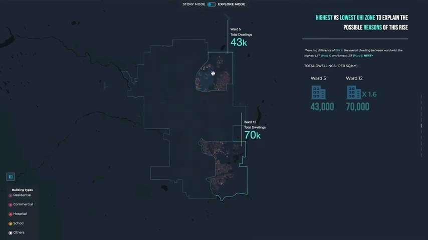
The tool is being piloted in the City of Calgary and in its current form, it can track, predict, and visualize urban heat islands. The team is planning to expand it to cover other climate-related disasters for making cities resilient.
Gramener is helping Evergreen make use of AI, big data, and geospatial analytics to solve these problems.
It’s a Single Source of Truth
The tool allows users to get all the data in one place, hence forming a single source of truth. Some of the main datasets are satellite imagery, Microsoft Building Footprints, infrastructure, weather, and socioeconomic indicators.
Hence, it integrates all the data sources seamlessly, thereby eliminating the need to track them separately. It also makes it easier to track the relationships between these datasets.
Geo Visualization Tool Gets You Insights
The tool comes loaded with features that can easily help users get the requisite insights.
- Compare View allows users to compare correlating variables at the same time, or the same variables at different points in time
- Story Mode allows users to see data insights as easily digestible stories
- Explore Mode provides a granular view of the data
- Building Footprints View allows users to see the details of every building in the city
Offers In-depth Prediction and Planning
With AI algorithms, the tool can find out at the micro-level which building has the maximum impact on the temperature in that area. This is an important factor to understand the heat island effect.
With the tool, users can also go back in time, or go into the future and see the impact under multiple climatic conditions.
The Scenario Modeling View allows users to simulate a view of the future by modifying various urban features or climate variables.
The Forecast Mode of the tool also lets users study correlations between different variables.
Hosting the Spatial Data Visualization Made Easy
Microsoft Azure has enabled the tool to become a one-stop-shop for all data storage, processing, and the application itself. It also helps to keep all the information secure in one place.
This ensures that the geo-visualization tool is scalable and can be expanded across different cities, locations, countries, and even the world.
Try Our AI-Enabled Data VIZ for Urban Planning
The feature-packed tool is one of the ways in which municipalities and governments can build urban resilience. With a combination of spatial data visualization, Artificial Intelligence, and the cloud, it is possible to mitigate the risks of climate change events and minimize the shocks and stresses caused by them.
Check out our spatial analytics solutions to know more about the solutions we built, utilizing the power of Geospatial AI to fight deadly diseases, build urban resilience, and conserve biodiversity. To catch up with us personally and understand all of it over a call, do put a request for a demo.
Hi my loved one! I wish to say that this article
is amazing, nice written and include approximately all important infos.
I would like to see more posts like this .
Kudos. I enjoy this.