

At Gramener, we have a team of data storytellers, information designers, analysts, and engineers. They all team up during the elections to decode election data and explore unconventional ways to visualize election data.
Table of Contents
What’s the Use of Election Data?
First, let’s take a look at what election data comprises. There are two kinds of data. The first is generated in the run-up to the elections. This majorly involves candidate histories and assets and opinion polls data.
Who are the richest candidates from each party? Which party has held on to a particular constituency for how long? What are the opinion and exit poll results? These are some potential questions that can be answered and visualized with data.
The second kind of election data is generated in real-time as the election results are being announced. These are more dynamic in nature and some of the questions which can be answered are: How did each region vote? Who won with the highest and narrowest victory margins? Where was a particular party the dominant one?
With our extended experience in visual data journalism driven election analysis we’ve reached out to millions of audiences through popular media houses such as Republic TV, Times Now, and CNN-IBN. The objective was to offer a good real-time visual election reporting and present meaningful insights as stories.
Read Case Study: How Gramener’s cutting edge visual data journalism cut Republic TV a huge slice of primetime viewership
How can you chart out and visualize election data?
Over the years, the Gramener team has explored several ways of visualizing election data. Various types of data visualization have been honed over time with a specific purpose.
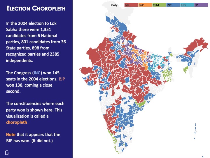
Election Choropleth
A Choropleth presents data on maps that use color or shading to visualize a given measurement, for instance, the party which won a particular constituency. The Choropleth makes it easy for a user to understand the variation of measurements across geographies. A visualizer uses multiple color codes to represent each measurement.
While Choropleth easily shows the big picture of parties winning in states, it only gives a bird’s eye view, rather than a conclusive one. For example, the election visualization below is from the 2004 Lok Sabha elections. Congress won the elections by 145 seats and BJP was the runner up with 138 seats in hand.
However, in the following visualization, it is difficult to judge whether the Congress or the BJP emerged the winner. Unless accompanied by annotations and explanations, this map would seem to indicate that the BJP had more seats (as it won in several bigger constituencies).
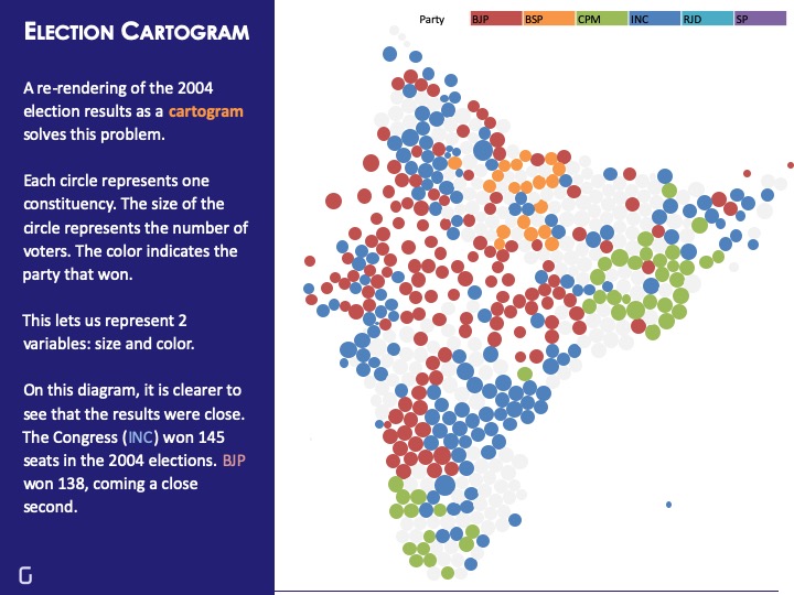
Election Cartogram
Now, we’re aware of the problem with the above map. Although the BJP did not win the 2004 elections, the map seems to suggest so at first glance. This is because the map fails to consider the size of constituencies. The BJP may have won in more constituencies which are bigger in size, resulting in red taking up a larger visual space. Though Congress won more seats, many of them are geographically smaller in size, resulting in a smaller visual space for blue.
We can reduce this confusion by creating a Cartogram, a map in which each constituency is represented by a single dot. In this, circles of different colors and sizes have replaced the geographical areas. Each circle represents one constituency. The size of the circle represents the number of voters and the color indicates the party that won.
Election Treemap
Treemapping is a method for displaying hierarchical data using nested shapes, usually rectangles. Treemaps for election data visualization answer questions of size or scale comparison. For example, during the 2014 Indian General Elections, we did an analysis of the wealthiest candidates from all the parties.
Nandan Nilekani was the richest candidate in the fray during the 16th Lok Sabha elections with declared assets of Rs. 7,710 Crores. Surprisingly, Naveen Jindal, the 2nd richest candidate declared assets worth Rs. 308 crores, nowhere close to Nilekani’s declared wealth.

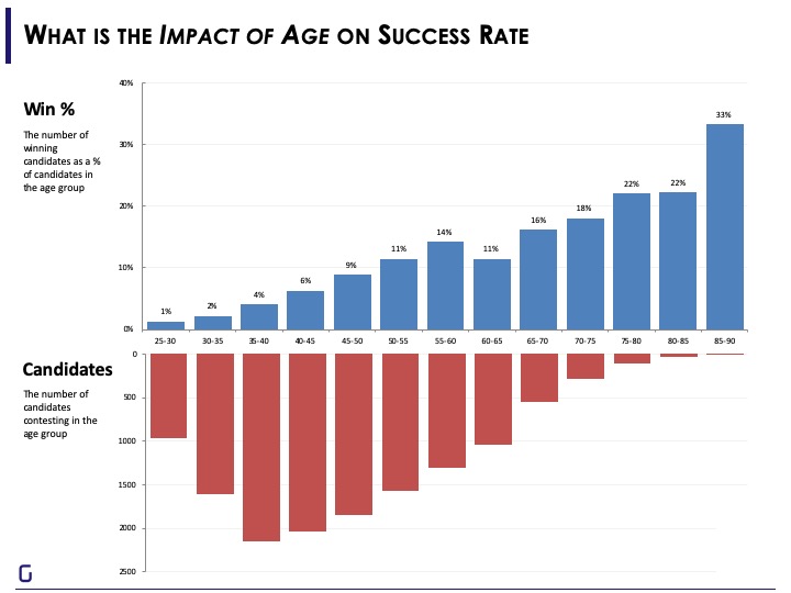
Election Bar Chart
Bar charts are a vanilla way to visualize data. A tried and tested method of data visualization, it has a huge impact in terms of conveying insights by nature of its simplicity. A combination of bar charts visualize differences between measurements and the correlation between parameters. The following bar chart is from the 2004 elections in India. It illustrates the number of candidates contesting from various age groups and the winning percentage of various age groups.
Note: Check out more election data visualizations from 2004 General Elections
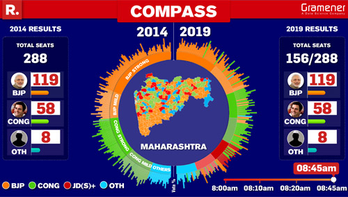
Election Compass
Compass, also known as the voters’ compass, offers real-time tracking of the party performance and swing seats. It is an interactive visualization where the audience can observe the change in seats from one party to the other with respect to time. Each bar on the semi-circle represents a constituency and each color is for a political party. The visuals change progressively with time as the counting during the election continues.
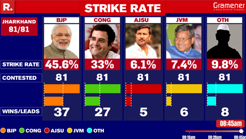
Strike Rate
“Who won?” is the first question anyone asks when the election results are being announced. The strike rate is a type of indicator of party performance. It compares the number of seats where it is leading with the total number of seats it contested in. For example, during the 2018 Jharkhand Assembly Elections, BJP won in 37 constituencies out of 81 with a strike rate of 45.6%.
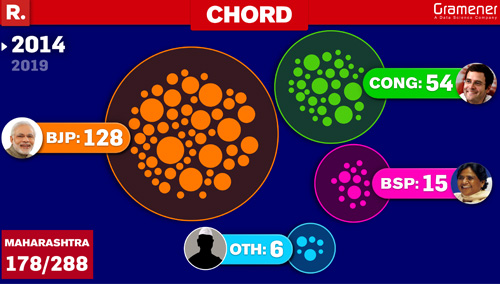
Chord
Chord is a package of bubbles jumping from one circle to the other. In simple terms, Chord offers a visual analysis of seats gained and lost by the parties in the current elections compared to the previous elections. It visualizes a real-time transfer of seats from one party to another as the election counting progresses.
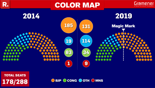
Color Map
The color map is a distant cousin of the Cartogram. It looks more like a semi-circle or a half pie chart. The map breaks down the parties by color and applies region-wise filters. Each dot or circle represents one constituency and each color represents a party. Hovering on the dots shows political parties highlighted against the constituency name. The magic mark is the threshold of winning the required number of seats to come to power.
The Voter Matrix
It is the 2.0 version of the dot plot and one of the newest members in the election data visualization family. It visualizes a timeline of leads and actual vote share in a scatter chart format. With election counting progressing, the voter matrix tracks the gain and loss of parties in the constituencies.

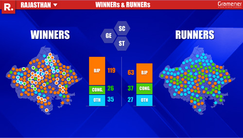
Winners and Runners
The Winners and Runners storyboard is a perfect end to the nail-biting action from the election counting day. This election data visualization summarizes the winner party and runner ups in constituencies by embedding colorful dots in the map.
Every election visualization tells a different story
And each visualization becomes the voice of election stories. We are now moving into a phase where we are going beyond traditional journalism and adding data to the equation to strengthen the narrative. Along with evidence, it adds impetus to news reporting, making it exciting and connecting the audience with the outcomes of the election.
Want an election data visualization to be the part of this list?
There are dozens of charts and visualizations that you can use to visualize election data. But choosing the right technique to answer the important questions from elections is a big challenge. If you know other ways to visualize election data by digging into insights, do share your ideas with us.
If you want to work with us for election data visualization, contact us at contact@gramener.com or Request a demo of our works.