

Design and visualization are an important part of data stories. They help users to identify insights quickly. There are multiple charts, and graphs available to make informative and meaningful data stories. However, in this guide, we share 72 different types of data visualization to create different types of data stories.
Table of Contents

What are Data Visualization?
Data visualization is the pictorial or graphical representation of data. It communicates the hidden information in data with images and charts. They are used to make important insights visually obvious. Data as visual narratives bridges the gap between data consumption and decision making.
Visualizations are also a vital part of a data story. They make the non-obvious insights visible on the screen and help in decision-making. In our earlier data storytelling blogs, we talked about easy steps on how to create data stories and tips to structure data stories. In this episode, we’ll show different types of data visualization that you can use to design your data story.
Why are Data Visualization Important?
Every dataset is different, and certain visualizations suit certain types of data. For instance, a line chart is perfect to show variations in data with respect to time. A pie or bar chart is the most suited to show categorical data.
Data visualizations allow users to identify patterns and trends in a single chart or a series of charts rather than exploring thousands of rows and columns in an Excel sheet. Even though data scientists and analysts explore meaningful insights from spreadsheets, it gets difficult to communicate them to stakeholders. That’s where data visualizations pitch in.
Types of Data Visualization for Different Data Stories
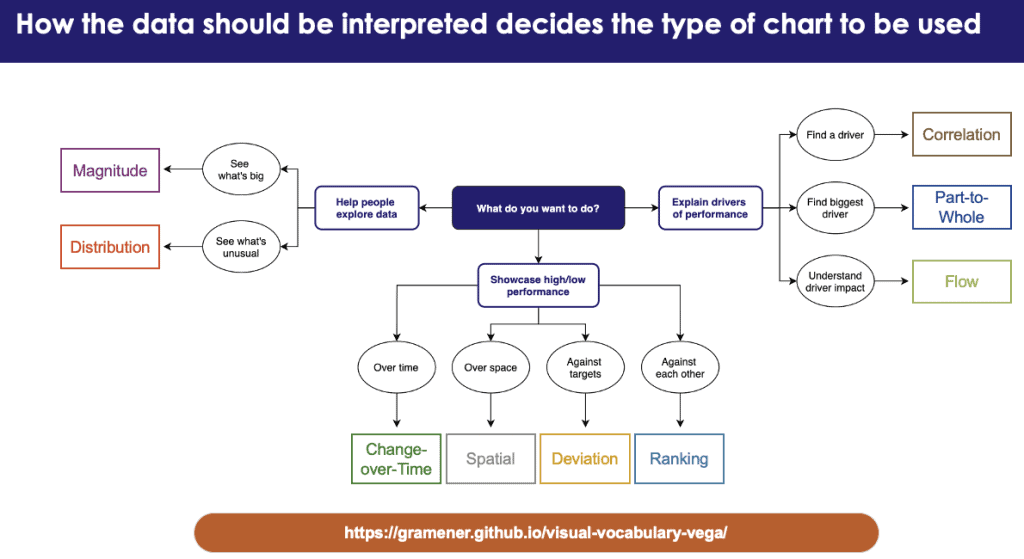
There are multiple ways to visualize data – how do you know which one to pick? Below are some categories to decide which data relationship is most important in your data story. We are classifying the types of data visualization for each category. You can compare and see which one works best for you. We believe this list can be a useful starting point for you to make informative and meaningful data visualizations.
Types of Data Visualization to Show Deviations
Visualizing deviations in data is common. Variations, be it positive or negative, are compared with a reference point, which is usually zero. However, reference points can also be a target or a long-term average. You can use the following types of data visualization charts to capture trends (positive/neutral/negative).
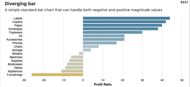
Diverging Bar Visualization
This is a simple standard bar chart that visualizes both negative and positive magnitude values.
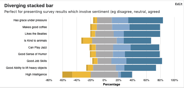
Diverging Stacked Bar Visualization
In stacked bar chart visualizations, some parts of the data are represented in either adjacent (horizontal bars) or stacked (vertical bars) manner. This data visualization is perfect for presenting survey results that involve sentiments (e.g. disagree, neutral, agreed).
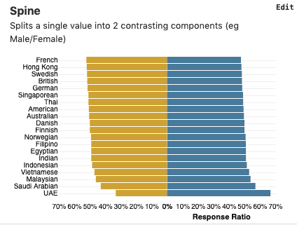
Spine Visualization
It is a type of horizontal bar chart that is used to show comparison. This data visualization splits a single value into two contrasting components (e.g. Male/Female).
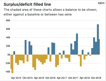
Surplus/Deficit Filled Line Visualization
Use this data visualization if you want to illustrate numbers against a reference point or show a balance between two series.
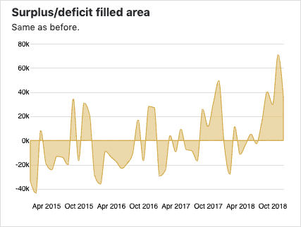
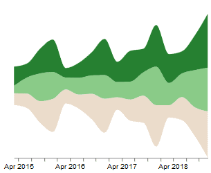
Surplus/deficit filled Area Visualization
This visualization is the same as the surplus/deficit filled chart but has an added feature of illustrating areas as shades.
Types of Data Visualization to Show Correlations
This type of data visualization shows the relationship between two or more variables. Scatter plots, bar charts, and XY heatmaps are a few types of data visualization in this category.
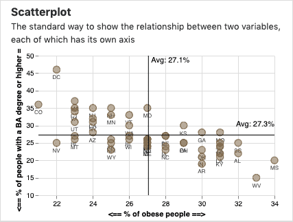
Scatterplot
A scatterplot is also called a scatter chart, scattergram, or scatter diagram. Scatterplots show the relationship between two variables, aligned on different axes.
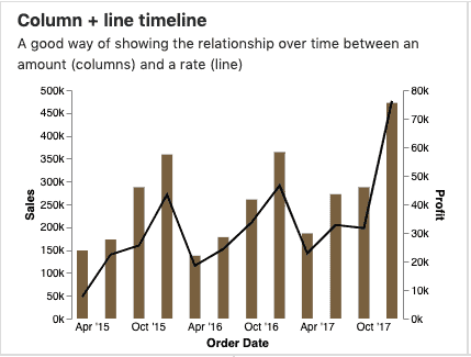
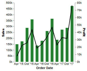
Column + Line timeline
Use this visualization to show the periodic relationship of any value with another one with respect to time.
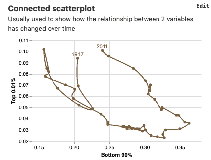
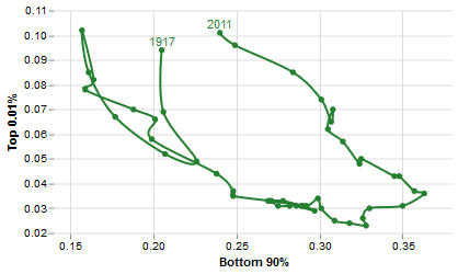
Connected scatterplot
Use this data visualization to show the changing relationships between two variables over time.
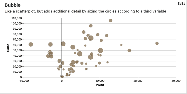
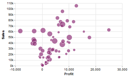
Bubble
This data visualization is similar to a scatterplot. However, you can consider a third variable and can embed additional details by sizing the circles.
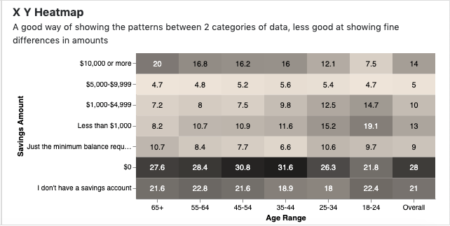
XY Heatmap
A good way of showing the patterns between two categories of data, not so suited for showing fine differences in amounts.
Types of Data Visualization to Show Rankings
Ordered lists or rankings are useful to quickly identify top or bottom performers. For example, your website data can give you insights about the most viewed pages by ranking them from highest to lowest or vice-versa.
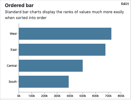
Ordered Bar
These are standard bar charts that show the ranks of values easily when ordered. These are horizontally aligned.
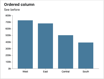
Ordered Column
The vertically aligned column bars display the data organized as categories and heights or lengths proportional to the values.
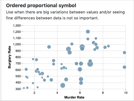
Ordered Proportional Symbol
This one is similar to scatterplots. You can use this data visualization chart to show significant variations between two or more variables.
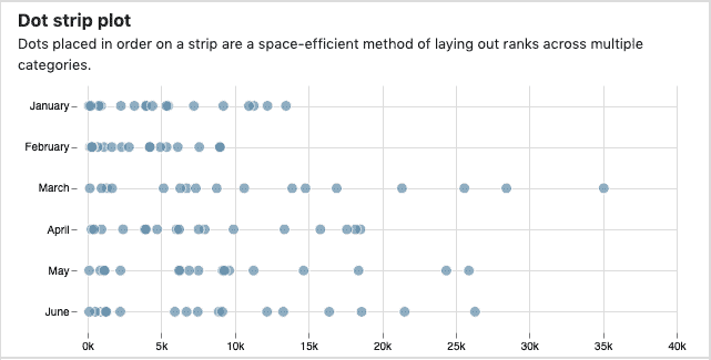
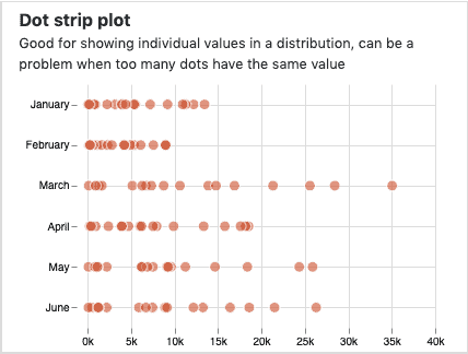
Dot Strip Plot
Dot strip plots represent rankings as dots plotted on the axes. This is a space-efficient method of ranking across different categories of variables.
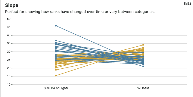
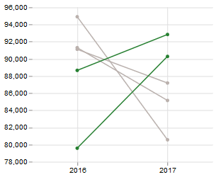
Slope
Slope charts show the rate of change in the ranks of a particular category over time.
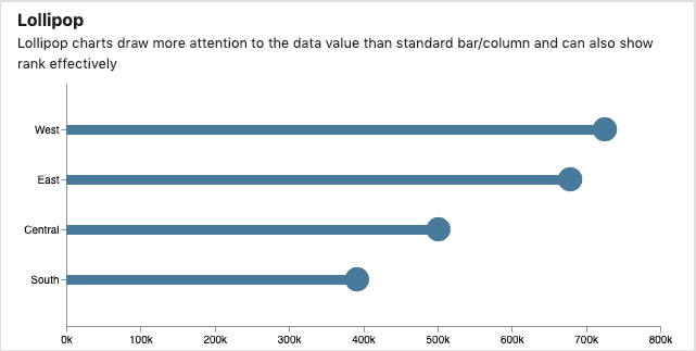
Lollipop
This is a chart where the bars are in the form of lollipops. They are visually appealing bar/column charts and are a catchy way of showing rankings.
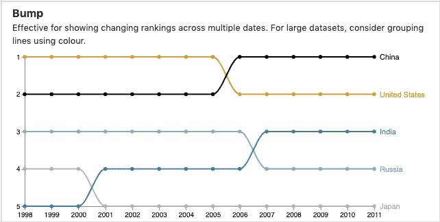
Bump
Bump charts are a cross-over type of visualization for the changing ranks of categories with respect to dates or time. For large datasets, consider grouping lines using color.
Types of Data Visualization to Show Distributions
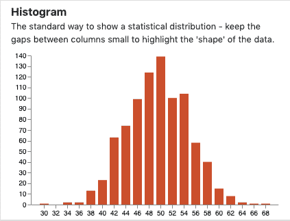
Histogram
Histogram visualizations use bars of different heights to show the distribution of variables in data. Each group bins the number into ranges and the size of the bar represents the volume of the data. Keep the gaps between columns small to highlight the ‘shape’ of the data.
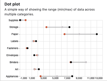
Dot Plot
A simple way of showing the range (min/max) of data across multiple categories by plotting the variables as circles.
Dot Strip Plot
Dot strip plots represent rankings as dots plotted on the axes. This is a space-efficient method of ranking across different categories of variables.
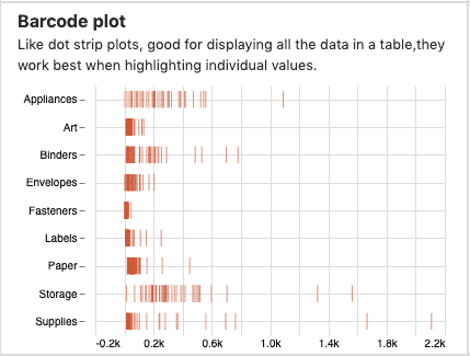
Barcode Plot
Barcode plots show all the data in a table and are useful to highlight individual values.
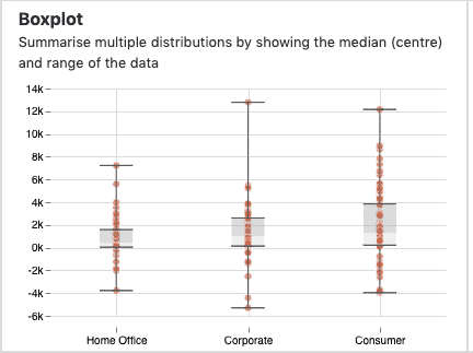
Box plot
A box plot is also known as a whisker plot and is majorly used in explanatory data analysis. It displays the numerical data through their quartiles and summarises multiple distributions by showing the median (center) and the range of the data.
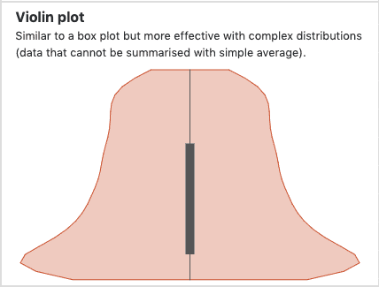
Violin Plot
The violin plot is similar to a box plot but in the shape of a violin. This chart is more effective with complex distributions where data can’t be summarised with a simple average.
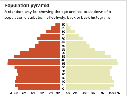
Population Pyramid
In the population pyramid, histogram-like bars are placed horizontally to show the age and sex breakdown of population distribution.
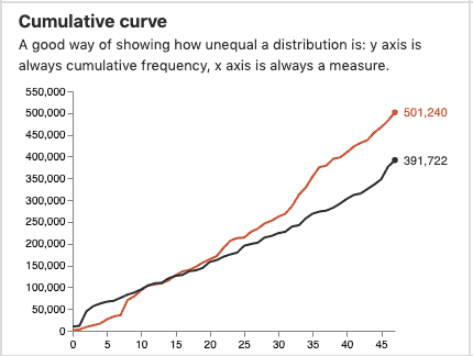
Cumulative Curve
Similar to a line chart, a cumulative curve chart is a good way of showing how unequal a distribution is. Here, the y-axis is always a cumulative frequency and x-axis is always a measure.
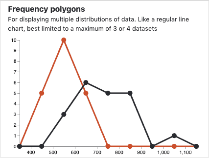
Frequency Polygons
Frequency polygons are used to display multiple distributions of data. The insights are discoverable if the data sets are limited (3 or 4).
Types of Data Visualization to Show Change Over Time
Using the following types of data visualization you can show the trends in a data set. The trends can go back centuries. However, to display non-obvious insights and context to read, choose the correct time period.
Line Charts
Line chart is one of the traditional visualizations to show a changing time-series. If data is irregular, consider markers to represent data points.
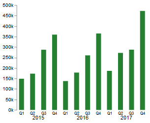
Column Charts
These works well for showing change over time, but usually best with only one series of data at a time.
Column + Line Timeline
It is a mixture of the above two charts. It shows a relationship between amount and rate listed on the two axes.
Slope
Slope charts can display change over time precisely if the data is simplified into 2 or 3 points.
Area Chart
Use with care. Area charts are good at showing changes to total, but seeing a change in components can be very difficult.
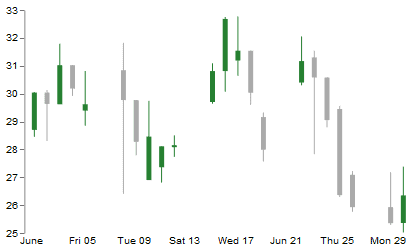
Candlestick
You can use candlestick visualizations to show the change in the intensity of an activity. For example, for any daily activity, you can show the opening/closing or high/low points of the activity.
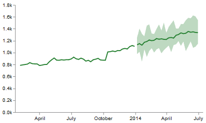
Fan Chart
You can use fan charts to show the uncertainty in future projections. So, this chart, along with giving you the projections, also highlights the aberrations in the projection.
Connected Scatterplot
A connected scatterplot is a good way of showing deviations in data for two variables whenever there is a relatively clear pattern of progression.
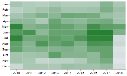
Calendar Heatmap
A calendar heatmap is visually similar to a treemap. It is a great way of showing temporal patterns (daily, weekly, monthly), at the expense of showing precision in quantity.
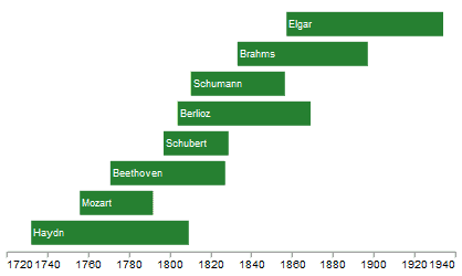
Priestley Timeline
Priestley timeline charts are good to visualize the date and duration in a data story. Choose this only when these two parameters have a huge role to play in your story.
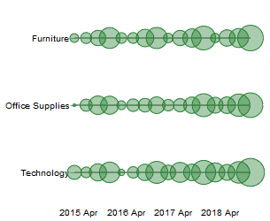
Circle Timeline
Circle timelines are another variation of dot plots. They are good for showing discrete values of varying sizes across multiple categories. For example, earthquakes by continents.
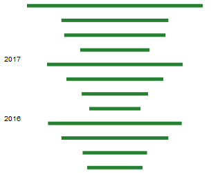
Vertical Timeline
Vertical timelines present time on the Y-axis and are similar to line charts. These charts give a good experience on the mobile view.
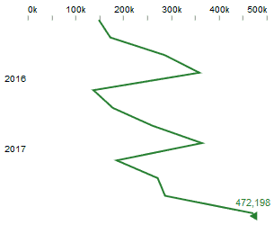
Seismogram
You can use seismogram visualization when there are significant variations in data. They are a good alternative to circle timeline charts.
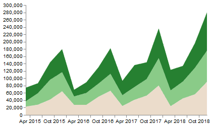
Streamgraph
Streamgraph visualizations are similar to area charts. You can use them when visualizing changing proportions over time is more important than individual values.
Types of Data Visualization to Show Huge Magnitudes
You can use the following set of charts to show size comparisons in data. These charts are good to show counted numbers rather than a value such as changing rate or percentage.
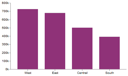
Column Charts
Column charts are a standard way to compare the size of things. You must always start at 0 on the axis and each column represents the size of a category.
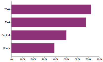
Bar Charts
Bar charts are the same as column charts but in this case, they are aligned horizontally to the x-axis. Good when the data are not time series and labels have long category names.
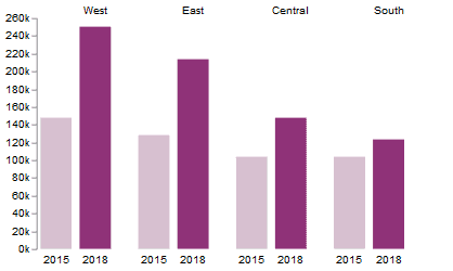
Paired Column
Paired columns are also called as coupled columns. Here, more than one bar is used to represent one category but in different timelines. The chart can become tougher to read with more than 2 series.
Horizontal Paired Bar Charts
Paired bars are the same as paired columns but are aligned horizontally parallel to the X-axis. The chart can become tougher to read with more than 2 series.
Marimekko
Marimekko visualization can show the size and proportion of different data packed in a square or rectangular form.
Proportional Symbol
Proportional symbol charts are similar to scatter plots and are used when there are big variations between values. You can use this chart if visualizing small differences between data is not part of your data story.

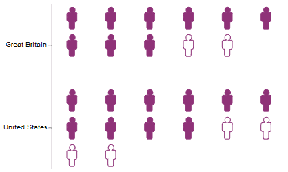
Isotype (pictogram)
The acronym Isotype stands for the International System of Typographic Picture Education. Isotype visualizations represent data in the form of icons. An excellent solution to represent whole numbers.
Radar
Radar visualizations are a space-efficient way of showing the value of multiple variables. Setting the visualization in a way that it makes sense to the reader is very important here.
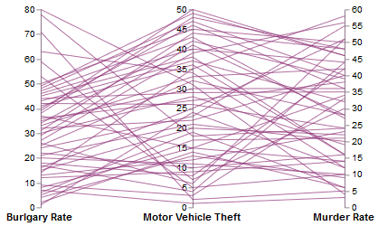
Parallel Coordinates
It is an alternative to radar charts and sets up a relationship between multiple categories by linking them to each other.
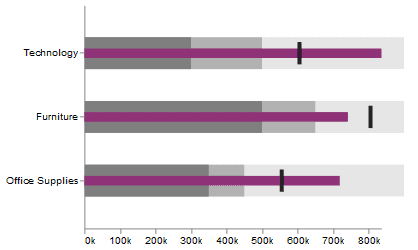
Bullet
Bullet charts are a good alternative for bar charts and can organize data in a space-efficient way, vertically and horizontally.
Grouped Symbol
Grouped symbol charts are an alternative to bar/column charts when being able to count data or highlight individual elements is useful. Best to be used for limited data points.
Types of Data Visualization to Show Part to Whole Data
The following set of charts can visualize the breakdown of a single entity into multiple components.
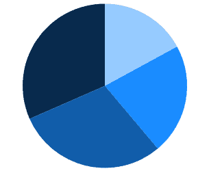
Pie Charts
Pie-chart is one of the classic types of data visualization to show part-to-whole data. However, there can be small segments of categories if the data is huge. Thus, it becomes difficult to accurately compare the size of the segments.
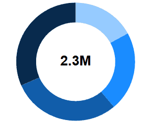
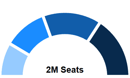
Donut
A donut chart is similar to a pie chart. However, the blank center can be a good space to include more information about the data.
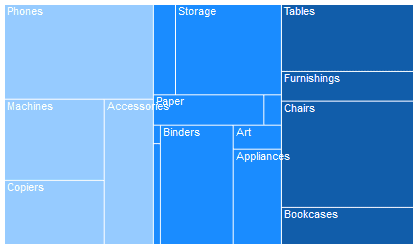
Treemap
A treemap visualization is suitable when it comes to highlighting the hierarchical structure and quantity of the categories in terms of size.
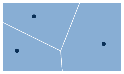
Voronoi
A Voronoi visualization is a plane partitioned into segments to visualize different sizes of categories in a data set.
Arc
Arc diagrams are majorly used to visualize political data such as election results.
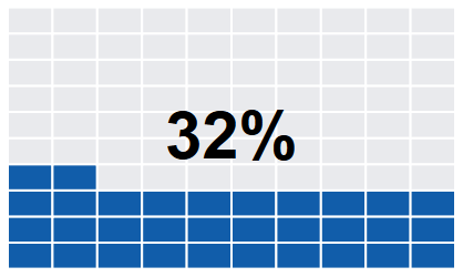
Gridplot
Grid plots are good for showing percentages. They work best when used on whole numbers and work well in multiple layout forms.
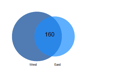
Venn Diagrams
Venn diagrams show the relationship between a finite collection of different categories in a data set.
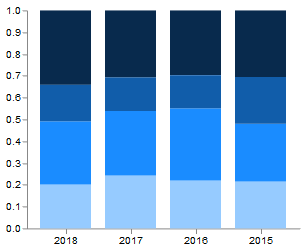
Stacked Column
A stacked column chart is similar to a bar chart but components stacked over each other. They can be difficult to read with more than a few components
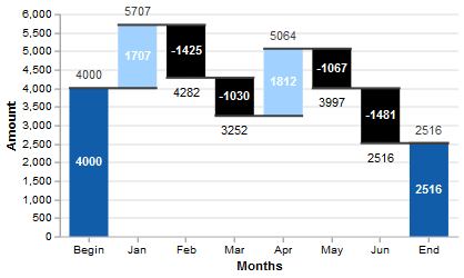
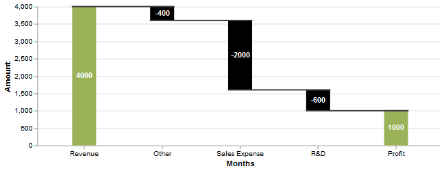
Waterfall
Waterfall visualization can be useful for showing part-to-whole relationships where some of the components are negative.
Types of Data Visualization to Show Spatial Data
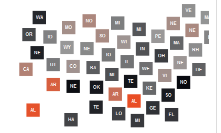
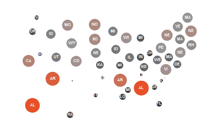
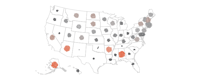
Map data visualizations are good to plot election data, census data, and any other type of data related to population. You can use the following types of data visualization when you have the data for precise locations or you want to find insights from geographical patterns. You can create all these charts using the structure of maps, such as country maps.
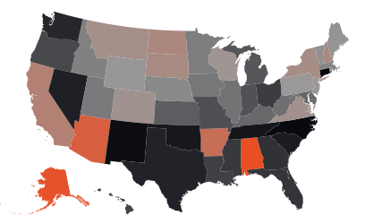
Basic Choropleth (rate/ratio)
Choropleth is a type of thematic map where the area or regions are shaded in proportion to a given data variable. The focus of this chart is to visualize rates rather than totals data based on geography.
Proportional Symbol (count/magnitude)
Proportional symbol charts are the opposite of basic choropleth charts. Here you can focus on displaying totals rather than rates. The chart will display significant differences but small differences will be hard to notice.
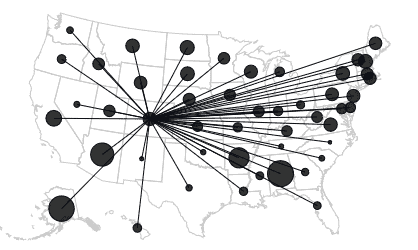
Flow Map
A Flow Map geographically shows the unambiguous movement of information or objects from one location to another.
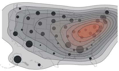
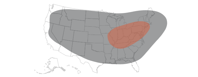
Contour Map
This type of map visualization creates a geometrical contour share for showing areas of equal value on a map. You can use deviation color schemes for showing +/- values.
Equalised Cartogram
Equalized cartogram maps are good for representing voting regions with equal share.
Scaled Cartogram (value)
You can use scaled cartogram maps to size areas on the map according to particular values.
Dot Density
Dot density maps are a simple and effective way to display density differences in geographic distributions across a landscape.
Heat Maps
Grid-based data values mapped with an intensity color scale. They are like a choropleth map – but not snapped to an admin/political unit.
Types of Data Visualization to Show Data Flows
You can use the following set of data visualizations to indicate flows in data in terms of volumes or intensity of movement between two or more states or conditions. These might be logical sequences or geographical locations.
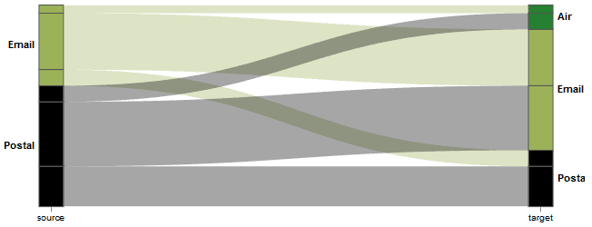
Sankey Diagram
A Sankey diagram is a visualization used to depict a flow from one set of values to another by connecting lines called nodes. The width of the lines represents the flow rate.
Waterfall
Designed to show the sequencing of data through a flow process, typically budgets. Can include +/- components
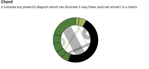
Chord Diagram
Chord diagrams visualize the relationships in data. It is a complex but powerful diagram that can illustrate 2-way flows in a matrix.
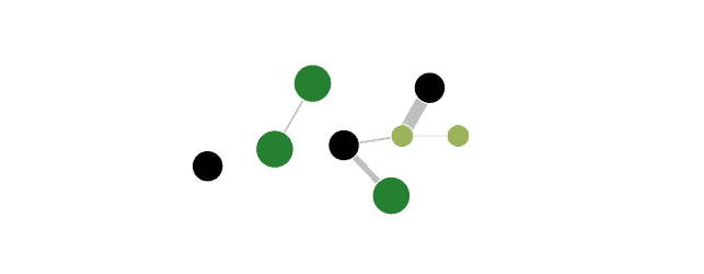
Network Diagram
Network diagrams are used to display the interconnectedness of relationships of varying types in a data set.
Pratap Vardhan, our principal data scientist created this list. This data visualization repository is inspired by Financial Times’ Visual Vocabulary & Andy Kriebel’s ft. and is hosted on Github.
Conclusion
There are hundreds of modern-age data visualizations. Developers and information designers can go beyond just bar graphs and line charts to display insights as data stories.
We also conduct workshops for businesses that want to leverage data storytelling for making successful decisions.
Check out the agenda of our data storytelling workshop. We use real-time examples and hands-on experience to make you exercise data storytelling techniques.
We hope that these multiple types of data visualization will help you create wonderful data stories. Finally, do share this resource with your colleagues and fellow analysts, designers, and developers. Share on social media and tag us (@gramener).