
The analytics industry has come a long way from just number-crunching. Businesses are taking data seriously more than ever. However, the struggles to understand complex data still exists. This problem has led to innovative methods such as data comics to bridge the data consumption gap.
Table of Contents
This is the 4th blog in our Data Storytelling 101 series. The goal is to make data storytelling easy for you. In our earlier 3 articles, we shared easy steps to create data stories, tips to structure data stories, and types of data visualization for storytelling. Do check them out as well to get a streamlined process and materials on data storytelling.
The Journey From Data Visualization to Data Comics
Analysts are not just analysts anymore. They are becoming the new-age data storytellers who continuously strive to deliver insights as stories. They look for new formats to engage their audience with complex-yet-crucial data. Comic data stories make data less complicated by adding a flavor of humor and entertainment. Moreover, they are a great medium to help decision-makers consume insights.
You don’t believe us?
In our experiments with data storytelling, we have found that comic-driven data stories are one of the best ways to communicate insights. The Data GIF example below tells a story about the Robotic Process Automation (RPA) system of ACME, a fictional corporation to assess customers’ deferred taxes.

It gives you insights about the percentage of bot utilization across several days of a week. Furthermore, the Data GIF adds a narrative to explain the drop in utilization of bots to assess taxes.
Why Data Stories?
With data stories, we reduce the heavy-lifting process of exploring insights in dashboards and visual platforms. Data stories serve crucial findings on a plate. The next question is, how do you present a data story even more engaging?
A data story has to serve 3 purposes:
- Focusing on the right problem
- Answering this problem with data
- Communicating this in the right way to decision-makers
How Data Comics Add Value to a CEOs Time
Let’s take another example of AcmeCorp. This time, the CEO of AcmeCorp wants to know the quarterly performance of sales in 2019. He also asks which business unit has done well and by how much.
A Sales Dashboard Without Data Comics
Here’s a sales dashboard that shows the quarterly sales trend of the company in 2019. The dashboard is self-explanatory. The colors represent each business unit. The stacked column bar chart shows the revenue achieved over four quarters. The line chart on the top shows the trend of sales, which dipped to the lowest in the 2nd quarter.
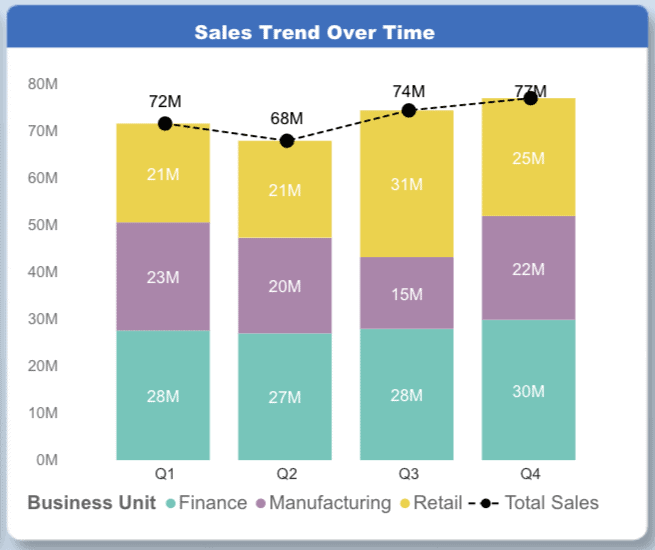
However, what this dashboard doesn’t explain is hidden insights such as the rate of growth, and performance of each business unit, which is crucial for a decision-maker.
A Sales Dashboard With Data Comics
Here’s another version of the same dashboard but with data comics. The female comic character, Dee, is narrating how much the sales value has increased in previous quarters (by 3.5%). The male comic character, Dey, tells us which business unit has done well in the last quarter (manufacturing with 45% variance).
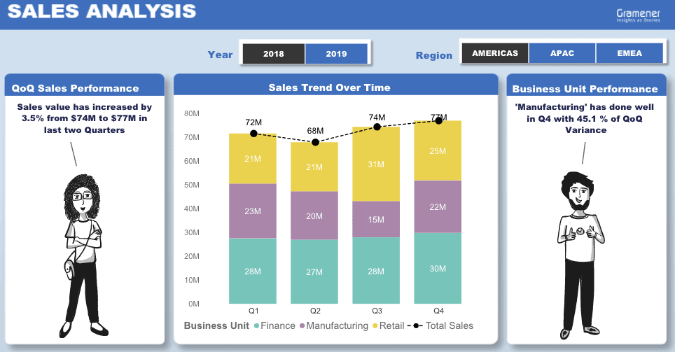
This dashboard was made in Power BI using our Comicgen Power BI plugin. Wanna know how to do that? We have a step-by-step guide on creating comic data stories in Power BI dashboards.
Now, coming back to the story. What’s the difference between the two dashboards? How differently will they impact the decision of a CEO?
The first dashboard is a classic case of an analyst visualizing all data and allowing users to explore insights and answers. There’s a fair chance that the CEO might miss asking the right questions to the dashboard. Also, self-exploring the insights need time and a CEO is busy with more crucial works.
The second dashboard is a storytelling dashboard that doesn’t let you waste your time and energy exploring insights. It gives the CEO essential takeaways in the form of a data comic narrative. Hence, we can conclude that comics simplify business stories and enable emotion-driven decisions.
Which one would you prefer?
Thought so.
Comic narration in data apps not only adds an emotional touch to stories but also helps in memorizing insights. It all leads to a better judgment of data and improved decision-making.
Comic Data Stories Can Be Without Charts and Graphs
The idea of telling a story is to convey a key message with narration. Data comics may or may not have charts and graphs in it unless it serves the purpose of communicating insights.
How?
Let’s take another example of the same AcmeCorp, which is contemplating an entry into the U.S. market to sell diapers. However, they don’t have a huge budget to do head-over-heels marketing. So, they take the help of data and choose to invest only in the area that has the highest RoI.
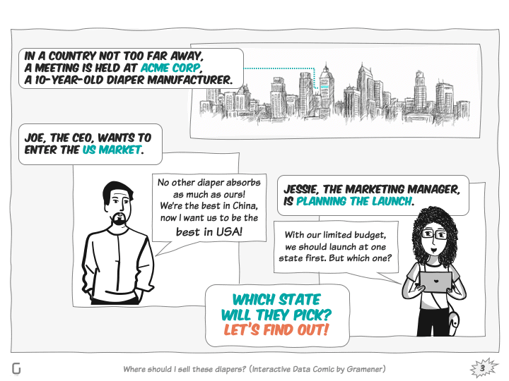
Data Comic Driven Business Story of AcmeCorp
Ringo, who is the CEO of AcmeCorp, is looking for a state in the USA to set up sales of their diaper product. Jesse, the Marketing Manager, suggests an obvious option to invest in, California, because it’s the largest state.
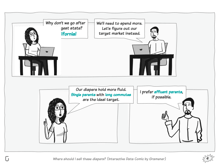
However, the specialty of their diapers is that they can hold more fluid for an extended period of time. So, that simplifies the puzzle a bit. They would want to go for a location that has more number of single parents who also commute long distances.
So, they take another shot with data and find out the regions with the most number of single parents.
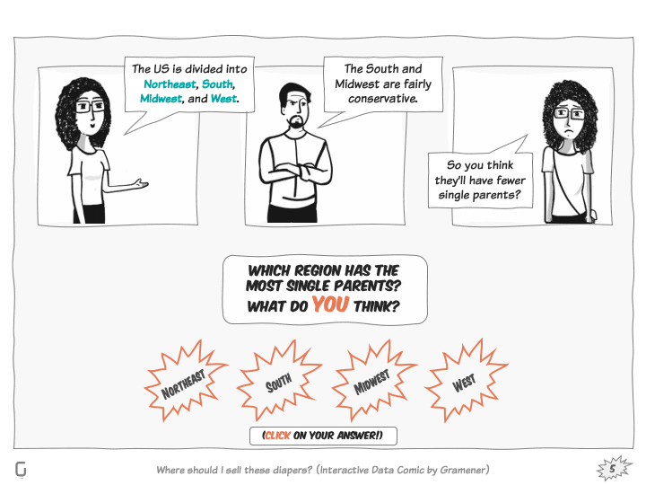
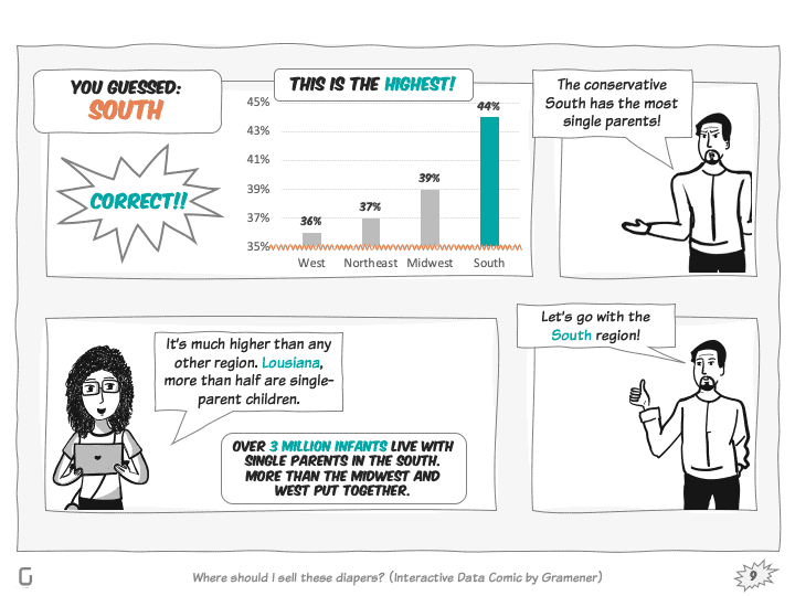
Finally, the data tells them that it’s the southern region that has the most number of single parents (44%), of which Louisianna has the highest. Earlier, Jesse and Ringo knocked off the Southern region thinking that the population there could be conservative enough to have single parents. Well, all we could say is that data is the Lightbringer.
Now, let’s find out in which regions parents do the longest commute. The usual guess would be D.C., maybe Delaware. But it’s Maryland where 470 thousand parents commute for over an hour.
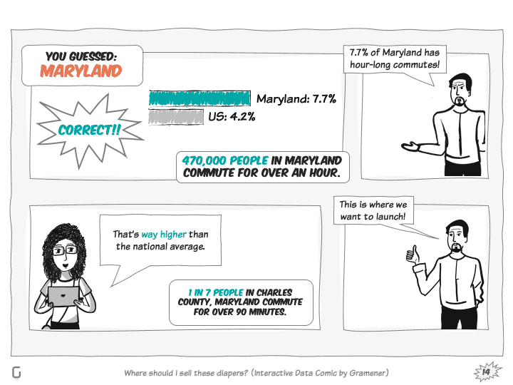
Another analysis states that the income of Maryland is also the 2nd highest in the whole country. What luck!!!
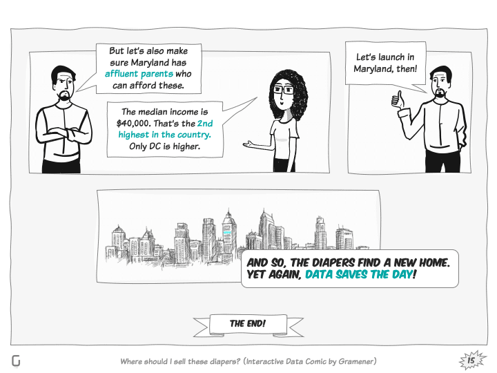
So, that means this also serves a good state from an affluence perspective. Well, YAYYY!!!
What we showed you is just the trailer of this story. You can download the full AcmeCorp case study presentation.
Interested in more case studies? visit our solutions page and search for comics in the search bar.
We also have a full page dedicated to data comics that lists all the comic data stories we’ve designed so far. There’s plenty in the repository to answer how comic data stories are offering insights in a memorable way.
Comic Data Stories for Business Decisions
Comics are “catchy”. We all remember how Spiderman defeated Dr. Octopus. The story stays with us still even after all those years. Why not use such format in data storytelling and make insights memorable?
They are visually appealing, catchy, have storylines, and drive emotions. A CEO or a COO, who doesn’t have much time to explore insights on their own, can leverage comic data storytelling to a great extent. They get insights on the go in the form of a comic data story. They get the answers to their questions as narratives. What else they need for decisions!
We also conduct data storytelling workshop for businesses. The workshop offers hands-on experience to data scientists and analytics experts with data storytelling techniques.
Register for our data storytelling workshop. We use real-time examples and hands-on experience to make you exercise data storytelling techniques.