
Data storytelling is a newly evolving field in Data Science. Data Storytelling not only makes insights engaging but also makes them memorable for a business executive. Every data scientist should know how to create data stories and be an insightful storyteller.
So let’s start this guide with a story.
Did you know that the art of data storytelling has been around for more than a century? Let’s talk about a story that dates back to the 19th Century. A British nurse, social reformer, and statistician designed one of the first comprehensive data visualizations to show the count of injuries and casualties during the 1853 Crimean war.
Still guessing who it is? It was Florence Nightingale, the Lady with the Lamp. Let’s take a look at the visualization she crafted.
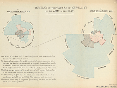
Data Led to Insight on Deaths
She collected the data on casualties in the war and noticed that the number of soldiers dying in the hospital was higher than those on the battlefield. She dived deeper into the data and learned that poor sanitary practices were the reason for higher mortality in hospitals.
Nightingale showed the visualization to the authorities and explained the need to focus more on the hospital and sanitation. Cleaner hospitals thus saved thousands of lives not only during the war, but after.
Moral – Data storytelling with insights has been a proven decision-driving tool for centuries.
In the present day, data storytelling is a critical skill among data enthusiasts. Data scientists, analysts, and managers sometimes find it hard to convey insights as strong, actionable messages. Analysts present their work full of numbers and charts. However, an audience needs an idea and a message that tells them what to do and why.
With this article, we want to share some data storytelling tips with you. We’ll share 4 easy steps that can help you build an impactful data story.
How to Create Data Stories – A 4-Step Methodology
If you’re reading about data storytelling tips, we believe that you already have the data and analysis. You are just curious to discover a roadmap that would lead you to your next data story.
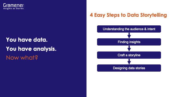
The following 4 steps cover all the aspects that are important for your data story.
- Define your audience and intent
- Find the most important insights
- Craft a good storyline
- Design data stories
Let’s talk about them one by one.
1. Create Data Stories For Target Audience
If you want to know how to create data stories, identifying your audience is the first task on your list. Every story has an audience. You can’t satisfy everyone with your story. But, there is a specific section of the audience that benefits from it.
Let’s take an example of sales data analysis for Acme Corp. Stakeholders want to know the sales over a period. The trends in sales data in an organization are relevant for a CEO, sales head, region leads, and individual sales team members. But, the way they understand sales data can be different. The way a CEO looks at sales could be different from the way a region head looks at it.
It would be better to define a persona and create specific stories for different personas.
Define a persona by asking these simple questions:
- What situation are they currently in?
- What problems do they face?
- What’s the consequence?
- What actions can they take from your analysis?
- What’s the impact of this situation?
Pro Tip: Combining the above questions you can come up with a user scenario. We call it a persona formula. Just fill in the brackets ([ ]).
“As a [persona], I’m in [situation] where I face [problem], leading to [consequence]. Solving it by [action] leads to [impact]”
Now, you have the formula to know what story you need to tell, who the audience is, and how you can help them solve their problem. Remember this: clear insights on needs and future scenarios leads to effective data storytelling.
2. Find Important Insights
You might think, “Hey! They are called insights because they are important!” Well, sorry to burst the bubble. The data can produce multiple insights that might not cater to your customer’s problems.
We recommend the BUS formula to define the severity of an insight. Insights should be:
B – BIG
U – USEFUL
S – SURPRISING
Just answer these three questions and you would get if you want to show this insight to your customer or not.
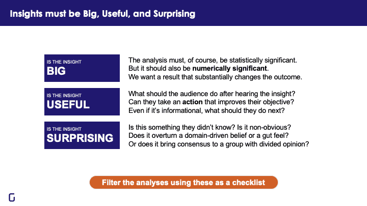
1. Is the Insight BIG?
The analysis must, of course, be statistically significant. But it should also be numerically significant. We want a result that substantially changes the outcome.
2. Is the Insight USEFUL?
What should the audience do after hearing the insight? Can they take an action that improves their objective? Even if it’s informational, what should they do next?
3. Is the Insight SURPRISING?
Found something the stakeholders didn’t know? Is it non-obvious? Does it overturn a domain-driven belief or a gut feel? Or does it bring consensus to a group with a divided opinion?
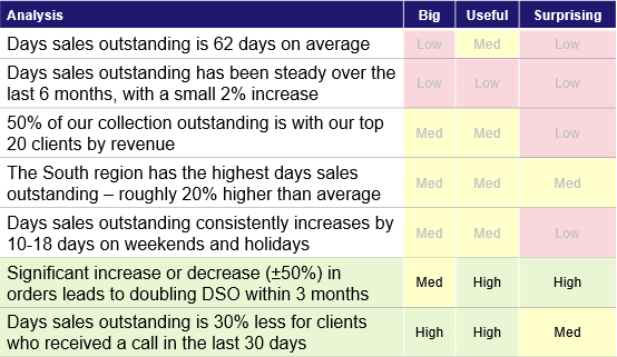
Pro Tip: Make a list of all your insights and add three columns for BIG, USEFUL, and SURPRISING. Now that you’ve understood the roadmap to create data stories, map your insights against these columns with a high, low, or medium priority. Filter the analyses using the BUS theory as a checklist.
Here’s an example where we look at the days sales outstanding of Acme Corp.:
3. Craft a Storyline
This step is seemingly easy but practically the most difficult. However, you can master the art of data storytelling by ensuring that you consistently follow these 6 steps.
- Draft an outline first: Your outline must include a problem, an approach, and a solution.
- Start with the takeaways: Add a one-sentence summary to your storyline. Every story has a message, and moral. Find it.
- Find the analysis to support the takeaway: Here you need to ensure that you are removing irrelevant content from your story. Keep only the things that matter.
- Convert analysis to messages: A message will convey the meaning of your analysis. Add context to your story. You can add a context to your story by either comparing periodic analysis, adding interpretations to your analysis, or explaining the insights with analogies.
- Structure the message: Construct a pyramid-like outline. Keep your key takeaway at the bottom of the structure. Keep adding blocks on the top that supports the takeaway. Strike off any message that is irrelevant to the data story.
- Re-order your messaging: Re-order your pyramid to make sense and increase memorability. Order your story in a way that motivates the customer significantly.
Pro Tip: Start your story with bad news and slowly move towards the good news. For example, Our sales grew mildly at 20%. Our margins didn’t improve at all. But our profits doubled! Remember, emotional contrast requires bad news – and it makes the good look better.
4. Focus on Design to Create Data Stories
Statistics can summarize the data but it may hide patterns in how the data is represented. Information designing visually represents data, which helps you locate patterns in data. At Gramener, We use visual encoding techniques to map data to visual attributes.
Adding visual design cues to the data helps you easily find patterns and insights. Always think about how to create data stories in a visually appealing manner that would enable the reader to self-explore the insights. Here are some tips.
- Colors, when used in context, are powerful. Add color codes to your data to stand out the BUS (big, useful, surprising) insight
- Use size as a differentiator to highlight important insights. Moderate size variations are easily caught by the human eye
- Use different types of charts to interpret different types of data. There are hundreds of charts available such as histograms, Sankey diagrams, chords, cartograms, and many more.
That’s how you create impactful and engaging data stories that would benefit your clients, and business executives. Help them make data-driven decisions through insightful data storytelling techniques.
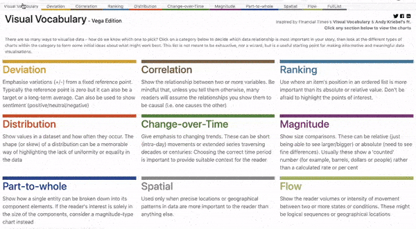
Pro Tip: Check out our visual vocabulary, which is a useful starting point for learning informative and meaningful data visualization storytelling.
We hope you can improve your game and focus on Big, Useful, and Surprising insights using these easy steps to tell a data story. You can also check out the PPT we made that lists all the data storytelling tips, right from creating a storyline to executing data stories. The structure of a data story is explained by our CEO, Anand S, in a webinar organized by Analytics Vidhya. Do check out.
Create Data Stories with Business value
Data storytelling is the missing elixir of business communication. Data scientists and analysts are good at crunching numbers. However, only a few can make the stakeholders understand the numbers. Stories are memorable, viral, and send an actionable message. That’s why we need more data storytellers than ever. With this blog, we would like to spark the need for data storytelling among the members of the data community.
Check out the agenda, process, teachers, and benefits of our data storytelling workshop. We offer hands-on experiences to data scientists and analysts and teach to create insightful data stories.
If you like this article, do share it with your fellow data enthusiasts. Finally, make a data story and tag us on social media (@gramener).