
Excerpt: This blog focuses on 3 major techniques for easy data consumption. Transforming complex data into impeccable visualizations, easy narratives, and memorable stories can enable rapid decision making among the users. The techniques were broadly discussed in the webinar conducted by Gramener’s Head of Analytics, Ganes Kesari, on How to build a successful data science roadmap.
Table of Contents
Introduction
Businesses are keen on utilizing the maximum value out of data to gain a competitive edge. However, all the data in the world won’t come in handy for your stakeholders when it comes to consumption. You must look for ways to awestruck your audience when they look at the insights.
Data Scientists and Analysts may ask, “Hey! I am already doing the data analysis and making a report. What else do you want me to do?”
But it’s important to make data pretty in order to make it comprehensive, consumable, and memorable.
Here are three ways we use at Gramener for identifying insights instantly from data.
I. Data Insights as Narratives
How easy it would be to consume complex data insights if someone just spoke or wrote them to you in simple, plain English. Presenting insights as a narrative is an easy way to make complex data consumable.
What is Data Narrative?
A data narrative is presenting the conclusions of data analysis in the form of a written summary. It explains the meaning of the data in detail using simple languages.
You can prepare a small document as a data analysis report and call it a data narrative. Then you can share it with your stakeholders to express the pain points. A data narrative can be as short as a powerpoint slide with a few bulletins.
On the other hand, there can be automated narratives where you can embed Natural Language Generation (NLG) into narrative science.
A well-designed data narrative can help others see important trends, comparisons, and differences in your data as well as the relevance and importance of the data to your topic.
For example, one of our leading retail banking clients wanted to expand wealth management services to a broad market. Our automated NLG solution sends data narratives as emails to the client summarizing their portfolio, advising them on actions. The model offers insights about the variation in net worth, portfolio, investments and so on.
II. Insights as Visualizations
You can go a step further and visualize the data. That’s where data dashboards and information design kicks in. It easily suffices information from hundreds of excel sheets into one page.
What are Data Visualizations?
Data Visualizations are visual representations of data to make it more appealing and consumable. They help in identifying trends, patterns, and outliers from data sets, by adding a visual context to it. Check out our library of 72 types of data visualizations to make insights obvious.
Data visualizations are not restricted to screens. Physical data visualizations is a format where you can literally touch the data. Physical data visualization utilizes a variety of tangible elements such as threads, clay doughs, color papers, etc. to create graphs and charts out of them. Here are some examples of physical data visualizations.
Here’s another example of how a data visualization helped us decode the hidden insights from 15 years of birth date data from the USA.
We transformed the data into a calendar-like visualization and the insights started peeking out of it. Check out the USA birth data visualization.
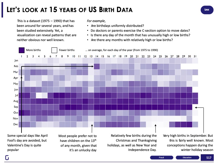
The darker shades are the days and months with the highest birth rates.
some of the insights we found
- The birth rates were highest in the month of September. It clearly indicated that the conception happened during the holiday seasons.
- Relatively, there were fewer births on important days such as independence day, Christmas, New Year, etc.
- Many children were born on Valentine’s day. This adds the assumption that parents like their kids to be born on special days. However, days like 1st April are not so popular among parents.
- The 13th of every month had fewer births, which indicates that parents do not want their child to be born on a religiously-stated unlucky day.
So, clearly, transforming data into a simple visualization made the insights obvious. In businesses, easy insight consumption also accelerates decision making.
III. Insights as Stories
Using data to tell stories can be tricky. But, it is a masterstroke for conveying insights easily. Stories are memorable and your audience will remember them for long. Stories have plots. An engaging plot with a problem and a solution can make the audience crave for more.
For example, we worked with the World bank to answer a question – Does access to new technology facilitate innovation?
We were curious to know if the data could tell a story about influential factors on innovation and entrepreneurship. Hence, we transformed the data set into an interactive visualization illustrating the insights as a story.
With over 1800 indicators, we focused on the Networked Readiness Index, as it has indicators on entrepreneurship, technology, and innovation. Nearly 150 countries across 6 regions were analyzed based on business, technology, innovation and entrepreneurship indicators.
We analyzed 150 Countries based on scores generated by Business, Technology & Innovation indicators, then used K-means clustering to group countries into four peer groups.
- Most Favorable: Leaders in Business, Technology, and Innovation
- Favorable: Strong in Technology & Innovation; Average in Business
- Somewhat Favorable: Room for improvement in Business, Technology, and Innovation
- Least Favorable: Tough challenges across indicators
We transformed the visualization into a scrolly-telling (inspired form storytelling by scrolling) that changes the dynamics of visualization and pops insights on screen with every scroll. Check out the visualization, play with the visual story, and let us know what you think.
The Concept of Data Storytelling
Offering data insights as stories are called data storytelling. At Gramener we research and publish data stories in multiple formats. For example:
Data Stories as GIFs
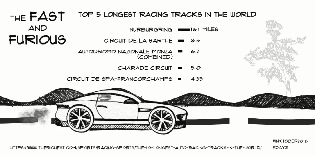
GIFs are the dancing images that tell a story in a matter of seconds. We see GIFs on social media every day. We also express our feelings (sad, anger, ROFL, LOL) on social media by using GIFs. In fact, Giphy, the top online source of GIFs on the internet, serves up to 2 billion GIFs every day. At Gramener we create data stories as GIFs. Here’s an example of a data story GIF illustrating the top longest race tracks in the world.
Data Stories as Videos
Video content receives the most engagement on social media than any other format. Surprisingly, 85% of the US internet audience watches videos online. However, long videos can be painful for the audience to watch. Videos less than 90 seconds in length see an average retention rate of 59%.
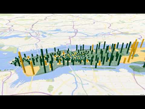
That’s why at Gramener we create 2-minute video data stories. Here’s a video data story about which coffee chain dominates the market in Manhattan, USA.
Data Stories as Infographics
Everyone loves infographics. It comes with a tag of “IMPORTANT INFORMATION ONLY”. Unlike narratives and huge reports, infographics visually represent the information and insights for easy data consumption.
Making good infographics require you to collect relevant data, write compelling text, and present them in an efficient and visually pleasing way. By doing so, infographics help to cover “heavy” topics in an enjoyable way. So, making infographics is a sure-fire way to carve your story in the audience’s memory.
Here’s an infographic we made to tell a story of how Gramener and Microsoft are helping to save penguins in Antarctica using AI.

Comic Data Stories
Yes, presenting data stories in the form of comic strips is yet another way of engaging your audience. Comics are catchy, simple, and drive emotions in readers. Channeling your insights in the form of comic strips will make the data consumption easy by adding a hint of humor to it. Comic data stories are tools for modern age storytelling.
Here’s a comic strip that illustrates information about the longest and shortest constitutions in the world. It also has insights about the number of words in each constitution.
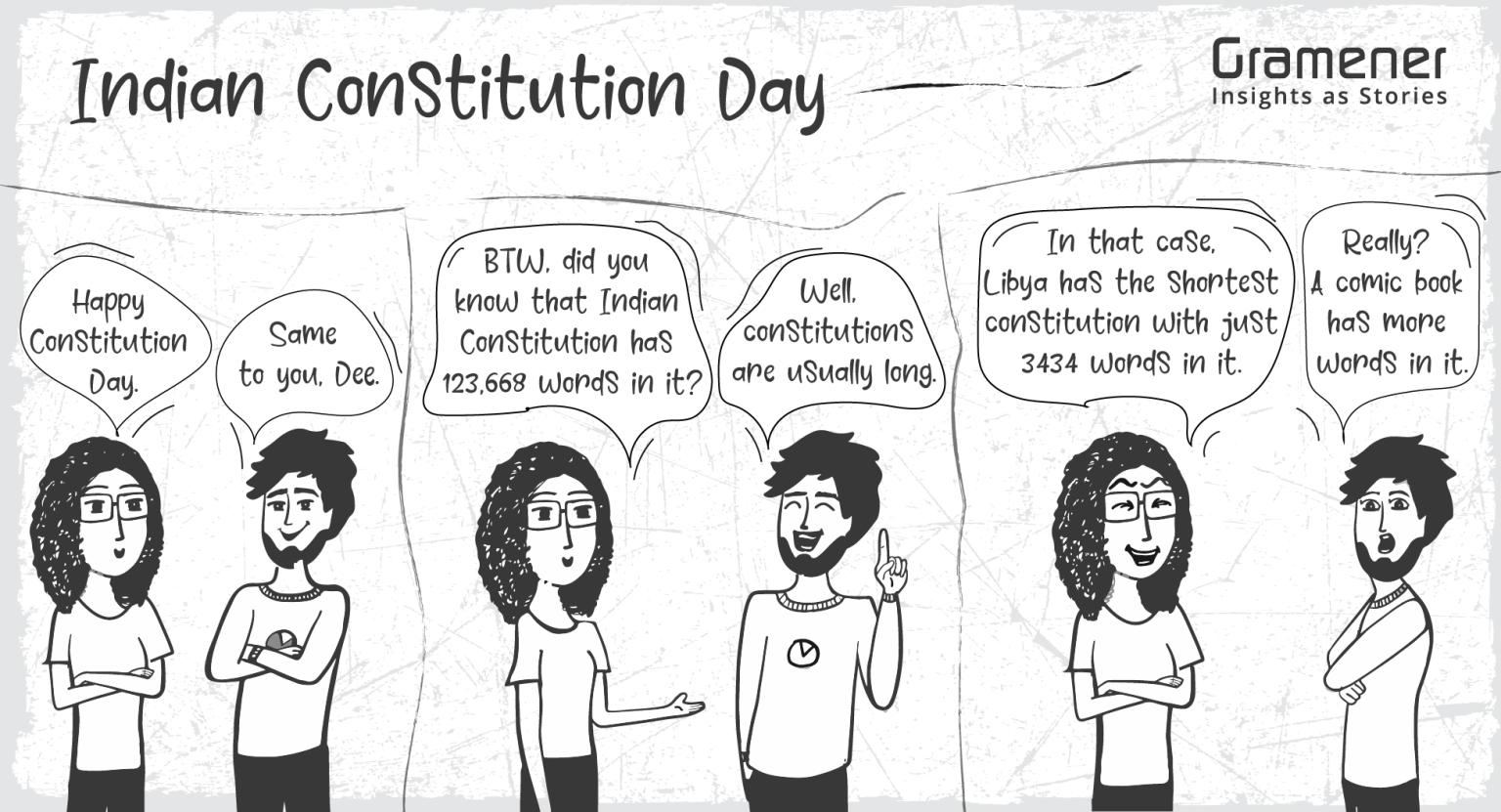
The comic strip is created using ComicGen. ComicGen is an open-source tool for creating comics.
Easy Data Consumption Techniques Add Value to Decision-makers
Data is valuable only if you can translate it into actionable insights. It is all about asking the right questions and answering only those questions comprehensively in the shortest possible time. Top-level business users do not have time to sit and explore insights. Easy data consumption techniques not only save their time but also help accelerate their decision-making ability.
The easy data consumption techniques described in this article is an effort to offer a helpful framework for turning that data into meaningful narratives, visualizations, and stories. Do share your thoughts with us in the comments. Share the article with others if you find it helpful.
About Gramener
Enterprises have access to information, but the gap between data science and business impact is too wide. Gramener is a data science consulting company that partners with enterprises to bridge this gap and enable decision making by extracting Insights and Communicating them as memorable stories.
We are leveraging People, Process & Technology to accelerate and automate Insight generation & consumption with greater emphasis on Pharma, Media & Entertainment, Banking & Financial Services, and Non-Profit sectors.
Check out the latest webinar from Gramener on choosing data science projects for maximum business ROI.
If you like the article, let us know your thoughts in the comments below. Share it on social media and follow Gramener for more data stories.