
Flourish made bar chart races easy to create. That sparked a data visualization meme with hundreds of bar chart races like these going viral.
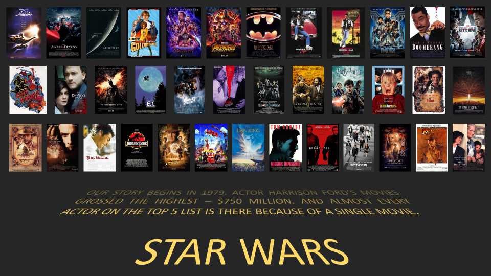
With PowerPoint’s morph transition, it’s now possible to make a bar chart race in PowerPoint, too. Here’s an example that we created for our last Bootcamp.
Step-by-step guide to make Bar Chart Race in PowerPoint
Here’s a quick walk-through of the techniques we used to create this.
Step 1: Create a 2-slide bar chart race
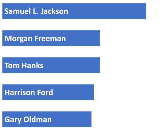
To create the animation, create two slides. In the first, add one rectangle per bar in the bar chart. Copy the slide to the second one, and move or re-size the bars. The result could look like this.
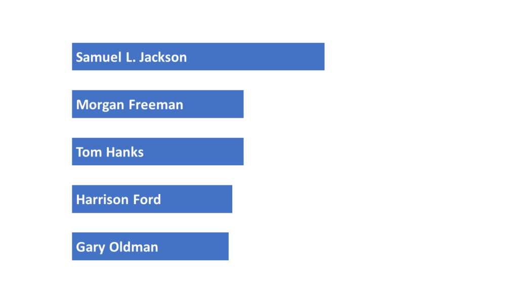
Slide 1 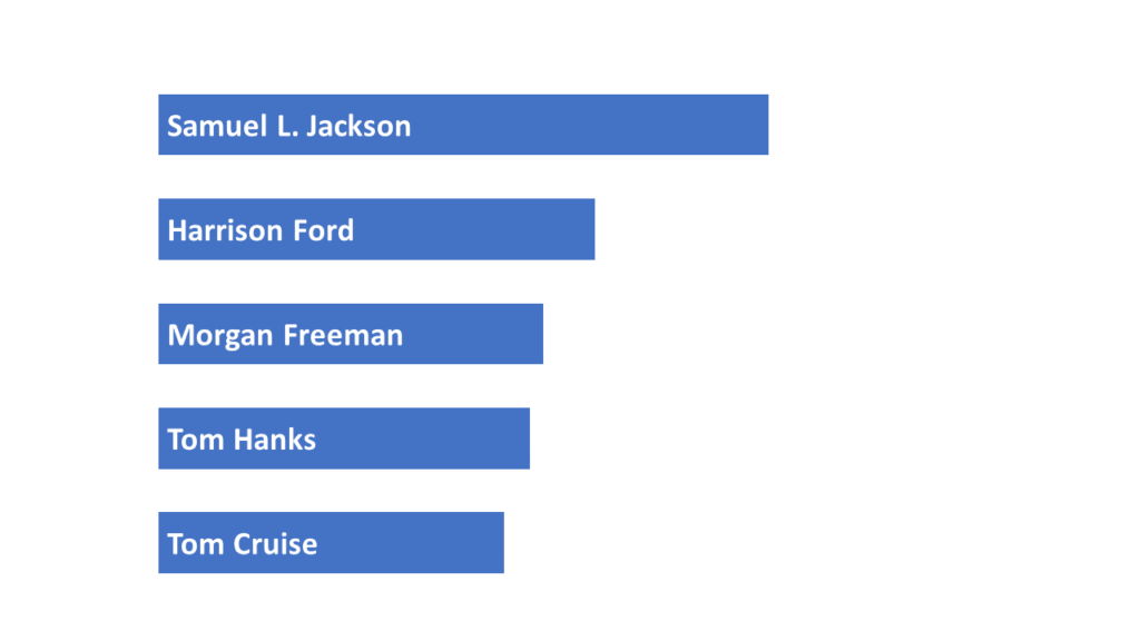
Slide 2
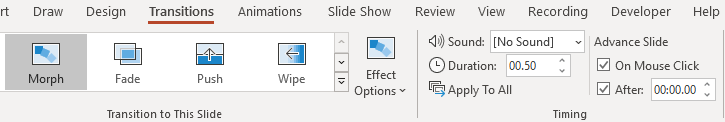
Under Transition, choose “Morph”. Pick a duration.
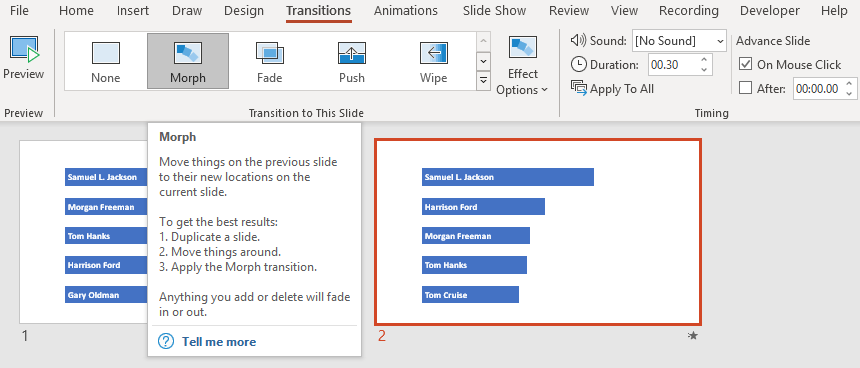
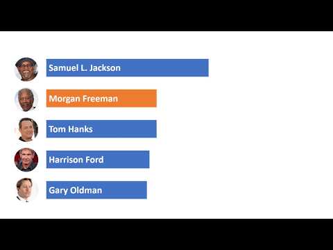
When you view it slideshow mode, this is what it looks like.
PowerPoint moves objects based on the text in the bar chart. You can add images. These will be moved too. Colors will be smoothly morphed.
Step 2: Size the bars accurately
The reason we can’t just use a bar chart is that PowerPoint can’t morph bar charts. So the (painful) alternative is to manually create the bars.
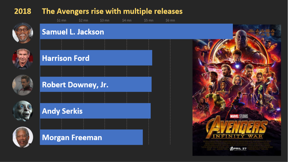
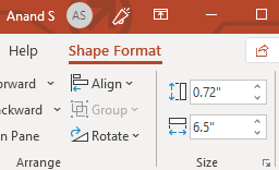
A quick way is to scale the numbers by a convenient factor. For example, if Samuel Jackson’s box office gross is $6.5 billion, you can select the Shape Format and set the width to 6.5″. (You can select all the bars and scale them later.)
Create the Star Wars Intro Crawl
The ShapeChef blog has a step-by-step guide on How to Create a Star Wars Intro Crawl. This uses WordArt styles and 3D rotation to create something that mimics the Star Wars intro crawl.
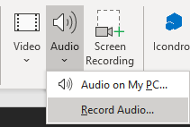
Step 3: Record voiceover
PowerPoint’s Insert > Media > Audio > Record Audio… feature lets you record your voice and insert it into the slide directly. You can use Playback controls to trim the audio and fade in or out.
I wrote down the script for each year and inserted the audio on every slide.
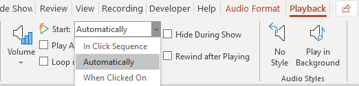
Step 4: Auto-play the voiceover
Select the Start: “Automatically” option. This plays the audio as soon as the slide starts.
To advance the slides automatically, select the Transition > Timing > Advance Slide > After option, and set it to zero. This will move to the next slide after all the animations (including audio) on the page are complete.
Step 5: Add background music
You can find background music at YouTube’s Audio Library, SoundCloud, Jamendo, etc. Download the audio, insert it in your first slide. Check Playback > Audio Options > Play across Slides. That will play the music in the background. (Reduce the volume, so that it’s not intrusive.)
Step 6: Export as MPEG-4
PowerPoint can save as MPEG-4 video. For some reason, though, the output was jittery. So for my final version, I used Open Broadcaster Software (OBS) instead and recorded the screen.
99% perspiration
These techniques were quick to find. But the bulk of the time went into:
- Crafting an interesting story to tell — which included the titles, and finding the movies to support the title
- Settings the widths on every single one of the 40 slides
- Adding the photos against every bar and movie posters on every slide
- Adding animations against every movie poster
- Recording the voice-over on every slide
All-in-all, a fairly manual effort. For deployment, the automated scrolly-telling approach “Box Office Mojo” created by Pratap works much better.
But we chose the manual approach consciously. While prototyping, it allowed us to change course mid-way easily.
More data visualizations on PowerPoint
To help business users create hassle-free data visualization and charts in PPTs, we’ve created SlideSense – A powerful PowerPoint Plugin for charts. This plugin is helpful for anyone who repeats a presentation daily, weekly, or monthly, and modifies the same slides for different audiences.
At Gramener we want to help you convey data insights as stories. Data visualizations are great visual stories. With this series of guides, we want you to make data visualizations on PowerPoint and share key insights with your colleagues and clients.
Check out another guide on how to make sand dance visualization in PowerPoint. Sand dance visualizations are a great way to show data distribution.
Authors: Chandni, Srikanth & Anand.

Pingback: Data Talkies: Video Data Stories and Visualizations with a Play Button
Pingback: How to make Sand Dance Visualization in PowerPoint [step-by-step guide]
Thank you so much for this free knowledge. You are a reminder that the best things are free but people don’t want to make an effort to learn until they are told to pay for it. Thank you again for this. Ijust needed to write this so that you know some of us appreciate this education.