Watch this short 2-minute video tutorial on making Sand Dance visualization in PowerPoint. After that, you can read and follow the step-by-step process and create interactive data-driven PPTs.
Table of Contents
Introduction
Presentation decks are standard to communicate findings because they provide the key takeaways in an easily consumable format.
But how can you provide that edge which drives decision-making among stakeholders? Data and visuals make a far more powerful presentation than just putting in the facts.
Why? Because the numbers tell us whether something is working or not, to what extent, and where we can improve.
Another reason is that stories are much more compelling when they’re backed by data and visualizations.
One of the possible problems with data visualization, however, is that complex visualizations involve code. In this blog, we discuss how you can create an engaging data-backed presentation using a sand dance visualization with absolutely no coding skills required.
What is Sand Dance Visualization?
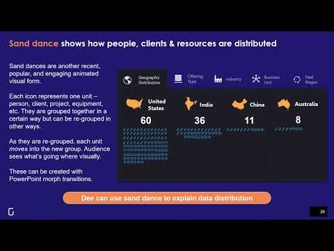
Sand dance visualization holds a respectable position amongst different types of data visualization. It lets you easily explore, identify, and communicate insights from a dataset. This is a powerful visualization tool that helps you understand data distribution. You can identify how data flows from one group to another based on the questions you ask it. Sand dance visualization illustrates patterns and trends by grouping data into multiple sections.
For example, you are a Marketing Manager and plan to run three campaigns to pitch your product to your existing client base. Your boss wants you to show him the people you are targeting for the campaign. You need to group the existing contacts into three groups, say clients who are already using the product, clients who are aware of the product but not using it, and clients who don’t know about the product.
Let’s take the same example to go further and identify steps to build a sand dance visualization in PowerPoint to fulfill this need.
A step-by-step process to create Sand Dance Visualization in PowerPoint
Step 1: Identify your prospects/targets
Go to your Customer Relationship Management (CRM) software or your client database. Identify all your prospects who are eligible for the multiple campaigns you have planned out.
Step 2: Make shapes in PPT
Consider every client you want to group for your campaign as a shape. PowerPoint offers a variety of shapes to choose from. In this case, we’ll make circles, where each circle represents the client and the color represents the status of the account. You can either manually arrange the shapes or use a plugin that automatically adds the shapes. Power User is a PowerPoint plugin that can help you make copies of your shapes in rows and columns.
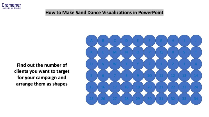
Step 3: Add names and color to your shapes
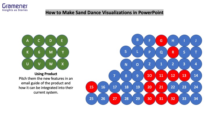
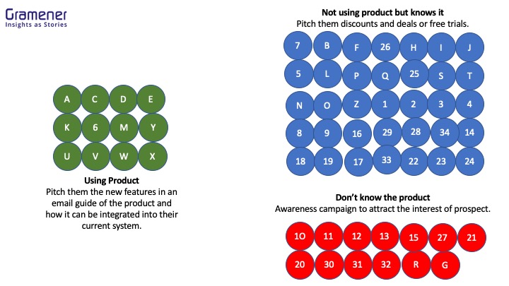
This step helps you in the future when you need to locate your prospects in multiple groups. In this case, we use capital letters, “A-Z” and numbers, “1-34” to represent 60 of your clients.
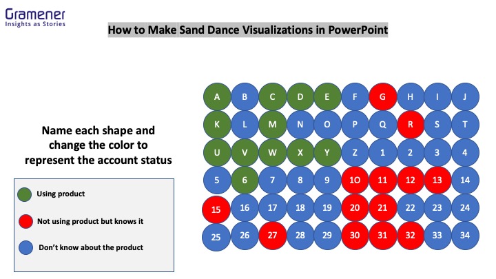
Step 4: Group the shapes as per the campaign
We now divide the shapes into sections. The green section is the list of prospects who are already using your product and need info about the new features you rolled out. The blue section is the list of potential clients who know about the product but are not using it. A red section is a group of clients who don’t know anything about your product but can benefit from it.
Step 5: Storify the shapes with Morph Transition
Morph transition can storify the content in your PPT. Group your entities and add the morph transition. Here’s a 2 minute tutorial on how to add morph transition to your PPTs. When you turn on the slideshow mode, the prospects will automatically slide into the campaign groups you have identified.
After grouping your prospects and adding morph transition to each group, you can visualize the targeted prospects for campaigns. Here’s how your final slideshow might turn out after doing all the steps to make the sand dance visualization in PowerPoint.

Still unsure of how to get started? Download the example PowerPoint presentation we used for this blog and follow the steps.
What are other use cases of Sand Dance Visualization?
The purpose of making sand dance visualizations in PowerPoint is to enable people to visually deliver quick insights. Anyone, right from the operations team to the marketing team and even the HR team can create the visualization and share them as reports. Some of the use cases we can identify are:
- Identifying insights from employee data such as “New vs Old employees,” “male to female employee ratio,” department-wise employee distribution,” “pay grade-wise employee distribution,” and more.
- Within a large portfolio of your products, you can do analysis on “growing vs shrinking products,” “high market share vs low market share products,” “support service products vs no support service products,” and more.
- You can also analyze specific events by making this visual. A classic example is how Microsoft used sand dance visualization to analyze the sinking of the Titanic.
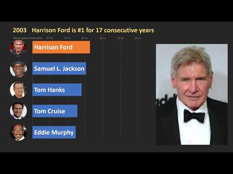
We have ignored the potential of PowerPoint to create interactive decks. If you are interested, here’s a detailed article on how to make a bar chart race in PowerPoint. Below is a data story about the highest-grossing actors in Hollywood in the form of a bar chart race made in PowerPoint.
Sand Dance Visualizations as data portraits
Data Portraits are interactive data visualizations that reveal the structure and the pattern of a dataset in the form of a portrait. They help users easily explore the data as each element of the portrait represents a piece of information. Data Portraits are one of the best examples of sand dance visualizations.
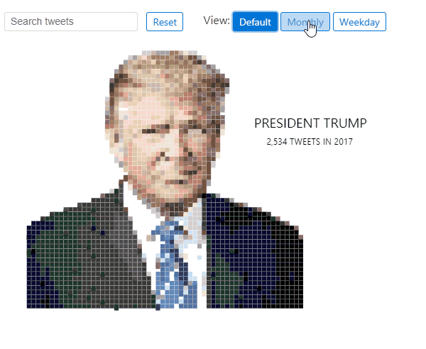
At Gramener, we make data portraits as a comprehensive medium to convey insights as stories. For example, here’s a data portrait of Donald Trump that illustrates all tweets from him in 2017. Each element of the portrait represents each tweet he posted in 2017.
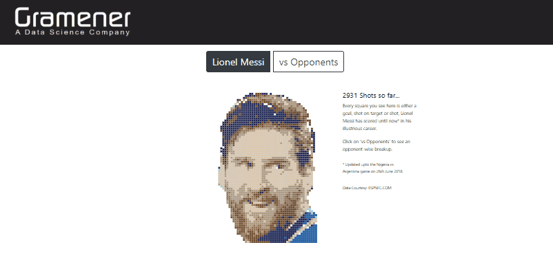
Similarly, here’s another data portrait of Lionel Messi. Each data point on the portrait represents goals scored by Messi in his football career.
Make Sand Dance Visualizations with SlideSense – a PowerPoint plugin
SlideSense is a Microsoft PowerPoint plugin for charts that helps you automate data visualizations such as bar chart race, sand dance visualization, treemaps, and more. The plugin is currently under development and now supports a limited variety of visualizations. You can try out the latest version of SlideSense and give us your feedback.