
This is part 4 of a 4-part series on The Making of Manhattan’s Coffee Kings.
Read Part 1, Part 2 and Part 3.
After 3 days of preparation, I now had the data to find insights and narrate.
Write the insight as a storyline
After a bit of hunting around, I thought I’d tell the story in the form of a battle between Starbucks (the incumbent) and McDonald’s (the challenger). Lessons from Resonate and Storytelling with Data helped me frame this with an emotional context. After a few hours, I crafted this storyline.
Starbucks is the coffee king of Manhattan. It is pretty much the only choice for coffee goers.
But in the mid-2000s, McDonald’s joined the emerging coffee craze by introducing flavored and iced coffees. The fight for the top position as the coffee king is on.
Starbucks is still the winner, with more people, more stores and with a solid grip over Manhattan. But McDonald’s gets more customers per store and is more profitable.
Each store has its skyscrapers and shacks. The strategy is to build near others’ skyscrapers and destroy our shacks. For McDonald’s, that means building near Starbucks’ 125, St Mark’s Place and closing 14 E 47TH ST store (8 people). For Starbucks, that means opening near McDonald’s 213 Madison Street in Lower Manhattan and closing 383 Madison ave (11 people)
If they follow this strategy, Midtown Manhattan should see fewer coffee houses, and Washington Heights & East Village will see more.
The battle for the coffee king will continue with Starbucks in the lead. If McDonald’s wants to win, it will be a bloody fight, with the customer emerging the real king.
This analysis is flawed, of course. It assumes that the number of customers is the number of residents. 383 Madison Ave is JPM’s office. It probably has zero residents, but thousands of coffee lovers. This is where a domain expert reviewing the storyline has enormous value.
Plan a format and design
Our team explored three formats that looked promising.
- A physical visualization (see examples)
- A Power BI visualization (to showcase at Microsoft Inspire)
- A video (or a “data movie”, as I like to call it)
There were three of us. We picked one each. I worked on the video. Devarani on the physical visualization. Navya on the Power BI visual.
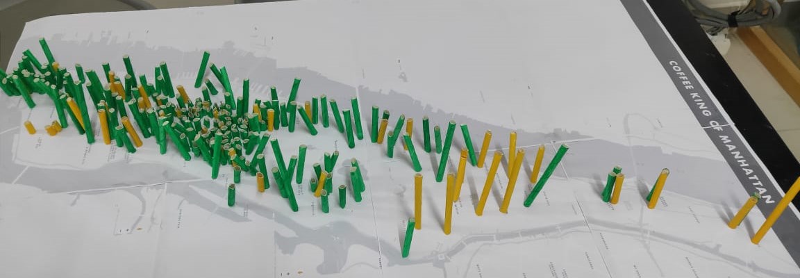
Physical Visualization
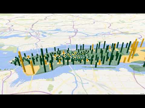
Since we were creating a 3D map in Excel that looked like this…

… we thought of replicating this physically. The plan was simple:
- Take a map of Manhattan
- Overlay each store’s coverage population as one of 4 categories — short, medium, tall, or skyscraper. (Fewer categories make it easier.)
- Print this map and stick it on thermocol
- Get 288 sticks. Cut them into these 4 sizes (1cm, 2cm, 4cm, 8cm)
- Color each stick based on the store brand color (orange or green)
- Stick the sticks on the map
The plan was good, but we struggled with 2 things. First, We didn’t plan enough time to step out for an A1 / A2 printout of the map. So after some delay, we printed multiple A4 sheets and stuck them together. Second, we didn’t have sticks. We had straws. Fortunately, we also had pins. So we stuck the pins and placed the colored cut straws on top of the pins, and also stuck them to the map with glue.

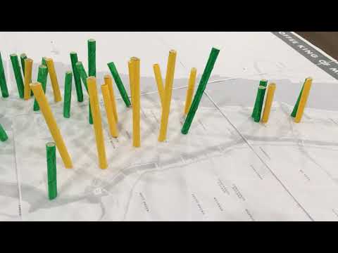
The end result was interesting… it looked more like blades of grass than skyscrapers. It also was a tad unstable. But it had the ability to tell a story.

At the last minute, we added a quick voice over to this to create a video, since the physical visualization couldn’t be shared online for the judges’ evaluation.
Power BI Visualization
On Power BI, our plan was to tell Starbucks and McDonald’s where to open and close stores.

The premise is that it’s best to close the stores with fewest customers and open near where the competition has the most customers.
This interactive Power BI visualization lets users click on the Open / Close icons to drill into the specific stores they should be closing, or opening next to.
Video
For the video, we wrote something like a screenplay.
CUT TO: Manhattan skyline. Edit https://youtu.be/eDAR2dxBThk

                NARRATOR
    Manhattan. New York City’s largest borough is the brewing ground for
    a very different kind of battle. Who will be Manhattan’s next coffee
    king?

CUT TO: Happy Holidays from Starbucks. Edit https://youtu.be/Eo3VeweHD74

                NARRATOR
    Starbucks is the largest coffee chain in Manhattan. Ever since they
    opened their first store at 87th and Broadway in 1994, they have been
    the darlings of the city.

CUT TO: Starbucks scene in You’ve got Mail. https://youtu.be/hZ7lFV9Z2hk

                TOM HANKS
    (Says his famous dialog about Starbucks)

CUT TO: McDonald's logo, with a gentle zoom

                NARRATOR
    BUT, in 2009, McDonald’s entered the coffee market, offering simple
    choices at low prices.

CUT TO: McDonald's ad about simplicity. Edit https://youtu.be/Kra1eWAiKvE

                PERSON IN AD
    I just want a coffee...

CUT TO: Manhattan map - full extent

                NARRATOR
    The 1.5 million customers in Manhattan, however, care about only
    ONE THING.

ZOOM TO: A single store

                NARRATOR
    How far do I have to walk for MY morning cup of coffee.

... (and so on)
This gave us the exact words and the exact scenes we had to stitch together.
The next step was recording the narration. My learning was that my iPhone records better than my Dell laptop. It’s also more portable. After hunting for a quiet spot (which I found in the storeroom of our office), I narrated the script in one sequence. If I made a mistake, I just repeated it until I got it right.
I had a 4-minute audio clip that I cut down into 14 clips — one for each scene — using Audacity. I also used its noise reduction feature to make the audio cleaner.
I downloaded the required videos using youtube-dl.
Windows 10 has a Video Editor that is easy to use. It’s not feature-rich but does a pretty good job for simple tasks. I added the videos — including the Excel 3D map export — trimming them where required.

Then I used the Custom Audio feature to add all the clips. It sounded good, except for the lack of background music. (Almost every video can be improved by almost any kind of background music.) So I added the first happy theme I found.
The result is this video: Manhattan’s Coffee Kings.
Read this whole thread of 4 parts. This was a nice read as well as inspiring to know how to go about doing data analysis and storytelling as a beginner.
Thanks