
Believe it or not, physical data visualizations or data sculptures are not modern-age methods of data consumption. Humans have presented touchable data since the dawn of civilization.
According to an eminent archaeologist (Schmandt-Besserat, 1999), the earliest data visualizations were likely physical. They were built by arranging stones or pebbles, and later, clay tokens. Clay tokens suggest that physical objects support visual thinking.
In fact, ancient Greeks in the 5th century BC used to visualize their opinions using pebbles, clay, and stones. They voted for government by dropping a pebble in an urn. A white pebble meant “yes” and a black pebble meant “no”.
3-D Data Models for Your Insatiable Visualization Appetite
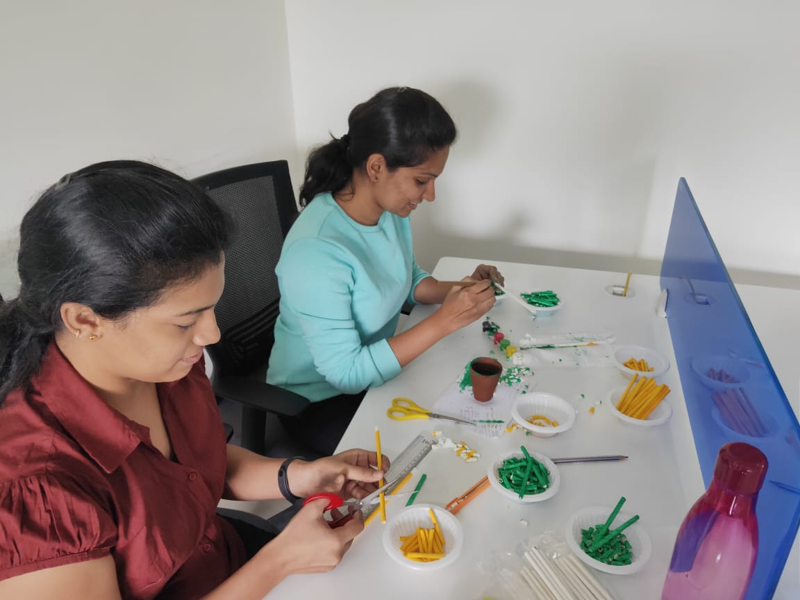
We thought, why not do some old school activity. This month’s Data Storytelling Hackathon theme was to create impeccable Data sculptures. The participants, both in-house and external, used disparate tangible elements to visualize data. The types of data visualization you would see are handmade and not developed by coding.
Sit back, relax, and enjoy some of the amazing data sculptures our teams created.
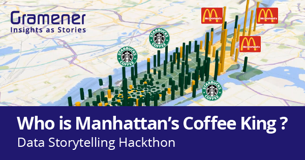
I. Who is Manhattan’s Coffee King?
A yummy coffee first thing in the morning is a cup of nectar from an angel’s kitchen. Brands like Starbucks, and Mc Donald’s have perhaps brought these kitchens from heaven to earth.
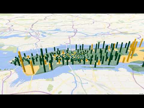
New York is America’s Coffee Capital. Starbucks alone in Manhattan houses more than 320 coffee shops. Here’s a visualization from Devarani locating each Starbucks and Mc. D on the Manhattan Map. Green and orange straws represent Starbucks and Mc. Donald’s, respectively.
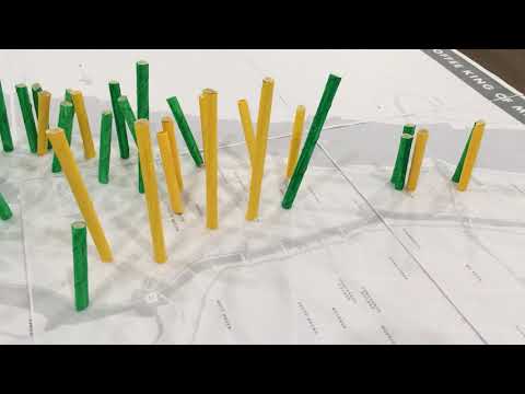
S. Anand went a step ahead and transformed the data sculpture into a video with 3-D maps. Take a look.
II. Where in Bangalore Would you like to eat? A Zomato data viz.
A wise saying quotes, “eat to live”. But thanks to rapid delivery platforms like Zomato, foodies these days “live to eat”. Zomato also offers ratings for fine-dines across the city. Prashant, Rajesh, and Chandni fantastically converted restaurant ratings into clay-made data visualization.
The presentation shows heaven-for-foodies locations in the happening city of Bangalore.

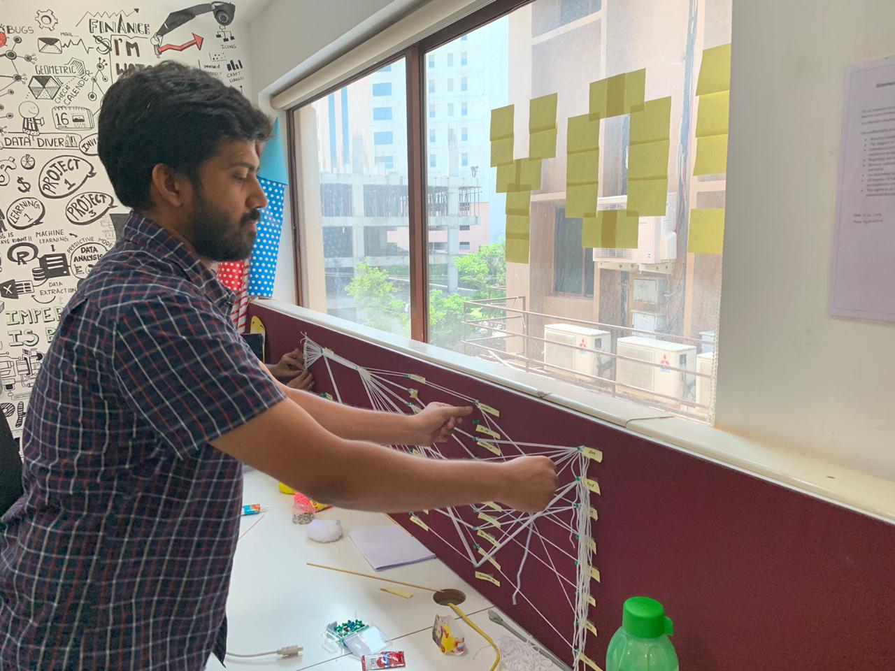
III. A Thread Parallel Coordinates Plot of Hackathon Participants
Richie, Sainath, and Pratap used simple colorful threads to create a Parallel Coordinates Plot. They connected the dots to find maximum participants from particular teams at Gramener. The Gramener design team had maximum participation (~60%). The leadership team had pretty good participation (50%) while no one from sales, marketing or the delivery excellence teams stepped up to play in the hackathon.
This visualization is a shout out to increase participation from other teams. Very well put, guys.
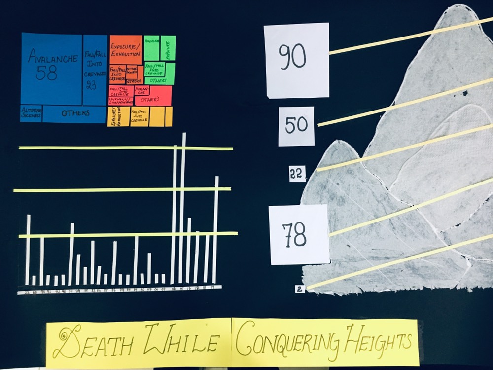
IV. Please, Trek Himalayas But Don’t Die.
Sandipan, Mohit, and Hemanth worked on an unglorified data of deads. The viz shows the number of deaths that occurred while climbing Mt. Everest from 1922 to date.
Unfortunately, Nepal tops the charts with a maximum of 114 deaths while climbing a staggering 8,848 meters. However, surprisingly few were due to exhaustion. They used elements like color papers and straws to create treemap and bar charts. Check out the video for more insights feed.
V. Suicides in India
It is heart-breaking to see newspapers and channels full of headlines of people committing suicides. However, it is never an option regardless of any reason.
Deekshita, and Padma created a data visualization on the same that sends chills down the spine. They used clay doughs to make human figures and used straws for line graphs. Surprisingly, the highest number of suicides in India are committed by men between the ages of 30 and 59. The root cause is family problems.

Other stories from our previous data storytelling hackathons
It has been 3 months that we are conducting data storytelling hackathons. You can check out the following links for the outcomes from previous hackathons.
You can join in
At Gramener, we’re learning how to make data more exciting. Our monthly episodes of Data Storytelling hackathon invite data enthusiasts from all across the city. Together we celebrate the second Friday of every month with data, visualizations, and stories. You can join us any month by registering through meetup.
Or, if you can’t make it, enjoy the image, video and physical data visualizations and stories we push on social media and let us know how you like them. We hope you join us soon to create more data stories.