
The interactive visualizations and insightful data stories from the New York Times are the benchmarks to what we call data journalism.
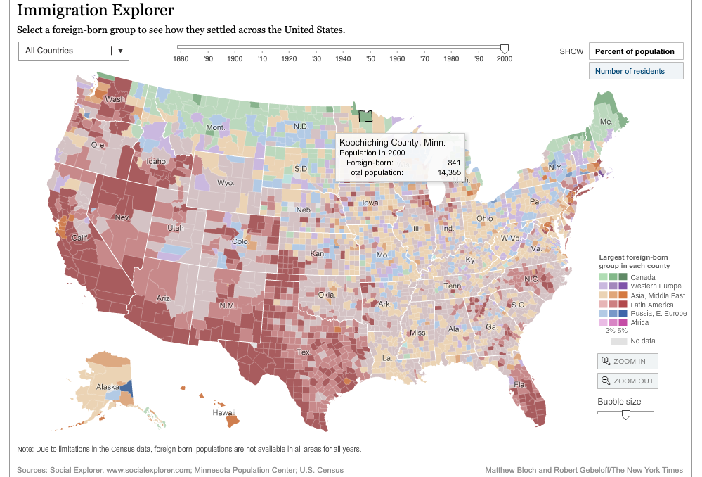
Here’s a classic example of visual data journalism. The immigration explorer built on the concept of interactive mapping zooms into the demographics of immigrants of each state in the US over the years. A simple hover on the map shows the exact number of resident immigrants. Color codes, which are assigned to a specific population, makes the data comprehensive and easy to consume.
Isn’t that the whole point of journalism? Show the right news in the right format. In today’s age, stories not backed with solid data rank low on the list of effective news. Data journalism simply uses data as a source in addition to humans.
What is Data Journalism?
According to Aron Pilhofer, visual editor at The Guardian, “When you say data journalism, it means something different to just about everyone.”
Data journalism is using numerical data to produce and distribute information through a visual medium. A data journalist plays the role of a data collector, analyst, visualizer, and storyteller. In many organizations, there is a small team of data journalists that works day and night on number crunching.
The New York Times and the BBC are just two media organizations that have invested in dedicated teams for visual and data journalism. In fact, the NYT is going a step further by equipping all its journalists with data skills.
The work of a data journalism team is distributed based on the skills and processes in data journalism. There are three major functions that need to be performed.
- Data acquisition, where the data needs to be scraped from websites or downloaded on a data spreadsheet for further analysis
- Data analysis, which looks for interesting insights and unusual patterns to weave a story
- Data visualization, which molds the story into an easily consumable format such as insightful charts, graphs, infographics, and other visualizations.
Why data journalism is important for mainstream media
News reporters from mainstream media are verbal mammoths and strongly communicate their stories. The support sourced from data adds strength to the news story. Human sources, in many cases, are either personal, official or anonymous whistle-blowers. Responsibilities such as their anonymization, protection, genuineness. etc come with live sources.
With data coming into the picture, these responsibilities reduce significantly. Data can also be used to reinforce the information given by a source. Data sources come with their own set of challenges but they do have benefits over traditional news reporting.
1. Data journalism offers rock-solid claims
Numerical data is credible. You get an exact number of events such as deaths, births, census, vote counts, and economic variation. From social media followers to travel records, everything these days is data.
2. Numerical data leads to unbiased journalism
In many cases, reporters are also subject to biases. Numerical data in news reporting eliminates the point of view of the journalist. Data decides the antagonist and protagonist in the news story
3. Investigative reporting with visual data journalism
Investigative reporting is about revealing the ‘why’ rather than focusing on ‘what’. Data helps news reporters dig deeper into the events to extract patterns. Data journalism has given mainstream reporters an investigative edge followed by a rigid story. For example, conveying that a minister lost in the election by X number of votes is news reporting. A data journalist investigates why the minister lost the elections. Which voters in which regions voted the minister out of power? How many of them were male or female? Were there any signs of losing the elections during the campaigns?
4. Focus on details
If a lead on a news story is from a human source, it should be credible. Audiences will take stories with a pinch of salt unless the source is credible, non-anonymous and relevant. Whereas, the need to solely rely wholly on such a source minimizes when data allows exploration at a macro level. ProPublica’s Surgeon Scorecard is an application that offers the data of doctors to the patients. So rather than relying on a word of mouth, the patients can choose doctors based on the data and insights such as qualifications, or years of experience.
Importance of visual data journalism during elections
The first successful large-scale intervention of data journalism in news reporting was during the 2008 U.S presidential elections. That was the time when Nate Silver’s FiveThirtyEight predicted the election outcomes with greater accuracy than traditional methods. Since then, analysts have adopted data-driven methods for election predictions. In fact, data journalism has predicted most election outcomes accurately.
However, data is a double-edged sword. Unethical data visualization can mislead the audience. Here’s an example.

The map above illustrates the county-by-county results of the 2016 presidential election. The counties in red are huge in the area but less populated. Each county in red represents far fewer voters (though vastly more physical space) than the densely populated blue counties. While the map itself is accurate, it does not reflect citizen support for either Clinton or Trump. However, the same visual was used for the cover of a book named “citizens for trump.”

Using the map to imply a representation of “citizens” mischaracterizes the data map of county election results, conflating them with numbers of votes. Here are a few more examples of misleading data visualizations.
It is the job of a data journalist to make sure that the insights are clear and focused. In any way, the visual representation of data must not mislead the users.
Election predictions are always a vital part of data journalism. Visual data journalism unfolds many stories from live election data and presents them in an insightful and consumable manner.
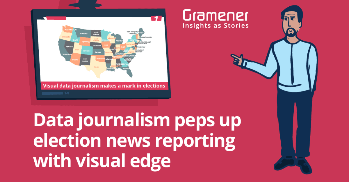
Visual data journalism is spreading internationally, giving media houses and TV audiences a chance to decode elections with simple visual insights. Regardless of how data literate, the audience is, election data stories help in hiccup-free consumption.
Gramener is making election data stories interesting
Gramener partnered with media houses in India such as News18, Republic TV, and Times Now to visualize real-time data on the days of election results. Gramener’s rapid data application building technologies empowered leading media houses to draw dynamic insights from the election data. We use different types of data visualization to bring crystal clear insights on the screen.
From our collaboration with Republic TV to visualize the 2019 General Elections results data, we offered real-time insights to the TV audience in the most simple and comprehensive way
- We helped our media partners raise their primetime viewership by 80%.
- During the 2017 elections, the viewership exceeded 26 million in numbers for Republic TV.
- Our election analytics center in collaboration with Microsoft served over 10 million public requests during the general election in 2014
- Millions of people on the internet and television easily absorbed the election outcomes with live visual updates on Bing.com
Here’s an exclusive telecast from Republic TV studio during the 2019 election in Jharkhand.
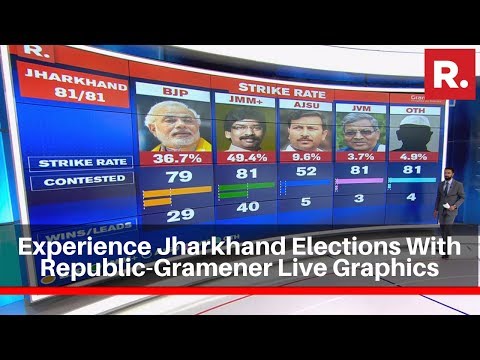
We created data visualization platforms to render the live data on the results day. Election data visualizations such as the color map, the voter matrix, chord, and compass helped Republic TV reporters with insightful information on the number of seats won, leads in constituencies, region-wise vote distribution and more.
Gramener’s live election data dashboard on the election results day visualized the real-time updates.

Insights from 2018 assembly election data
As mentioned earlier, data journalism focuses more on ‘why’ rather than ‘what’. The investigation must find a logical reason behind a data story. At Gramener, our team of data journalists extracted a few insights during the 2018 assembly elections.
- In the Shekhawati region, Rajasthan, Congress led by 13 seats in 2018 compared to 3 seats in 2013. Resentment among the Jat community over their inadequate representation in the state government could be one of the reasons.
- In Chhattisgarh, the Congress did well in agricultural regions. The promises of the party to waive farmers’ loans and help them get a double price for their lands could be reasons.
- In Madhya Pradesh, the BJP did well in areas with the Muslim population in the majority. Prime Minister Modi’s decision to visit Saifee Masjid, Indore a week before the elections to address the Bohra Muslim community could have caused this impact.
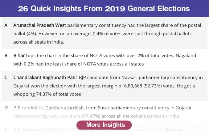
Insights from 2019 General Election results data
Team Gramener worked on the 2019 general election results data and documented the insights in a clever alphabetical format.
Check out 26 insights from the 2019 General Election results data.
Know more about our visual data journalism engagement with Republic TV for the assembly elections 2018 and General Elections 2019. Contact us to know more about Gramener’s services on the election data analysis and visualization storytelling.