
Introduction
The Coronavirus outbreak, which originated in Wuhan, China, in the last months of 2019, began spreading rapidly throughout the globe in 2020. It has now affected over 200 countries and caused over 100,000 deaths. In this time, all of us seek accurate information about what is happening and what is yet to come.
We at Gramener have put together Coronavirus dashboards, Maps, data stories, and trackers on COVID-19 to help not only the public but also organizations.
In this article, we use the Choropleth visualization technique to understand the origin of the Coronavirus and how it has changed over time. Firstly, we’ll look at the Choropleth maps and their applications. We will then use Choropleths to visualize COVID-19 cases across the globe.
What are Choropleth Maps?
Choropleth is one of the many types of data visualization for mapping data geographically. Choropleth is a type of thematic map where the area or regions are shaded in proportion to a given data variable.
There are two types of Choropleth maps, namely static and animated or dynamic maps.
Static Choropleth maps are useful in comparing the desired metric by region. For example, to compare the number of COVID-19 cases across all countries at a given moment.
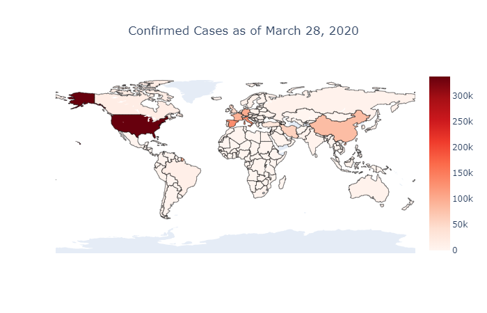
The above picture illustrates the total number of Coronavirus cases across the globe as of the end of March. The power of visualization shows us that currently, the United States of America is profoundly affected by the pandemic followed by Italy.
However, we know the number of cases across the globe, but we are still unaware of the rate at which the virus spreads. To demonstrate that, we should consider an additional attribute: time.
To incorporate this additional attribute, we use the second type of Choropleth map – the animated or dynamic Choropleth map.
This is similar to the static version, with only one difference. In essence, it has the time component, which gives us the advantage of comparing the number of cases by region over time. With the addition of this dimension, it makes this visualization more insightful and compelling.
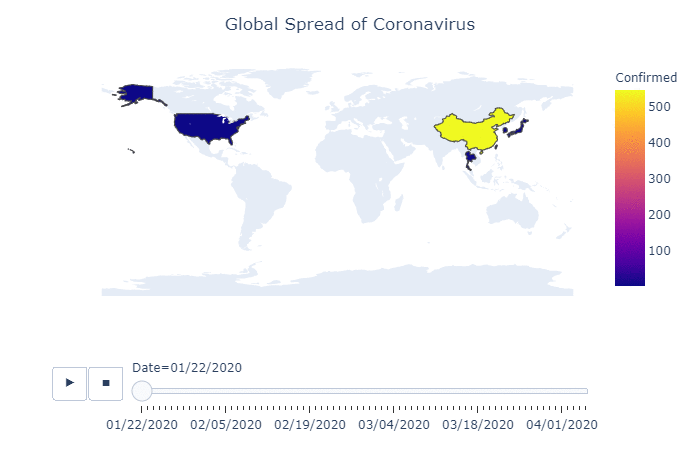
In the GIF above, you can actually see how the spread of the Coronavirus started in China and, at first, slowly made its way across the world, picking up pace in a span of weeks. As we reach the end of March, we see that the number of cases in the U.S. and parts of Europe overshadows those in China.
Data Sources
We used the Novel Corona Virus 2019 dataset from Kaggle to create the above visualizations. The dataset is a composite of multiple sources, including the WHO, National Health Commission of the People’s Republic of China, and the United States Centers for Disease Control.
Application used to build the Choropleth map
I used Python to build the above visualizations. More specifically, I used the graph_objs library, which is available under the Plotly library in Python’s Matplotlib, to create the static choropleth graphs. Similarly, I crafted the dynamic choropleths using the Express library, which is also available in Plotly.
Likewise, there are other applications and programming languages to build these maps. Below are some programming languages and libraries that can be used to create Choropleth maps:
- R Programming: You can create a choropleth map using ggplot2 and ggmap libraries.
- Javascript: Build choropleth maps using Leaflet, an open-source JavaScript library for interactive maps using GeoJSON functions.
- There are visualization tools like QlikView, Tableau, and Microstrategy, using which you can build choropleth maps.
If you don’t want to get into code, you can try out Gramener’s Cartogramener tool to generate a static choropleth map. Just fill in your data against the countries.
Conclusion
Data visualization is the most effective method to illustrate complex information. It also plays a vital role in data interpretation and insight generation. It’s a powerful asset that can convey insights as stories. It can make simplify thousands of complex numbers and convert them into an easily digestible visual.
Even in the case of Artificial Intelligence and Machine Learning in the market, we always need data visualization to make the analysis more insightful. Choropleth maps can be very useful when it comes to plotting any data on a nationwide or worldwide scale.
If you build visualizations on PowerBI, you can try the Choropleth PowerBI plugin. You can explore deep geographic data, plotting hundreds or even thousands of items (all US counties at once, all the precincts in a county, etc.) and then drilling down their data hierarchy (like from state, to county, to precinct).
Check out our works on COVID-19 related visualizations and data stories.
References
You can access the complete code and Jupyter notebook use to generate these graphs on my GitHub.