
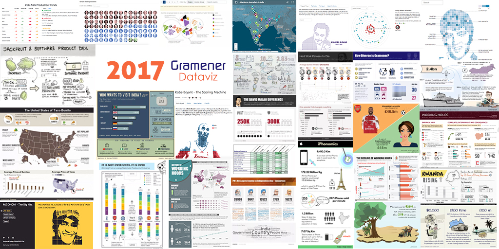
We’ve had a lot of fun at Gramener in 2017 creating some exciting dataviz. It is that time of the year to look back with satisfaction and also spark the desire to do even better dataviz in 2018. This post is a round-up of some of our favorite work this year.
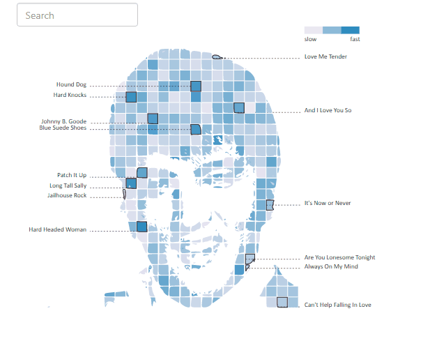
Two of our dataviz properties found their way to Andy Kirk’s ‘Best of the Visualization Web’ in 2017. The interactive Elvis Presley Jukebox was a result of one of our experiments in creating data portraits.
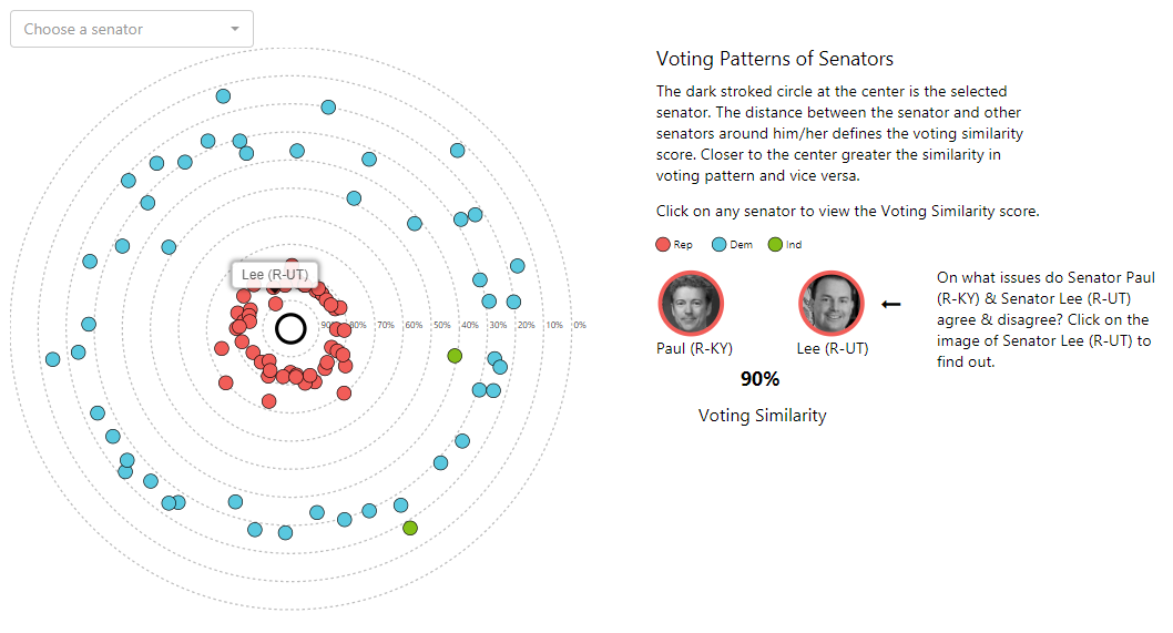
The exploratory viz on ‘voting patterns of senators’ was the other to get listed in Andy Kirk’s Best of the Visualization Web in 2017. The visual techniques used in this work in particular inspired the data community to discussing merits and demerits of the representation. Dataviz guru Alberto Cairo described it as a ‘simple but rich graphic’. Famed Statistician Andrew Gelman wrote a critique of the viz suggesting improvements – Alberto Cairo responded with a powerful improvisation. Here’s how the original version looks.
At Gramener we’ve done a lot of dataviz on Cricket already but we just couldn’t resist the temptation to create another one, this time an interactive infographic – Dhoni’s ODI Sixes

In the guise of analysis we also had a lot of fun listening to Kishore Kumar.

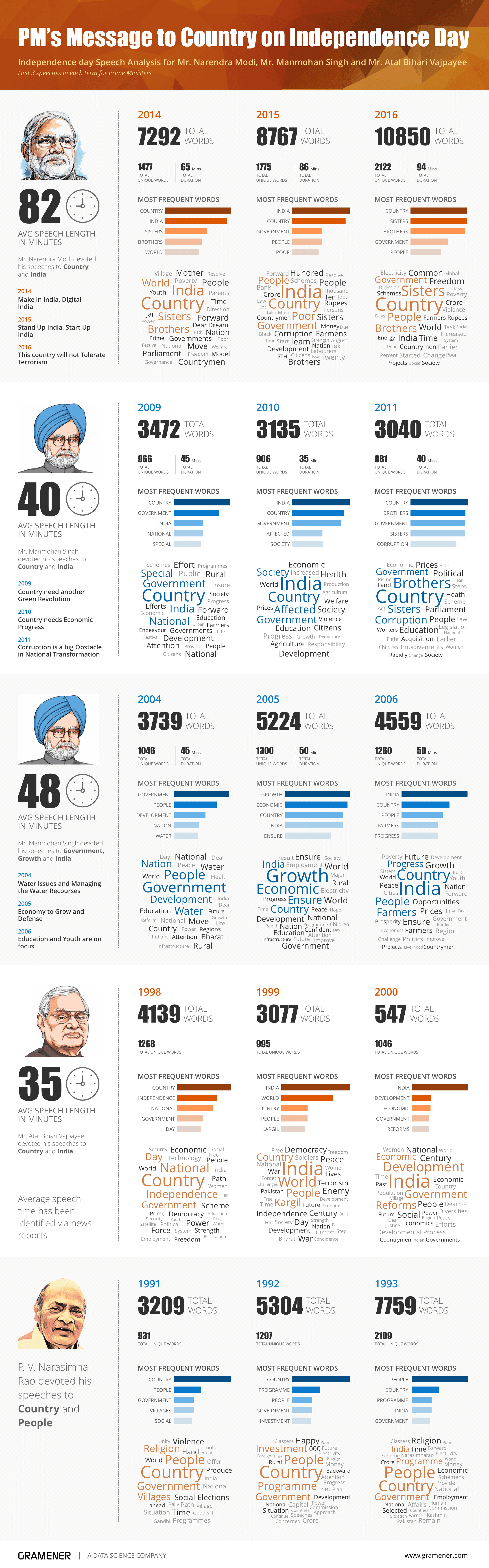
We did an analysis on the Independence Day speeches of Prime Ministers.
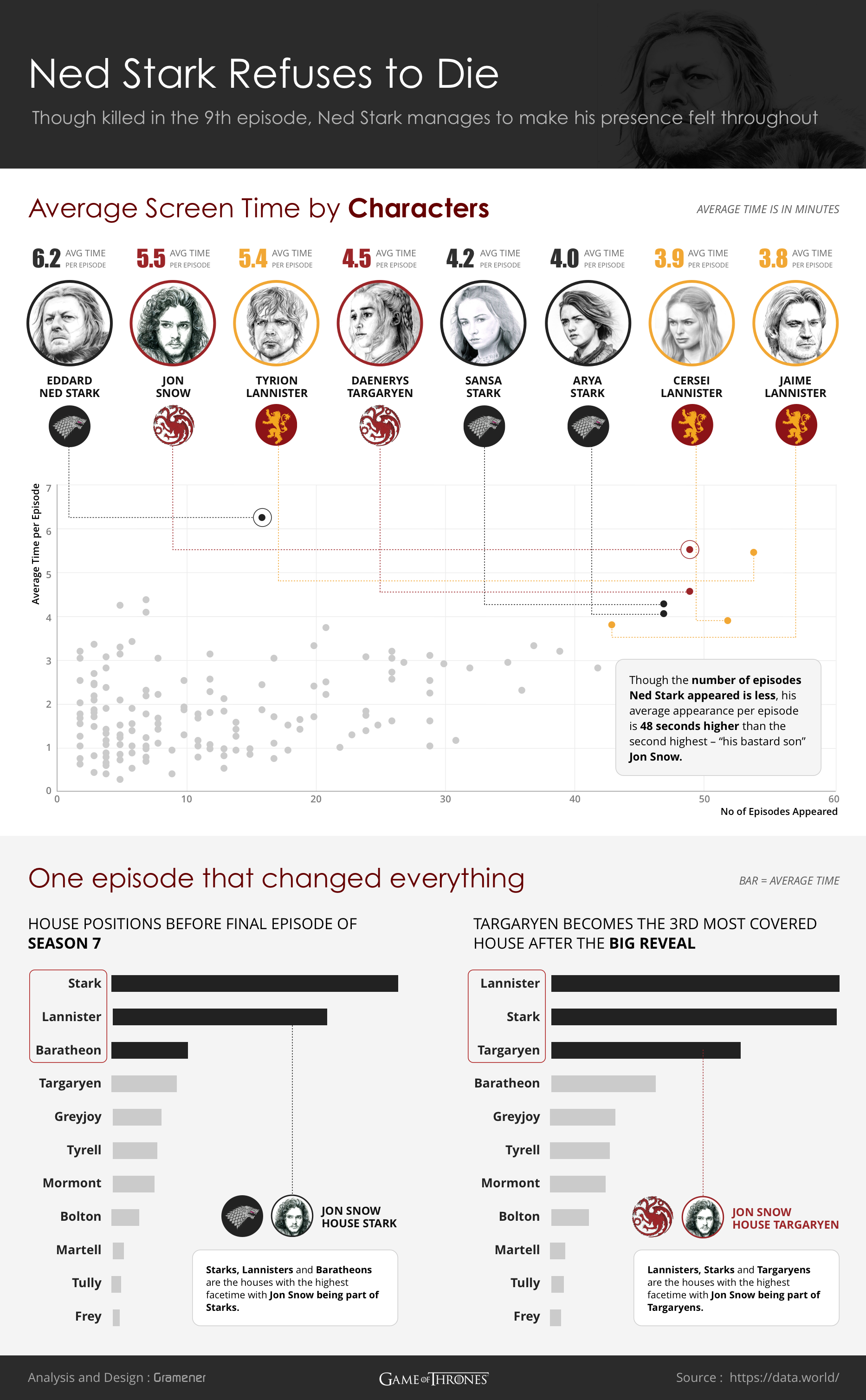
Our folk too were bitten by the GOT bug.
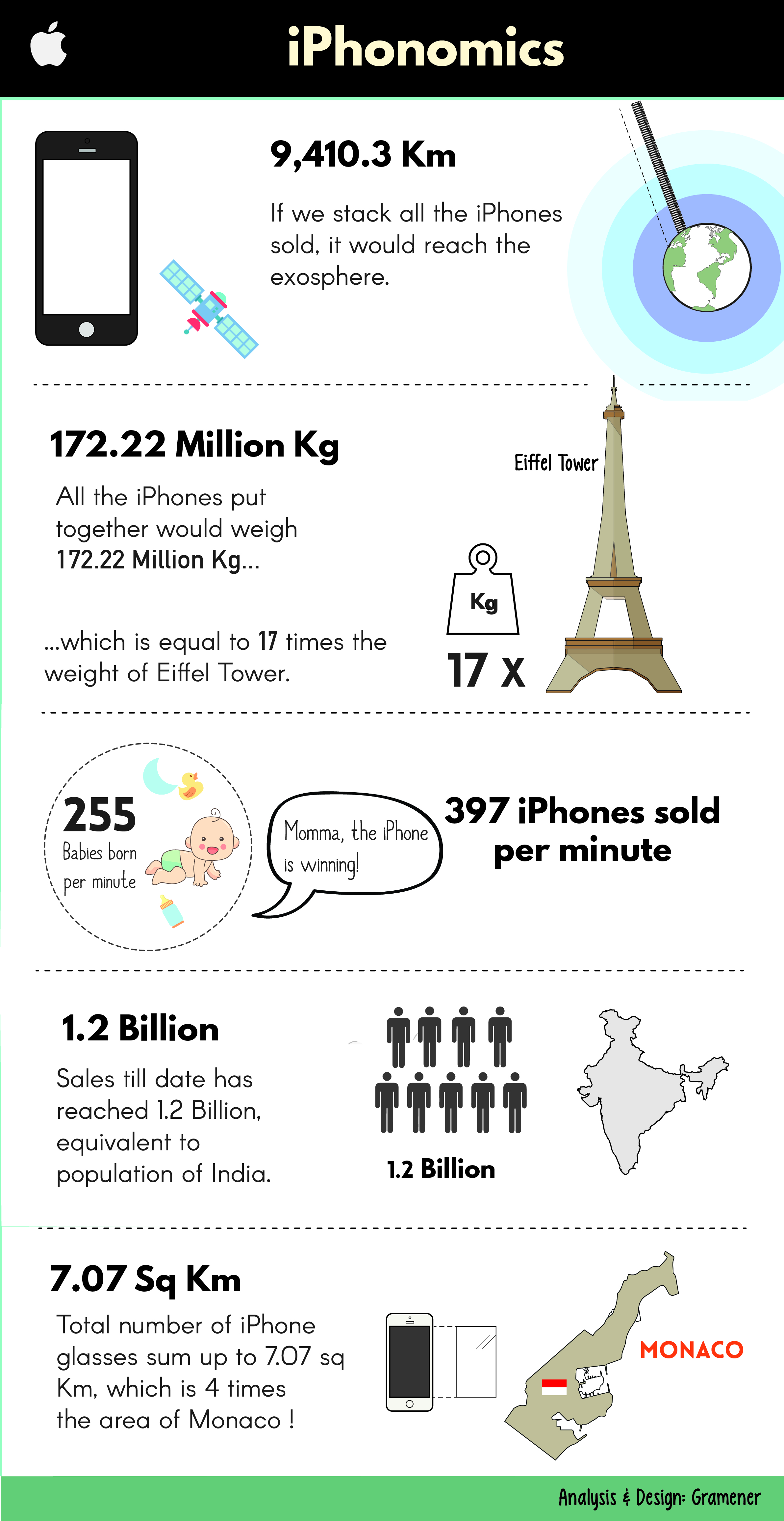
We were not to be left behind in the iPhone mania as well.
Sketchnotes make excellent communication narratives. Here’s one of our sketches.
We tried our hands at different narrative techniques to communicate the enormity & context of numbers. Sometimes a simple juxtaposition of images & text helps like in this one.
Our designers had a great time at the design hackathon. Here’s the winning entry;

The runners up came up with some fantastic work as well. You can view them over here and here.
Other interesting reads include our analysis on Silk-Board traffic , the curious nature of names, the power of defaults & the different aspects of Data Science .
Hope you enjoyed our work throughout this year. We hope to bring you more exciting data visualizations, infographics, data stories & sketches in the forthcoming new year. Thanks for reading. Wishing you the very best for 2018.