

Mumbai, India, December 11 2018: Team Gramener was ready on Republic TV to give Indian TV audience a taste of visual data journalism. Right when the vote count started to pour in from the regions of Telangana, Madhya Pradesh, Chhattisgarh, Mizoram, and Rajasthan, Gramener’s live election data dashboard started visualizing the updates, every minute. It was a nail-biting experience on election result day.
Table of Contents
What is Visual Data Journalism?
Simple. Visual data journalism is an interactive method of representing data using graphics such as maps charts and other visualizations to weave stories around the data. Visual data journalism is spreading internationally giving media houses and TV audience a chance to decode elections with simple visual insights. Regardless of how data literate the audience is stories with data aids in hiccup-less consumption. Gramener’s visual graphics promisingly delivered the fastest election number with crystal clear insights wrapped in engaging narratives and stories.
Audience Want Different Insights, Deeper Insights

No election enthusiast would want to settle on one story. Visual Data Journalism is enriched with tremendously insightful stories coming out every second with every vote count, keeping the viewers engaged and interpreting for hours. Gramener tried to link each story from a single data source. To give the audience an experience worth remembering there is tactful effort backstage implementing the ideation followed by using various technology tools and techniques.
Team Gramener Demonstrated agile visual storyboards
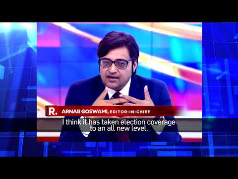
A team of 10 potential members from Gramener family including designers, coders, developers, and testers worked with Republic World Team to execute fastest election results and insights. We Thank Arnab Goswami, the MD of Republic TV, and his team for yet another successful collaboration. Gramener assisted Republic TV earlier during the Karnataka and Gujarat State Elections 2017.

Visual data journalism tools to make election insights obvious
We built different types of data visualization specifically for showcasing election data on the screen. Below is the list of visual applications. We’ve updated this blog with the new versions of the election data visualizations we have used. The different years or state names resemble their usage in various election periods.
Compass
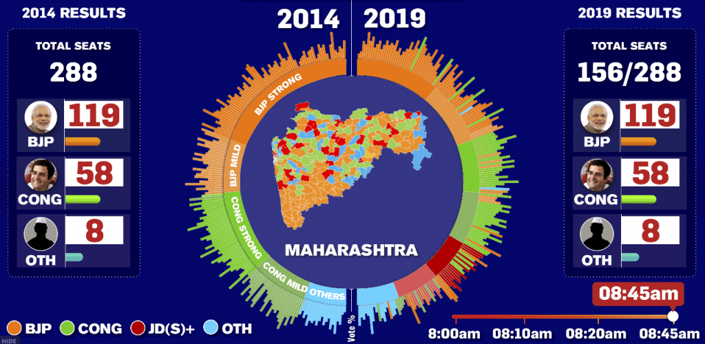
Compass enables real-time tracking of the party performance and swing seats. Observe the change in seats from one party to the other with respect to time shift. It highlight the party that has been leading the previous three assembly polls in the seat.
Strike-rate
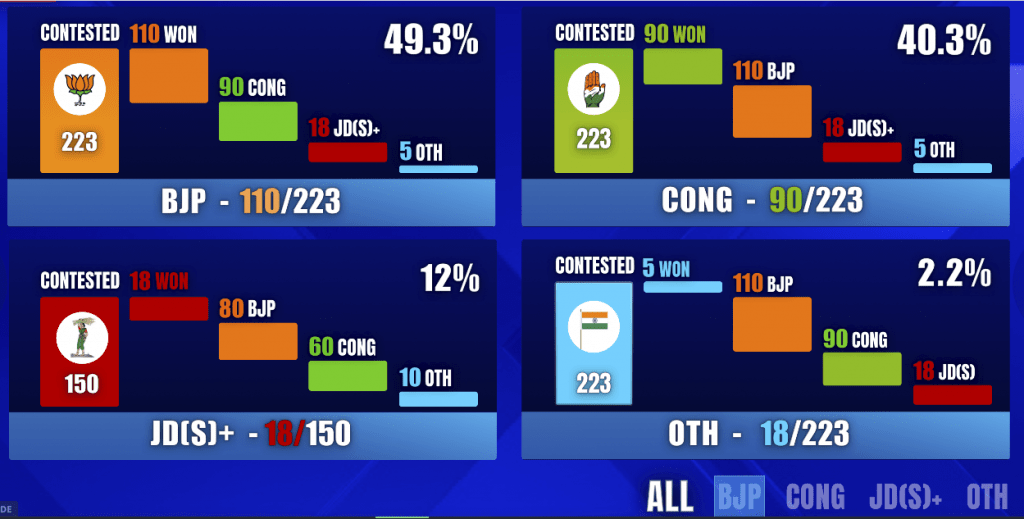
The strike rate gave a comparison of the party performance with respect to the number of seats it is leading Vs the number of seats it is contesting for.
Chord
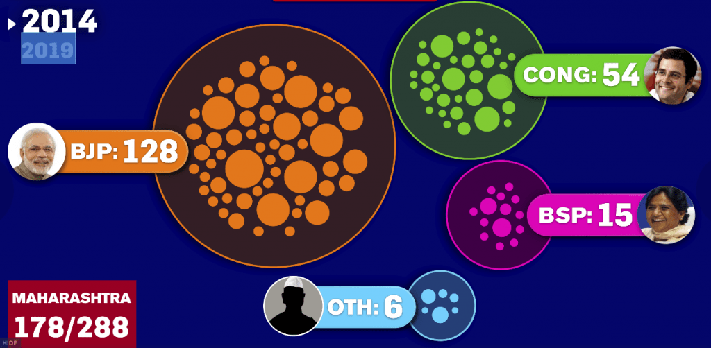
The Chord offered a visual analysis of seats gained and lost by the parties in the current elections Vs the previous elections. It showed a real-time transfer of seats from one party to the other.
Color Map
The
The Voter Matrix
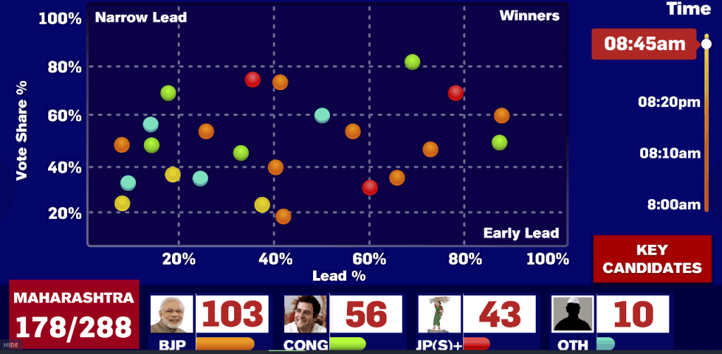
The Voter Matrix presents a timeline of Leads Vs eventual vote share in a visual format. It helped to track how the constituencies have gained or lost the seats during the election counting day with respect to time shift.
Winners and Runners
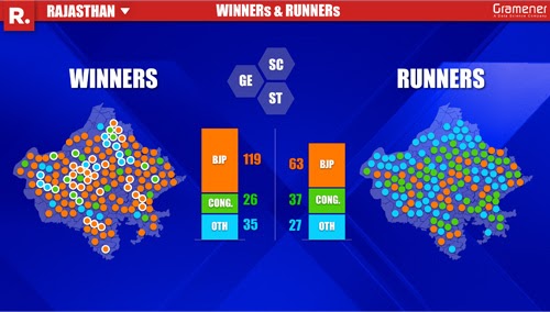
Last but not the least and one of the most exciting storyboard, it is a post result representation of winners and runner-ups, party-wise across seats. It is a perfect end to the nail-biting-close-fight scenarios from the election counting day.
A few Worth-an-eye Insights Drawn from the Visual Storyboards
- In the Shekhawati region, Rajasthan, Congress was led by 13 seats when compared to 3 seats in 2013. Resentment among the Jat community over their Inadequate representation in the state government could be one the reasons for it.
- In Chhattisgarh
congress did well in agricultural regions. The promises of Congress to waive farmers loan and help them get doubled price of their lands could be the reasonof it. - In Madhya
Pradesh BJP seemed to do well in Muslim Minority populated areas. Prime Minister Modi’s decision to visit Saifee Masjid, Indore a week before the elections to address the Bohra Muslim community could have caused this impact. - Congress seemed to have done well in the Rajgarh, M.P region because of the strong popularity of Digvijay Singh.
- This one’s exciting. NOTA got an overall vote share of 1.52% in MP. And in at least 33 seats the number of NOTA votes is greater than the difference in margin between BJP and Congress candidates.
This blog was updated with new information on 25th June 2020.