Data Visualization is a powerful medium to tell data stories.
While the creation of visual stories has been simplified with a plethora of drag-and-drop tools, they do not necessarily transcend into useful or usable entities. Let’s face it, we have seen visualization dashboards turning clunky with data, of insights not being obvious, or worse, data stories failing to engage the audience.

A Recipe for Terrible Data stories
Post-mortem of failed visualizations often points to one key mistake that people make while creating data stories. Therefore, they routinely dip into a catalogue of ready-made charts and then sprinkle them onto a dashboard using pre-set visual templates.
This blunder is the equivalent of writing English prose using a rigid list of sentences, as opposed to the conventional way of elegantly stringing together words by blending in the grammar.
Talk on Grammar of Graphics
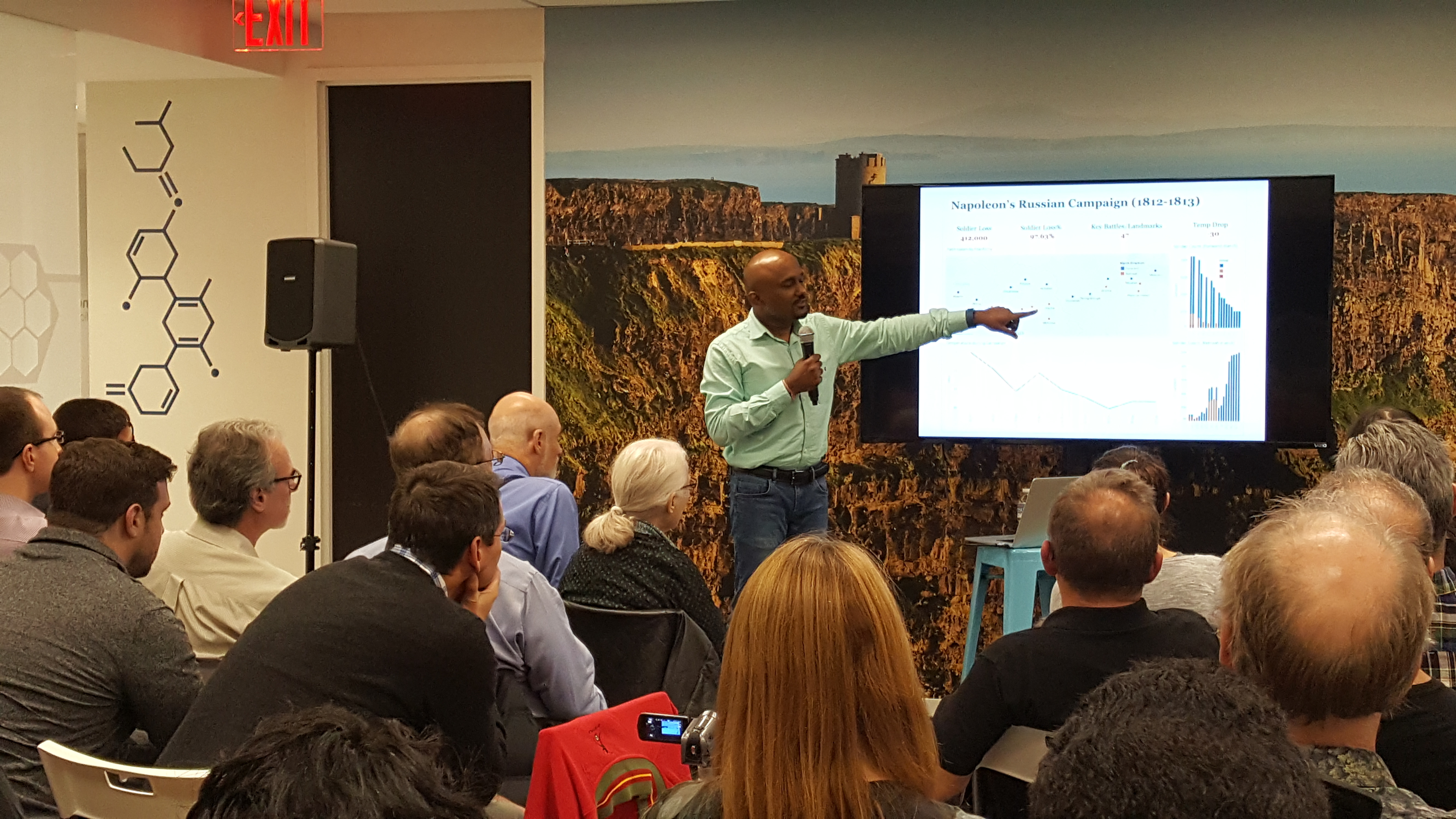
Our co-founder, Ganes Kesari introduced the concept of ‘Grammar of Graphics’, as put forth by Leland Wilkinson. Using simple examples, he presented a tutorial to demonstrate the fluid construction of elegant visuals, layer by layer.

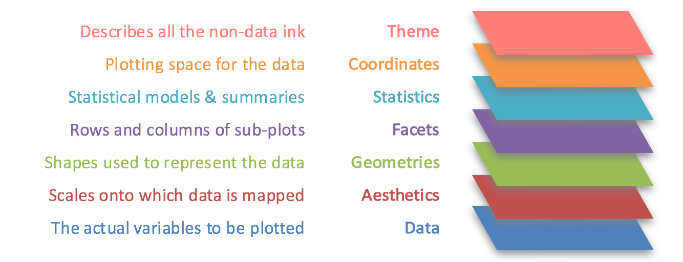
The 7 layers of Grammar of graphics provide a standard set of guidelines on converting data into effective visualisations that tell their story. When done right, they endow people with the power to invent their own visual representations.

Moreover, do check out the session video and the slide deck to find out more.
Grammar makes language expressive. A language that has words and no grammar expresses only as many ideas as there are words.
Leland Wilkinson