
Elections are a massive affair for both media houses and citizens of a country. The excitement doubles on the election counting day as the audience are glued to their television screens to get minute-by-minute updates. However, there are only a few media houses that do more than just election reporting — they go the extra mile and communicate real-time election insights to their audience through impeccable data visualizations.
Table of Contents
What do we do with election data?
Gramener has been teaming up with media houses for years to convey complex election data easily, adding a flavor of data storytelling to journalism. Stories are attractive and memorable. Stories about elections, which are already a massive affair, start trending quickly, offering valuable insights to the audience and huge primetime viewership to news channels.
Following is the list of election data visualizations we created to show the history of Indian General Elections from 1951 to 2014.
Data Visualizations illustrating the dance of democracy
1. Choropleth
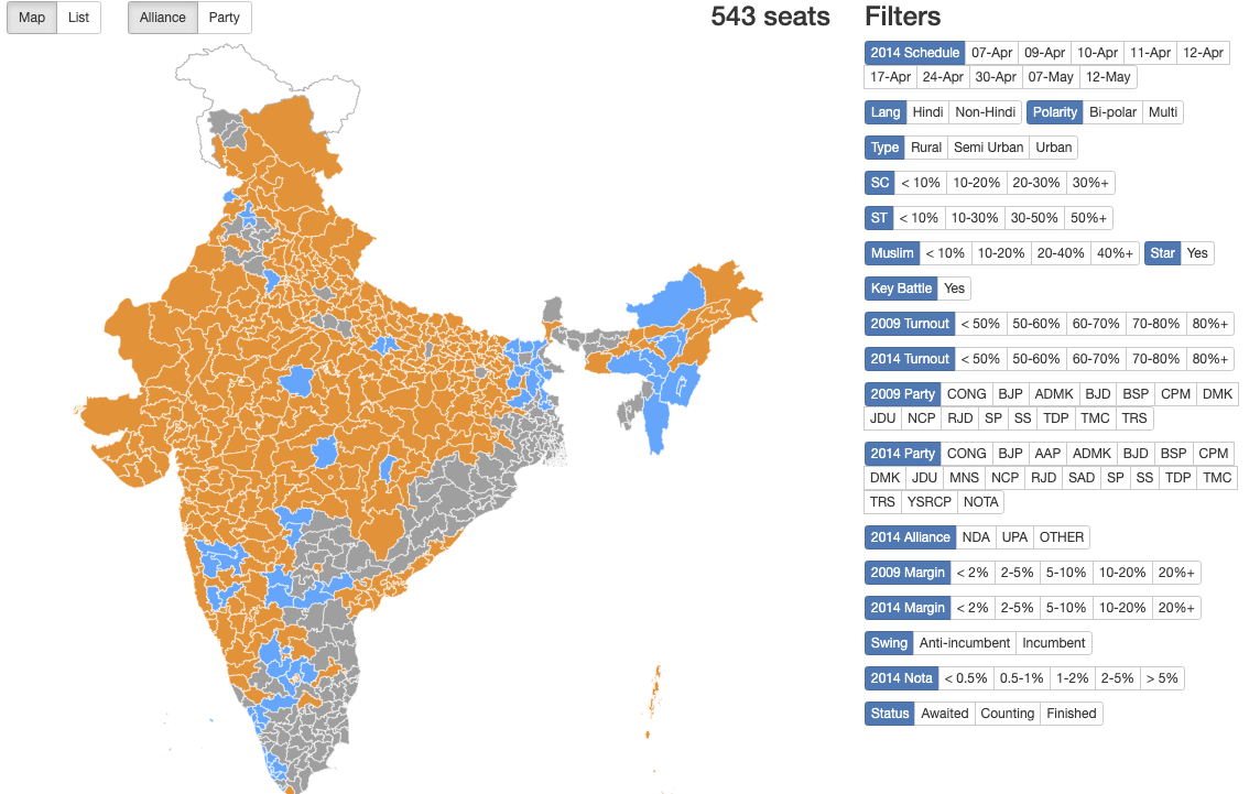
Choropleth is one of the types of data visualization that maps the numbers against the region. The orange and blue colors are the regions where the Bharatiya Janata Party (BJP) and Indian National Congress (INC) won the elections, respectively. It is a perfect way to show wins and losses of political parties in contested regions.
Check out more insights from General elections from 1951 to 2014 with Gramener’s election choropleth.
2. Election Factoids
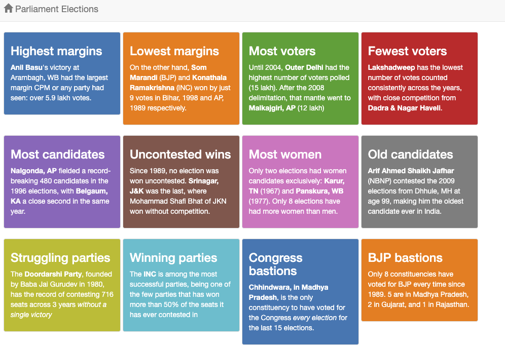
Elections always throw surprises in the form of outliers. These are small factors that have a significant impact on a political party’s win or loss. Spotting the outliers is fun too. These facts can be presented as visualizations with very little narrative. That way the audience can easily consume and share interesting facts.
Check out more election factoids for every General election since the dawn of democracy in India.
3. Line Charts
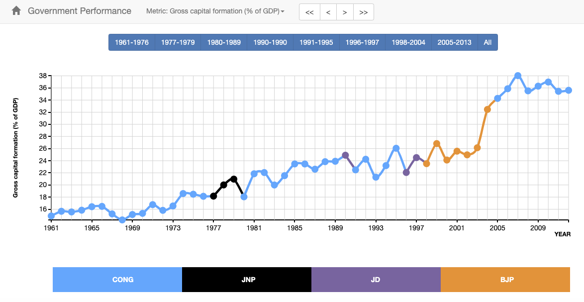
The audience is not only interested in the current election scenario but also the past. They also want to know the development undertaken by a government during their tenure. A line chart compares the tenure of a government with multiple parameters such as growth in GDP, unemployment rate, literacy rate, sex ratio, and many more. It enables the audience to make the right decisions to vote for the government working for their development.
Check out the live chart illustrating the growth in India’s GDP under multiple governments since 1951.
4. Cartograms

Cartograms are maps that show statistical information in diagrammatic form. In a cartogram, the relationship between objects is retained while the geometry of objects is distorted. A cartogram is similar to a choropleth map that has been modified to show the size and a range of other data in a much clearer and in a more interesting way. The bubbles in the cartogram above are the constituencies. The size of the bubble can represent multiple parameters such as the number of candidates contesting, the number of votes, and so on. Furthermore, the colors represent the parties that won in that particular seat.
Check out cartogram stories from every Indian General Election.
5. Stacked bar chart visualization
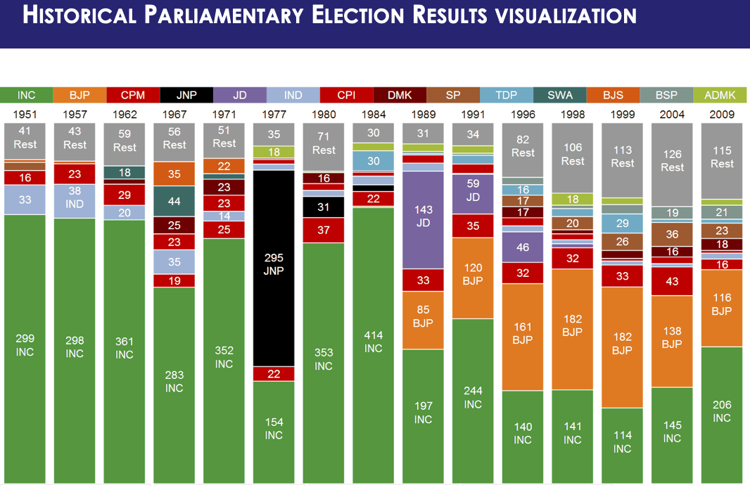
Here’s a modern stacked bar visualization. We call it the historical parliamentary election results visualization. It illustrates the winning parties and seats they won from 1951 to the 2014 Lok Sabha elections. It’s a simple way to convey the most important insight from the election.
It is an interactive election data visualization and you can tinker with it in real-time.
Data visualizations add an interesting edge to election reporting
Visual data journalism is gaining an edge among news channels. Data not only offers solid support to the reporting and visuals but also makes the story interesting and worth telecasting. Even the audience enjoys election stories with data, as viewership research has shown.
Visualizing the electoral landscape is not new. Till now, election visualizations were limited to only a few inferences such as wins and losses. But the question is – how can we dig deeper into election data and visualize every insight. Hence, analytics tools and data visualization techniques, handled by creative minds and data journalists are making it possible.
Finally, know more about our data visualization and analytics solutions for elections.