
On a bright sunny morning of 19th May in Noida, the studio, the guests, the anchors, the production team were all geared up to present and analyze the live streaming results of the State Elections 2016.
While the fortunes were destined to be unveiled for some of the biggest and the smallest names, the new comers and the breakaways, in some of the most interesting states/UTs of India – West Bengal, Assam, Tamil Nadu, Kerala and Puducherry, there was one more team who was hoping anxiously with baited breath that their hard work and efforts meet its value. This was TEAM GRAMENER.
TIMES NOW, one of the most popular news channel in India had teamed up with GRAMENER, more than 6 weeks back to create a first of its kind, power packed, intriguing yet meaningful set of Visualizations to excite and engage the audience and pump up the TRPs.
These 6 weeks for the Team GRAMENER were full of learnings and experiences. A few firsts for the most of us– Seeing a studio set, seeing an anchor, seeing the craziness during primetime shows – all LIVE in person.
Now the question is, what all did we do and how was it received.
The first few weeks of discussions with the channel folks were all about the design of the properties we scoped out – the things we presented, the options we offered, the colors, the fonts, the boxes, the charts etc. All in all, we could see thru mainly 3 sets of asks from them:
- Everything needs to big and bold
- Everything needs to pop onto the screen in an animated never before seen way
- Everything needs to be in your face – the colors, the effects
Anything that runs behind (the main crux, the development, the structure, the programming) was completely left to us to decide and take a call. No interference, no follow-ups, utmost flexibility. While the opportunity was huge and exciting, it also had its fair share of risks – how would the visuals constructed look on TV, how big an LED wall would it be projected on and would it really be intuitive enough for the viewer to grab all that in a few seconds which we present on a single chart.
What added to the complexity was the technology to be used for display. What works on the Web doesn’t work on TV. Additional dimensions like color and contrast reproduction, focused lighting in the studio, all start to play key roles in the look and feel of the visuals.
We can safely say that most media networks across the world use Vizrt for creating graphics viewable on TV, which we clearly had no clue about. Since most of our deployments are mainly on server based web links (which offers us the power of producing automated graphics with no hassle to the production team), an integration of the visuals with the Vizrt didn’t look like a possible step for exploration within the given timelines.
So the plan was to host our product on their local system and plan a seamless switch in the control room on the Result Day. This indeed was tricky. One of our team members would then sit thru the entire day on the 19th to monitor and educate the controllers/producers on how to effectively use the graphics with the several interactions build in and sync it with the anchor presenting it in the studio (and clearly the studio person and the controller aren’t sitting next to each other so imagine the potential chaos)
We can gladly say that several risks were kicked out of the window by the channel team as they had enough faith in our art (the visuals) and in their craft (the production) on TV, assuring us time and again that we were collectively moving in the right way forward. On reflection, the journey truly has been rewarding and of a true collaboration between TIMES NOW and GRAMENER.
With the scope being frozen, hence began our stream of project plans, development and testing programs, multiple iterative reviews, content discussions and then finally the necessary configurations for the GO LIVE. The biggest worry – Nobody knew what data would look like on the result day. All left to fate!
Let’s talk a bit about the Visuals:
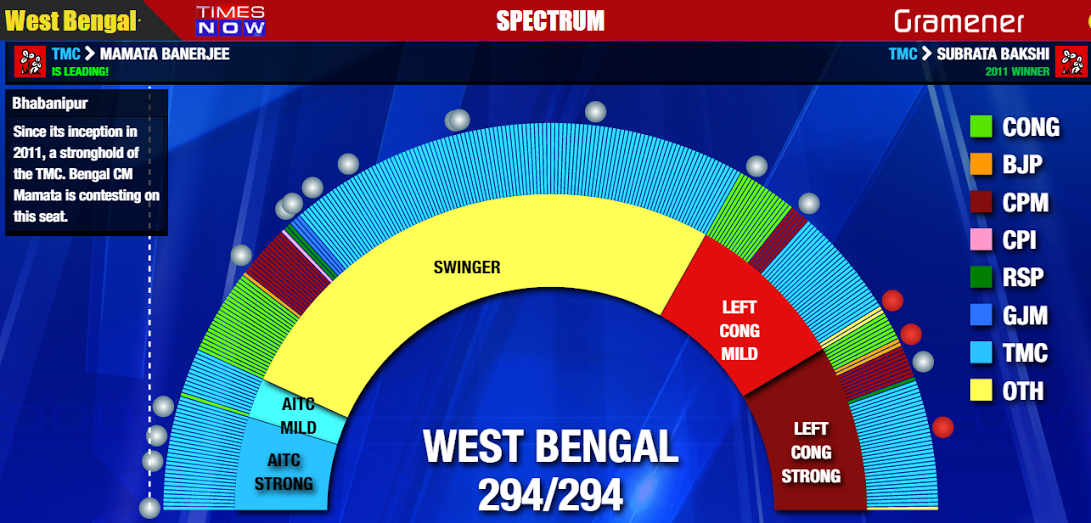
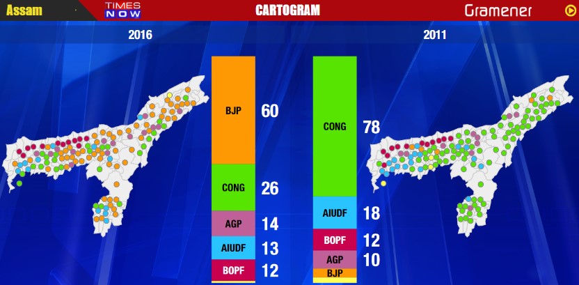
SPECTRUM: a unique but simple depiction of what’s forecasted versus actuals. Some seats are bastions of parties and their retention/losing is a strong measure of their power in the state and the nation. Also some seats have juicy info like sports personalities fighting elections, flyover collapse, bribery cases etc.

A few days prior to the Result day or as we can say judgement day, the news was up, the promo videos were out on the channel with the trailer of the visuals along with some shots of the Gramener team happily being captured brainstorming.
As far as how it panned out on the 19th, amid all the last minute hustle bustle with the setups, the development pushes, the testing, the run thrus, all we can say is that it looked – beautiful, magical, a visual treat, larger than what Team GRAMENER had expected on screens big and small, and Mr. Arnab Goswami left no stones unturned in bringing life to these graphics thru his wonderful story telling. The rest as they say is history.
Some Links to the videos:
& the audience feedback:
https://twitter.com/AnjuChandel/status/733362215668047872
https://twitter.com/AnjuChandel/status/733353786400509952
We would like to provide a sincere thanks from everyone at GRAMENER to the TIMES NOW channel for putting up this faith in us and providing us the opportunity to make a strong mark in the space of Visual Data Journalism.
A big kudos to the TEAM GRAMENER for propelling us forward. Many more success stories to come!! Watch out.
We take back with us some great memories and this:
-YASH RAINA(yash.raina@gramener.com) from TEAM GRAMENER