Data journalism is something we at Gramener have been very interested in for some time. It brings the power of data visualisation to mainstream media and spreads it to the common man.
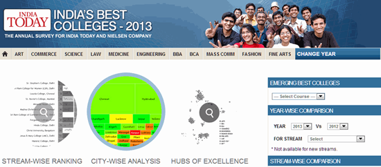
We’re happy to share with you interactive visuals of India Today’s Best Colleges – 2013 survey. And here’s the story of how these were made.
India Today has been publishing a survey of colleges with Nielsen for 17 years. The data is rich: we had every colleges’ rank from 2006 to 2013 across fields (Arts, Commerce, Engineering, Science, etc.) along a number of parameters (Reputation, Student care, Infrastructure, Placements, etc.). The trick was to see what stories the data could tell.
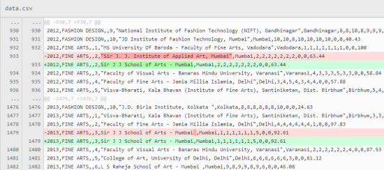
But the first task was getting the data and cleaning it up. Normally, India Today takes tables produced by Nielsen, enhances them and publishes them. Raw data was not readily available. But once we got that, the next challenge was to clean it. Across the years, colleges were named or spelt slightly differently. For example, “Sir J. J. Institute of Applied Art, Mumbai” in 2012 became “Sir J J School of Arts – Mumbai” in 2013. Our team spent over a week patiently creating a common spelling for each college across the years and testing this out to ensure nothing was missed out.
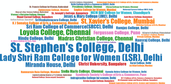
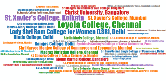
Then came the designs. We were toying around with traditional and new methods of representing the data. The first question on most people’s minds would be: Which are the top colleges? We attempted a word cloud to address this question. Here are the word clouds for Arts and Commerce colleges in 2013. The size of the college’s name indicates the rank (top ranked colleges are bigger) and the colour is based on the city.
But this was neither as informative as we would have liked (for instance, can you spot which is the #2 college in Commerce?) nor as aesthetically pleasing as we’d hoped. So we went back to tables.
Each row shows a a variety of parameters. For example, the picture below zooms into JMC Delhi, which is ranked 11th in Arts for 2013. It’s rank has been steadily growing since 2006, as seen by the sparkline next to the rank, and is currently at its highest. It is ranked 14th on reputation, and this too has been steadily growing.
The colours have been chosen to highlight the ranks and growth. Sparklines have a dark background if the college’s rank has improved a lot from last year, and a light background if they’ve worsened. (We later realised that this colour scheme is difficult to read. Given time, we would probably have played with the colours a bit more. But the media world has firmer deadlines than the software world.)
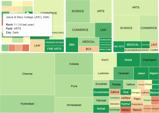
Apart from the ranks of colleges, the other area of clear interest was: Which colleges have improved? Which have worsened? To answer this, we decided to use treemaps.
We started by city. The first level showed each city as a box. The size of the box represented the number of colleges in the Best Colleges 2013 survey from that city. Delhi, Bangalore and Mumbai topped the list. When a city is clicked, it drills down to show each field within that city. The colour of the box shows whether the colleges grew or dipped in rank on average. (Red shows a dip, green shows a growth). Another click takes you to individual colleges. In the picture above, you can see JMC Delhi having a light green colour, showing that its rank improved a bit compared to last year.
But rather than read this explanation, you may find it more intuitive to just explore the treemap yourself.
We made sure that the visuals have expressive filters. You can search by city, field or college. These are search-as-you-type filters. You don’t need to type your entire search to see the results. Just search, and the colleges will be filtered automatically – making it very easy and fast to find a college, field or city of interest.
The other question on people’s minds is: Which city has the best colleges?
A question like that is best answered on a map. But the trouble with a map-based representation is that most of these colleges are crowded in a few cities. If we were to plot each college at its exact location, they would all sit one on top of another.
Another option was to plot a circle at each city, the size of which would represent the number of colleges there. But this is a cop-out, and wouldn’t present the kind of richness that this data deserves.
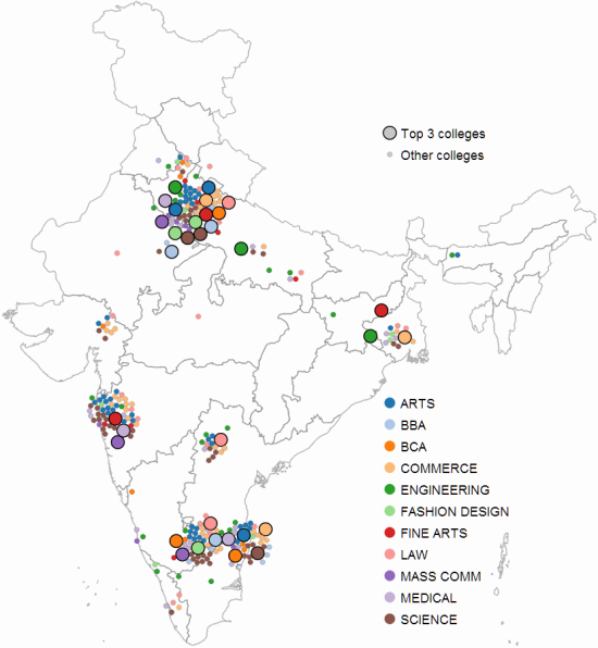
We decided to use cartograms instead. Each college is represented as a circle. The colour indicates the field. The size indicates whether it’s in the top 3 colleges for that branch or not. We allowed the colleges to “push” each other away so that they did not overlap. This meant that they would spill over outside the city. In fact, colleges in Bangalore and Chennai fade into each other. So do colleges in Mumbai and Pune. But the advantage is that one gets to see the real centres of learning.
Delhi clearly is the power-house of colleges in India, with most of the top 3 colleges based out of there. Bangalore and Chennai have a number of colleges too. Interestingly while Mumbai has many good colleges, it has only one that’s reached the top 3 – Sir JJ School of Arts is #3 in the Fine Arts Category. Kolkata just has St Xavier’s. Hyderabad just has NALSAR. Some cities like Kanpur or Kharagpur just have one college covered in the survey, but these are in the top 3.
You can explore the hubs of excellence further at India Today’s website.
We’ve a number of projects on the data journalism side that we’ll be sharing over the next few months. But most importantly, we hope that with these representations of data, your role will shift from being the reader to being the journalist – being the person that explores these visuals and data, and finds interesting insights. And we hope you’ll share those with us and the rest of the world.




This is quite awesome. To be able to tell a story in 3 interactive visuals is quite something.
Just had one question. What does factual rank mean? And how is that computed? It seems odd that you have St. Stephen’s as #1 across all categories, but factual rank says #13.