
Everything on our devices is competing for our attention. Push notifications are a constant distraction. We are addicted to apps for the same reason that gamblers are addicted to slot machines. If you are a programmer, distractions can be especially harmful.
Studies show that programmers require 10 to 15 minutes to resume work after being interrupted. The ideal state of mind for a programmer, is what psychologist Michael Csikszentmihalyi calls flow – “a state of effortless concentration so deep that they lose their sense of time, of themselves, of their problems.”
We usually try to induce ‘flow’ by listening to music, which distracts us just enough from ambient disturbances, like coworkers talking or traffic noises. The music creates a strong buffer around the mind, one which can only be broken very deliberately. (However, some developers can be uncharacteristically devious – they prop their headphones on and pretend to listen to music while people around them continue to embarass themselves.)
I listen to music all the time. Nearly two years ago I purchased a Google Play Music subscription. Not only is Google omnipresent, but it also has enough data to make relevant recommendations.
I am quite meticulous about tweaking recommendation systems. When I don’t like a Facebook post – I tell it so. If I don’t like a Twitter account, I unfollow it. If I don’t like a YouTube video, I consciously try and ‘dislike’ it. Over the years, this has ensured that there is always a lot of relevant content for me to consume. I don’t have to look for it.
Tweaking music recommendations, though, is not as easy. You don’t interact too much with your music player. You cannot leave your development environment and tell Google Music that you don’t like a particular song – that would be a significant interruption. As a result, over time, songs in the playlist start becoming repetitive, which leaves no room for discovering more music.
The Playlist Problem
What happens when we skip a song?
Deciding, while working, that we want to skip a song is a context switch. Worse, it is a needless decision which we shouldn’t have to make at all. Moreover, in order to switch a song while working, we have to switch a browser tab or an application window, or press a media key on the keyboard which is typically far away from the home row. Thus, the very act of skipping a song breaks the flow.
So I asked myself if there was some way I could make a playlist which was completely unskippable.
The Data
In order to answer this, I had to dig through my own Google Play Music history. Google’s Takeout feature makes this very easy (you can download your activity on any Google service under the “My Activity” section of https://takeout.google.com). My Google Play Music history can be obtained as an HTML page, which can be parsed to obtain a nice, manageable tabular format as follows:
| Activity | Temperature | Weather | artist | status | track |
| [‘Leisure’, ‘Traveling’, ‘Standing still’] | Warm | Overcast | Guns N’ Roses | Listened to | Street of Dreams |
| [‘Leisure’, ‘Traveling’] | Warm | Overcast | Led Zeppelin | Listened to | All My Love (2012 Remaster) |
| [‘Leisure’, ‘Traveling’] | Warm | Overcast | The Who | Listened to | Baba O’Riley |
| [‘Leisure’, ‘Traveling’] | Warm | Overcast | The Beatles | Listened to | A Hard Day’s Night (Remastered 2009) |
| [ ] | AC/DC | Skipped | Let There Be Rock |
(Note that the Activity, Temperature and Weather fields may only be available on mobile clients, depending on the permissions granted to the application)
We are primarily interested in the “status” field of the dataset. After counting occurrences of “Listened to” vs “Skipped” in the status field, it turned out that I skip only one in four songs. That is not too bad – since I believed that I skip most songs. However, it still can be much better.
Visualization & Analysis
The next natural question to ask is which are the songs or artists that I am not likely to skip? To answer this, we attach two attributes to each unique song:
- The number of times it appears in my feed
- The probability of me listening to it.
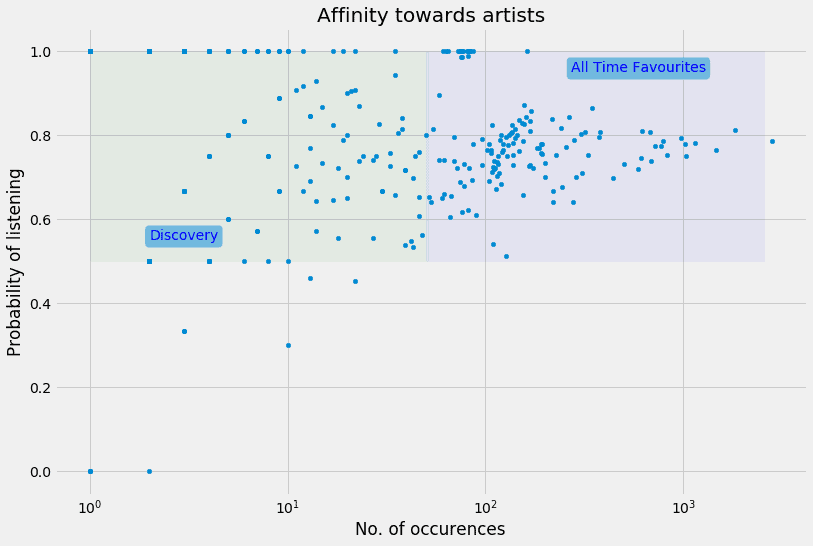
When we use a scatter plot to examine these two attributes of a song, we come up with the following chart.
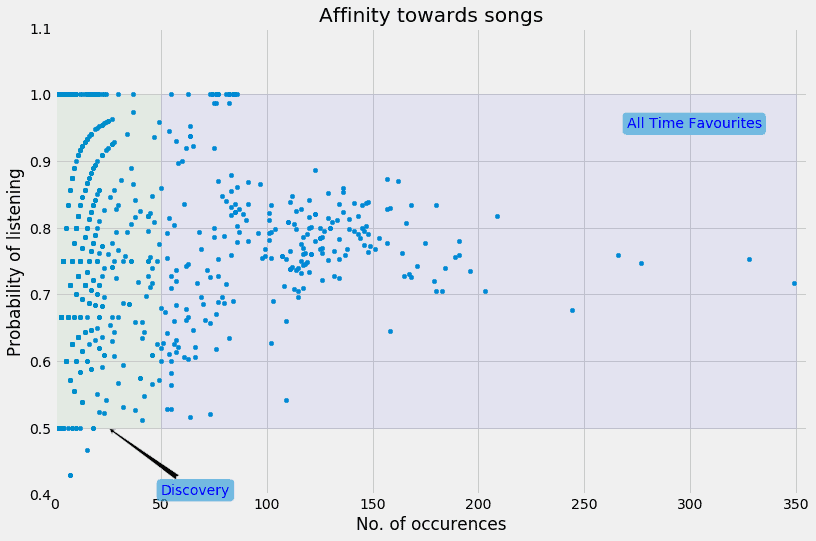
This chart is then divided into two zones. One zone contains songs which occur very frequently, and which I’m more likely to listen to than skip.
I call this set of songs “All Time Favourites”, since they appear often and I listen to them often. Now, These songs are indeed good candidates for an unskippable playlist, but if I don’t keep revising this set often, these are the very songs that will later on become stale and more prone to skipping. Specifically, having too many songs in this zone is dangerous – since it indicates that I’ve fallen into a musical rut, which will eventually lead to a lot of boredom. Moreover, these songs are so mainstream for me now that there is nothing of interest in this zone for me.
The other zone contains songs that occur rarely, but I don’t skip them. This is the ideal zone in which to discover songs. Because they don’t occur very frequently, I’m not likely to get bored with them.
Upon closer inspection of the upper half of the discover zone, we see that there are some interesting patterns in the data:
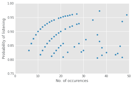
It seems that there are some sets of songs such that the more frequently they occur, the more I’m likely to listen to them! Just using visual feedback, we know that the function which maps these points along these curves is logarithmic in nature. In fact, these curves can be modeled with generalized logarithmic functions of the form $latex p = log(x-a) / b + c$, where $latex x$ is the number of occurrences of a song. By finding the right values of $latex a$, $latex b$ and $latex c$, we can create a function that maps the number of occurrences of a song ($latex x$) to the likelihood of the song being heard ($latex p$). Typically we would use machine learning to approximate such functions, but for this simple example, playing around with the parameter values yielded a sufficiently good fit.
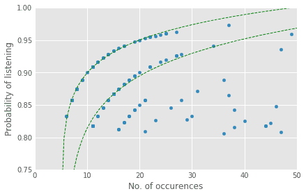
(The logarithmic nature of the curves indicates that the phenomenon of preferential attachment is at play here. Stated informally, it means that ‘popularity feeds on itself’. Gramener’s CEO, S Anand, has spoken in detail on how this phenomenon plays out in how we name children.)
This was the case for individual songs. We can repeat the same analysis for artists, instead of songs, and we see that this phenomenon shows in the discovery zone of artists as well:
The Inferences
Looking at which artists fall on (or near) each of these logarithmic curves, we get two lists of artists:
| Upper curve | Lower Curve |
| Hans Zimmer | Hans Zimmer |
| Ramin Djawadi | John Williams |
| Mohammed Rafi | Manna Dey |
| David Buckley | Henry Jackman & Matthew Margeson |
| Manna Dey | Nick Arundel |
| Jagjit Singh, Gulzar | Pu. La. Deshpande |
| Pu. La. Deshpande | The Beatles |
| David Arnold | Michael Giacchino |
| John Williams | The Piano Guys |
| Nick Arundel | Shirley Walker |
| Rupert Gregson-Williams | David Buckley |
Surprisingly, these are predominantly artists who write background scores for historical epics, fantasies, superhero movies, and video games! (There are, of course, outliers like Manna Dey and The Beatles). I always knew that I was fond of this category of music, but I now have empirical evidence that they occupy a very special place in my playlist.
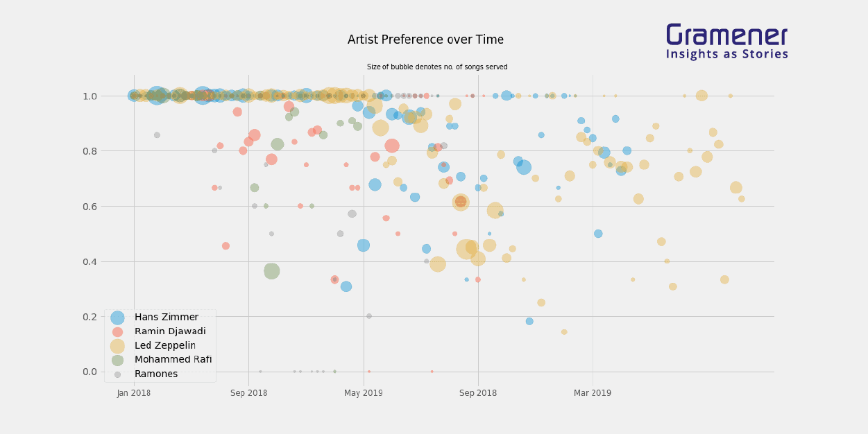
So far, we have not taken time into account. It makes sense that if we keep relentlessly sampling artists or songs from the preference curves, they will eventually cross over into the all-time favorites zone, and lose their appeal. Therefore, even for the artists listed above, we might want to look at how their presence in the playlist has evolved over time. If we sample the preference curve (sampling being weighted by the dominance of each artist in the playlist) for five random artists, we can see their timelines as follows:

As we can see, both Hans Zimmer and Led Zeppelin begin to drop in their scores after May 2019. These could be cases where the preference curve went too far and started becoming boring. Mohammad Rafi, on the other hand, started with a very large number of songs with a high listening score, suffered a massive drop right after September 2018 and then finally jumped back to a high score, although with much fewer songs. (Somehow I must have eliminated all Rafi songs I didn’t want to listen to, but I don’t remember doing this.)
So, in conclusion, here is my humble attempt at a formula for a good playlist:
- Get the data
- Find the probability that you’d listen to an artist or a song, and how many times they occur in a random playlist.
- Locate the discovery zone, and within it, find preference curves, if any.
- If there are such curves, sample them for artists or songs, but stop sampling well before you saturate the curve.
- Repeat this every six months.
If you would like to help me build an application to automate this process, please get in touch. And if you have stuck around so far, here is a little machine-generated token of appreciation.
Enjoy the music!