Reading Time: 4 minsCreating and managing a mutual fund portfolio can be quite a task without the right set of tools to compare funds. On the one hand, you have volumes of information from research reports. On the other hand, you have data on Excel that let you compare specific parameters. But few tools offer a complete view of the portfolio with all relevant details across the funds in a single snapshot.
At Gramener we applied visualisation to a set of equity funds, comparing them on various parameters.
The layout has been kept simple, but the information density is rather high. Both are on purpose, This, clearly, is quite a complex visualisation and merits closer observation.
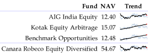
The first block shows the name of the fund, the current net asset value (NAV) and the overall trend over the last 30 days. The black line shows the daily trend while the light blue line behind it shows the movement of the benchmark – the Sensex in this case.
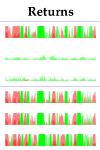
The next block shows daily returns as a horizon graph. The returns on each day over the last 30 days (from left to right) are shown in red (for negative returns) or green (for positive returns). The intensity of the colour indicates the magnitude of the return. This makes it easy to compare returns for a given period across funds. For instance, it is clear that the beginning of the month was a bad time (since the left-end is red) for almost every equity fund.
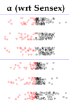
The returns are also plotted against the returns of the Sensex as a jitter plot. The red dots on the left are days when the returns fell below the Sensex. Far left indicates very low returns, far right indicates very high returns. A glance shows that the second and third funds have returns that are spread out, but the others are fairly closely clustered around the Sensex’s returns.
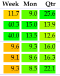
The next block shows the average return over longer periods – a week, month and quarter. The colour indicates how high or low the returns are with respect to other funds. Red indicates the lowest return, green indicates the highest return. Here, the second and third fund have had a fairly high return compared to others during the last week.
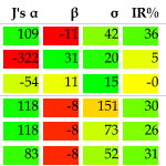
Some of the more complex parameters that investors look at are Jensen’s alpha, beta, sigma and the information ratio. These too are included in this visualisation, again showing their relative performance with respect to the other funds. The only fund that does not perform poorly on these parameters here is the third fund.
But one other parameters that would be of interest is, how good is the fund’s return compared to other funds. Irrespective of the return with respect to the Sensex, a key parameter is the return with respect to other equity funds if these funds are the investments of concern to us. We plotted the weekly return as a percentile rank. If the fund is the best performing fund on a given day, we plot a dot at the right end. If it is the worst performing fund, we plot a dot on the left end. The mix of dots tells us how the fund has performed relatively over the last month.
The last column shows the average of the weekly percentile rank. This is a good indication of the fund’s relative performance averaged over time. The first fund, for instance, has on average outperformed 63.7% of the other funds. The next has outperformed 61.6% of the other funds. And so on. The table is sorted based on this column.
The aim of this visualisation is to present, in a very condensed and information-dense fashion, all the information an investor requires to make a decision. As you can see, an explanation of the visualisation takes more space than the visualisation itself! Yet with a bit of understanding, getting insights out of this plot can take just a few seconds. A far cry from having to read 50 equity research reports!


Amazing stuff. I’m certainly going to use few of the applications and techniques mentioned here for my project. Thanks a lot for sharing this wonderful information.