From http://analyticstraining.com/2012/data-visualization-in-analytics/
Data Visualization in Analytics
Gaurav Vohra
Data visualization is one of the most under-rated aspects of analytics. No doubt there is some awareness of the importance of visualization in the field of analytics (Proponents of R rave about its data visualization capabilities and it is seen as a big reason why many analysts prefer it over some other tools). Yet the emphasis is nowhere near as much as it should be.
Visualization is the best way to summarize, understand and analyse data. Good visualization will help you easily identify patterns, problems, and outliers in the data. For most businesses, this is the most logical first step towards leveraging the available data. You don’t need expensive IT systems or complex predictive models at the start. What you need is to be able to summarize and understand what is happening with your business.
This is where Gramener, an exciting start-up with a unique approach towards analytics, comes in. They create great visualizations that will give you an intuitive understanding of your business and the problems and opportunities hidden deep inside your data.
Gramener’s visualization-driven approach to analytics is different from that of most other analytics service providers. It has a lot of advantages over the traditional statistical modelling approach.
For starters, it is a lot easier to explain to a client. Analysts have always struggled with this part. Building a neural network model or even a complex regression model is usually a lot easier than explaining the results of the same model to a client. And it becomes even harder when your insights vary from the client’s beliefs.
As an analyst, I often think of data as a living being. A living being that sees everything, knows everything. The only problem is that this being talks in a different language. It talks in the language of mathematics. The analyst is essentially an interpreter. Her job is to listen to what the data is saying, understand it and then interpret it for the client. The problem here is that the client has no way to verify how accurately the analyst is interpreting what the data is saying. He just has to take the analyst’s word for it.
Gramener’s visualization-based approach will effectively provide a translator to the client – he can directly hear and understand what the data is saying. He no longer needs to just take the analyst’s word for it. It is all right there, in front of him, in the form of visualizations.
Indian businesses are a sceptical lot. It is very hard to convince them to trust a statistical model that they have no understanding of, over their gut and intuition. Gramener’s approach will work well in this market. It will convert sceptics into believers.
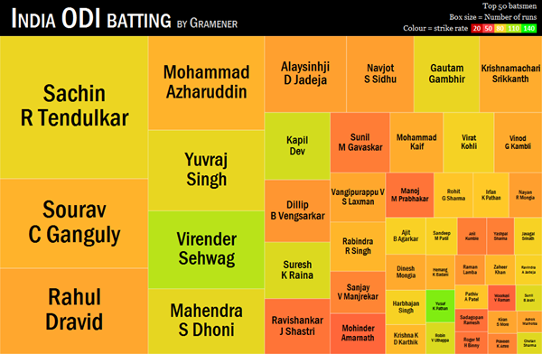
Here is an example of some of the great visualizations Gramener has created.