The following blog is a summary of a well spent day with data creating stories at the data storytelling Hackathon. We proudly present some of the finest visual data storytelling examples from the bootcamp to nudge your story-senses and help you create impressive data narratives.
Hackathons & bootcamps are fun 😎, aren’t they? Working hard and fast on a project to deliver an impressive result in short duration is a hard-to-find skill. We too, at Gramener, love bootcamps.
Data Storytelling Bootcamp
This time we expanded the reach of our traditional Data Storytelling Bootcamp and invited external participation. And boy, was that a great idea 🤘.
Like-minded people with a shared sense of purpose to narrate visually compelling stories, actively registered from different locations across India. Indeed, the positive response and participation added to the fun. Here’s a snippet from the day.
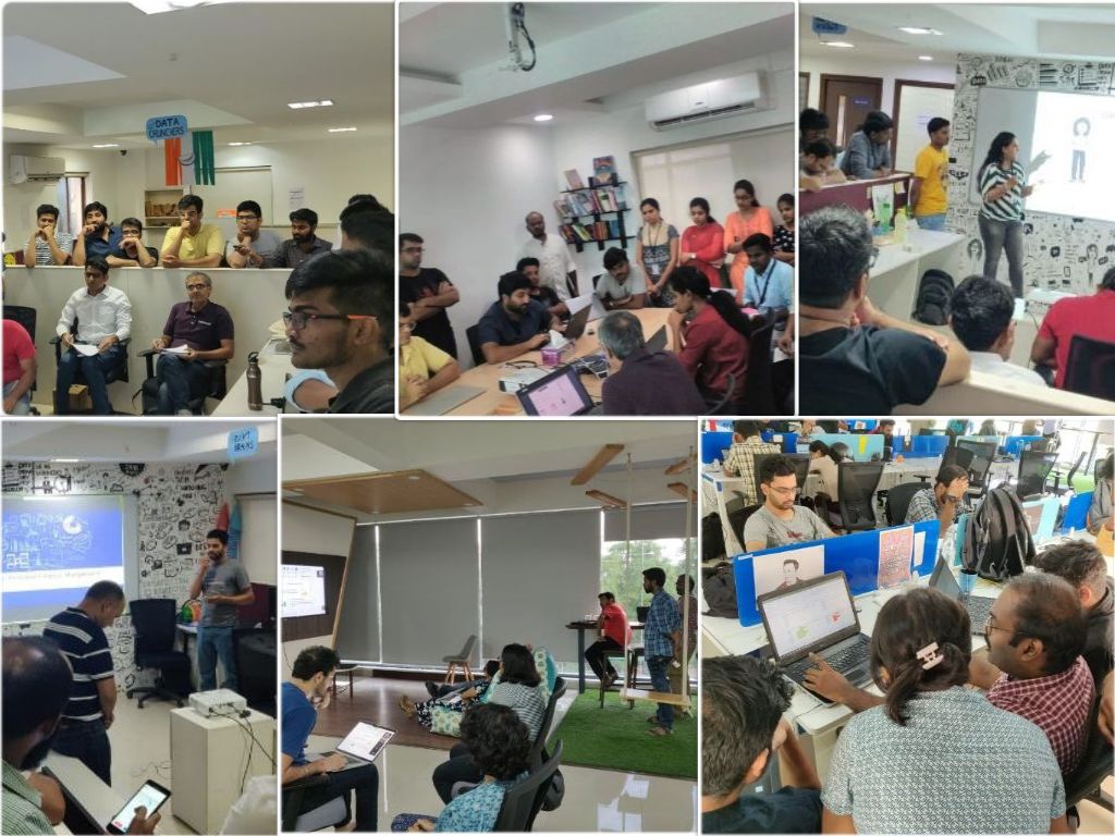
Apart from bootcamps and hackathon, we also organize data storytelling workshops for business users, expert analysts and data scientists. The aim of this workshop is to teach how to create data stories and build a community that can convey actionable insights as stories.
Visual data Storytelling Examples from the Bootcamp
Visual stories add a great value to the statement, “Say it all without saying anything.” The unparalleled potential of stories enthrals the audience, leaving them craving for more. Also, MIT research states that a human mind can process an image in as little as 13 milliseconds 😲. Unbelievable, right?
Let’s look at a few compelling visual data storytelling examples from the hackathon and see how fast you can grab the insights.
I. Team Storytellers
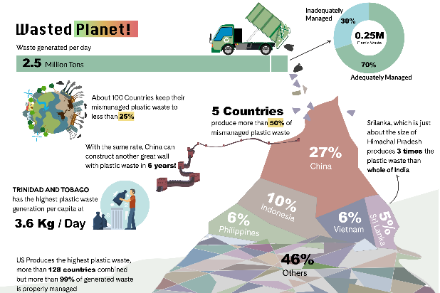
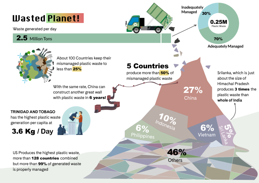
The team led by Vamsi, Venkatesh, Hari, Arihant, and Shankesh created an eye-opener visual data narrative on Plastic waste. This visual story touches a sensitive topic of pollution 🏭 vs. sustainable living 🌲.
Apparently, we come to know that out of all, 5 countries produce more than 50% of mismanaged waste including China and Srilanka. Check out another story we created sometime back to visually explain the data from 25th great British beach clean program.
II. Team Movie Buffs
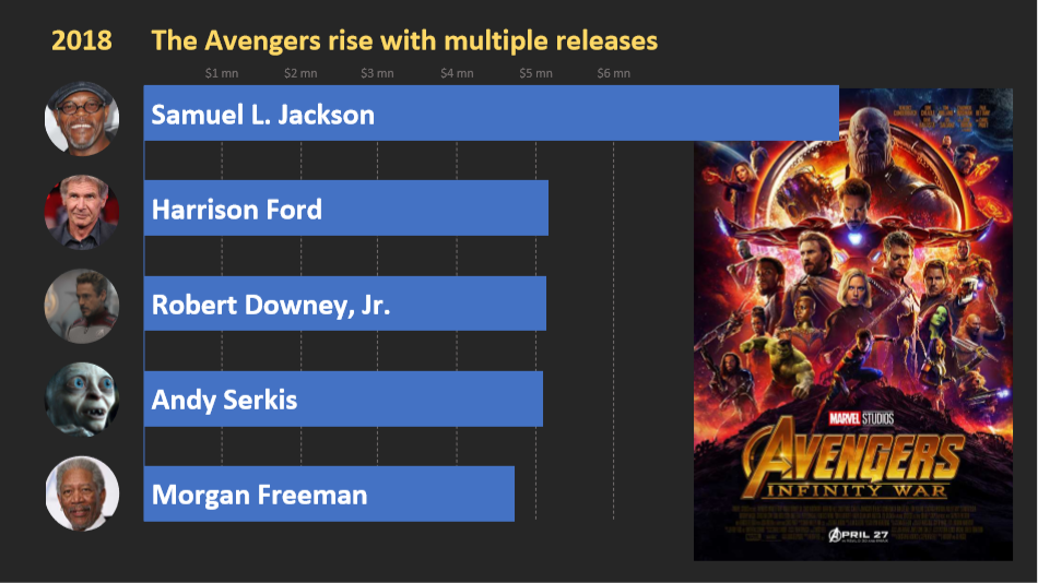
This team was led by S. Anand, Chandni, and Srikanth. G. They leveraged their passion for movies to extract insights about top grossing Hollywood actors from 1975 – 2019 🎬.
Samuel L. Jackson, who played Nick Fury in Avengers, has topped the box-office charts for over two decades.
III. Team Last Week With Data
The team led by Giri, Maria, and Kartikeya picked the recent sports affair to create a visual narrative. The World Cup is trending in the sports world. Anyway, this data story is not about the ICC Cricket World Cup but the FIFA Women’s World Cup ⚽.
Did you know, that the USA women’s football team scored a record-breaking 13 goals against Thailand? Well, data says that this is the highest number of goals registered by any team in the FIFA world cup (Men & Women).
Still, gender disparity in World cup prize money is plaguing the efforts to abolish discrimination in sports 😏.
IV. The Solo Storyteller
Bhanu K. from Gramener analyzed the health of all the parliamentary constituencies in India. This Unique data narrative provides important and actionable insights to improve the socioeconomic, nutrition, and health status of the citizens 💊.
Surprisingly, Barmer constituency from Rajasthan came out to be the most backward area in the state with least concern on health & nutrition. Hope this story reaches heights for authorities to notice and take corrective actions😤.

V. Team visual narrative explorer
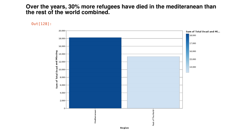
Karmanya and Laiba led this team to add some insights about the lost refugees across the world. People who move away from home due to war, poverty, and imbalanced governance hardly make it safe 😢.
The data story aptly shows the count of missing refugees. Furthermore, it classifies the death counts against places, weathers, and death causes.
Refugees death tolls in central Mediterranean countries is highest by a huge margin when compared to eastern and western Mediterranean countries.
And That’s a Wrap
We had a plan to expand and share our data storytelling ideas with a larger group. Interested people joined us to create & show some impeccable visual data storytelling examples 🎨.
While some data narratives were fun to read, others spoke the harsh truth about society. We as a community believe that powerful stories are the ones that really connect with our human emotions!
Finally, thanks to everyone for joining us at the data storytelling hackathon. Till next time, keep storifying data.
P.S: Check out some of the cool visual data narratives on DC & Marvel Comic, Indian Premier League, and more from our early data storytelling bootcamp.
