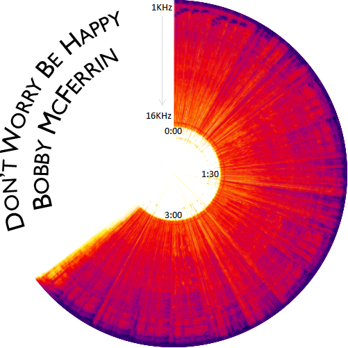
We often wonder what songs would look like. Here’s our take on what Bobby McFerrin’s Don’t Worry Be Happy looks like.
This picture is a spectrogram of the song. It starts at the 12 o’clock position, and moves clockwise, ending at about 4:00 minutes. The intensity of colour indicates the volume at different frequencies – blue for high volume, red for medium, yellow for low and white for zero. The outer radius represents the lower frequencies and the inner radius the higher frequencies.
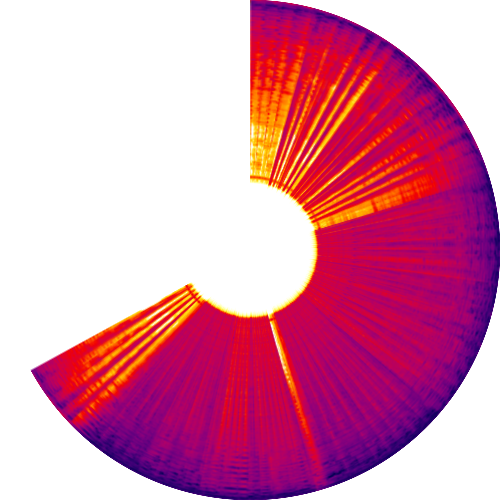
This sort of picture almost gives you a “fingerprint” of the song, and a feel for the kinds of ups-and-downs. For example, if you look at Bryan Adam’s Everything I Do, you can clearly see the light beginning, the somewhat stronger middle; then a pause before the 3:00 mark, strong again, and then fading out.
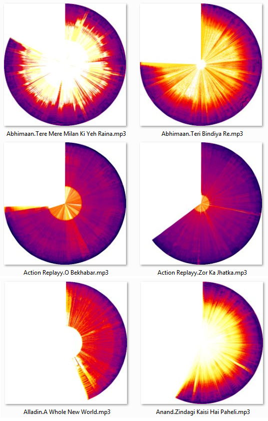
For your amusement, here are what a few more songs would look like – a mix of Bollywood, old and new.


Clearly defined…
Nice blog !
Greetings!
This is absolutely stunning and amazing!!
I have few questions….
How do I record the music to show the colors like you did?
Would it be possible to utilize the images above into an art project?
Finally…
Could you email me as I would love to learn more about this!!
Have a fabulous day!!
Auria
Auria, there are many programs that convert music into spectrograms. We used an open source application (http://sox.sourceforge.net/sox.html) but you may find many others.
We then converted the rectangular image into a polar image using ImageMagick (http://www.imagemagick.org/). Again, you may find this easier with other applications like Photoshop.