
This is the original version of the two-part interview that appeared on Analytics India Magazine as:
- Data Visualization – A POV from Gramener
- Interview – Anand S, Chief Data Scientist and Co-Founder at Gramener

In an interview with Analytics India Magazine, Anand S talks about Gramener and his topic of talk at The Fifth Elephant, which is “Visualizing Text”.
What according to you are currently the most important and specific Data Visualisation needs for the industry?
Consider this price and sales table for four cities:
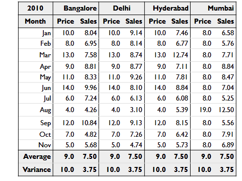
Can you figure out how each city is performing? Notice that the average for each city is the same.
Now take a look at the same data, plotted.
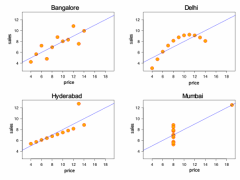
The patterns are a lot clearer now, and you can quickly see that:
- The four cities are completely different in behaviour and need different strategies for growth.
- That Delhi is price sensitive, while Bangalore and Hyderabad are not
- There is at least 1 data point each at Hyderabad and Mumbai that look like abberations
This is an example of the issue industry faces today: significantly larger quantities of data, but still visualised as plain tables.
The human mind is much better suited to process pictures than numbers. Data visualisation is about communicating the same message to our minds as a picture story rather than a table of numbers.
Where do you see the bulk of your business coming from?
From companies that have large volumes of data. So far, in our case, it’s been from Banking, Healthcare, Pharma, Retail, Telecom and Utilities.
However, two things have surprised us.
First, several small well-run enterprises tend to have much more data than we expect — driven by the dropping cost of data collection infrastructure.
Second, there is much more variation within companies than across companies. For example, even in large utilities, there’s much more information in sales and operations than there is in administration or HR. We find more in common between the sales data of an FMCG and the sales data of a bank than between the sales and HR data of any organisation.
As a result, we’ve become more functionally focused than industry focused — with the bulk of our business coming from sales, operations, and finance, in that order.
Gramener operates in a very niche area. How does a typical requirement gathering to delivery cycle looks like in Data Visualisation?
We build a series of “templates” for clients. A template takes data and transforms it into a visualisation. Here’s what a typical cycle looks like:
- Brainstorm with clients on the key problem areas
- Get an anonymised dataset in that area — the larger the better
- Work offline (without any preconceptions of existing reports) and create a series of visuals
- Share with the client, understand the decisions they need to take, and rework accordingly
- Implement the visualisation as a template in their environment
You’ll notice that we’re combining two things: independent discovery (working without the influence of existing material) and a review process — both of which are essential to delivering a useful product.
How do you see Data Visualisation evolving today in the industry as a whole?
The first entry point for data visualisation is through in-house tools — typically Excel.
Slowly, industries recognise the value of taking this further and start looking for improved tools in this area. A number of product companies are catering to this need — Tableau, Spotfire and Qlikview in the data exploration space; R and SAS in the analytics space; Microstrategy and Cognos in the Business Intelligence space; and Gramener’s visualisation server in the data visualisation space.
Often, this is outsourced, just as analytics is increasingly outsourced today. Data analytics firms will slowly evolve to include visualisation as part of their core offerings.
What are the most important contemporary trends that you see emerging in this space across the globe?
There are three worth mentioning:
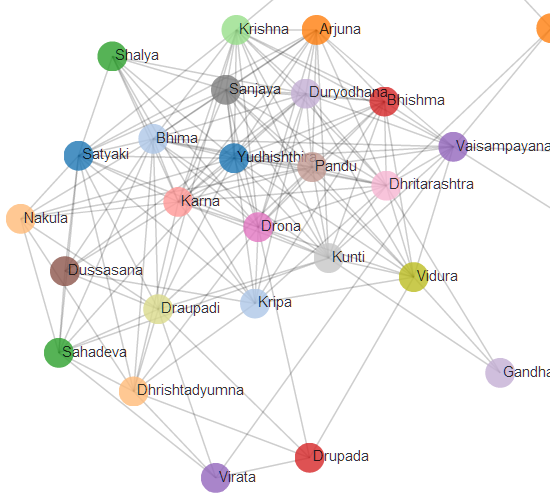
- Unstructured data. Data visualisation is no longer in the realm of pure numbers. Text analysis is relatively mature and is being applied routinely to various problems. Even a pure text corpus like The Mahabharatha can be visualised. Images, audio and video are rapidly becoming analysable and visualisable.
- Cognitive research. What we know of the human eye and brain is increasingly making its way into practical visualisations. For example, most men can name only 11 colours (women can name about 15), but can differentiate between over a million colours when placed next to each other. So, while a heatmap that places regions adjacently can be coloured with millions of shades, a bubble chart should have 11 colours at most. Such rules of thumb and now baked into the software people build for data visualisation these days.
- Mobility. Tablets and phones are the most popular modes of consuming information, increasingly. A strong trend is embracing this medium along with its limitations (e.g. size and form factor) as well as advantages (e.g. touch screen, geo-location).
Would you like to share any example of a visualisation insight that generated a huge positive impact for your client?
This is an anonymised version of our very first visualisation.
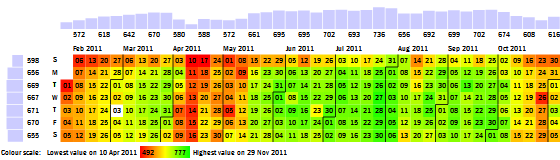
We were working with a telecom client who provided us with minutes-of-usage data. We plotted this time-series on a calendar, creating the Calendar Map you see above. Red cells show days with lower usage, and green cells show days with higher usage.
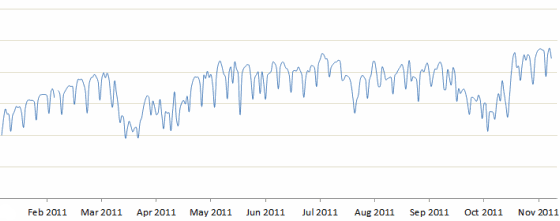
This made it possible to spot a number of patterns that were relatively hidden until then. For example, on this calendar map, it’s obvious that call volumes are lower on Sundays. But 31st July was a relatively good Sunday, with high call volumes. That’s tough to spot on a line graph because it’s not high in absolute terms — just high for a Sunday.
With this visualisation, our client discovered a number of insights in calling pattern behaviour of their customer segments. For example, the share of rural traffic rises on Sundays, mainly because urban traffic falls while rural traffic is unaffected. It also made it possible for them to identify specific days on which their competitors’ call volumes shot up, and helped them identify which competitor’s campaigns were proving effective against them.
The visualisation is now integrated into their strategic review process.
Are there some favorite instances you’ve seen of data being interpreted in a visual manner?
Here’s a visualisation of the social network of geeks across different cities in India. An interactive version of this is available. We built this to identify who would be a good candidate to hire, as well as decide which city is the best hunting ground for geeks.
Each circle represents a developer. The size indicates the number of followers they have on Github. The colour indicates the language they code in. Networks of followers are connected by lines and clustered together.
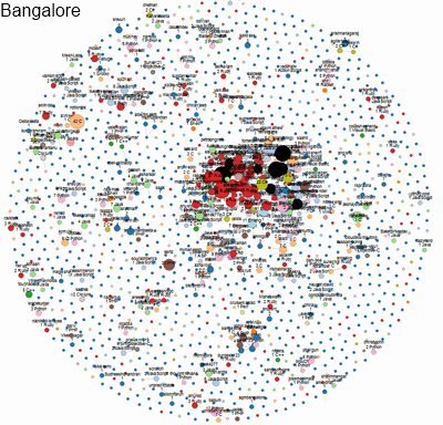
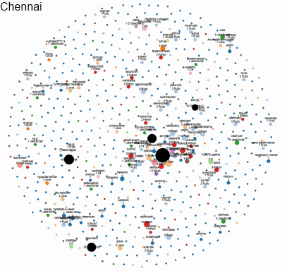
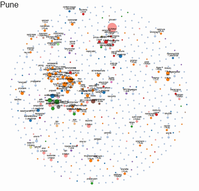
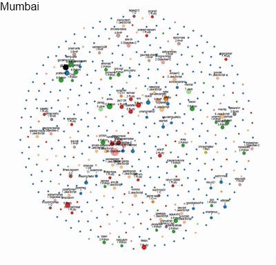
This is an instance of transforming relatively unstructured data into quantitative metrics (distance between a pair of people; density of a network; etc) and displaying them purely visually, without any numbers. As a result, it conveys far more richness and meaning intuitively to the viewers.
Another instance is this visualisation of the entire history of batting in Indian one-day cricket. The size of the box represents the number of runs scored by the player. The colour indicates the speed at which they scored those runs (red is slow, green is fast.)
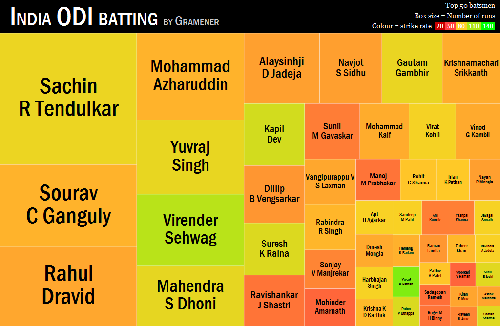
It’s evident that among the big scorers, Sehwag is India’s fastest run-getter. Clicking on the players shows an second drill-down featuring every match they’ve played. An interactive version of this is available at https://gramener.com/cricket/batting-India-plain
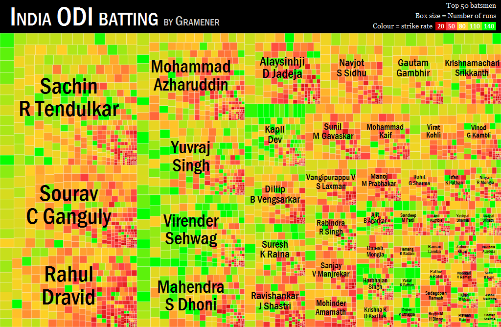
This compresses over 150 pages of information into a single sheet without any loss. Part of the power of data visualisation comes in this ability to compress information and compactly convey insights.
What are the most significant challenges you face being in the forefront of Data Visualisation space?
Our biggest challenge is recruiting.
Data visualisation requires a combination of statistics, programming and design. People with all three skills. Finding good people with one of these talents is hard enough. The combination is near impossible. As a result, we’re spending considerable time building our internal training programme and hope to churn out more people with the skills we need.
Another challenge is the corporate procurement cycle.
Almost every person on the business side understands the value of data visualisation instantly. Once we hit the procurement team, however, there is the learning curve around how to classify data visualisation (software? service? consulting?) and how to price it (by number of users? reports? templates? rows of data?) We spend a fair bit of time educating our corporate customers and evolving our commercial models.
What is your projection of the growth of the Data Visualisation practice in the future?
Depending on the report you look at, the number is anywhere between $5 billion to $50 billion. We don’t have enough data to predict this with confidence. But in our experience, of the 100+ organisations we’ve met, every single one clearly expressed a desire for data visualisation. Whatever the market size is, it’s large enough for us and a number of other players put together.
What are the next plans for Gramener?
Growing the team is our immediate priority. We’re 60 people strong, spread across Hyderabad, Coimbatore and Bangalore. To meet our pipeline, we need to rapidly recruit and train many more.
We’re moving into visualisations of non-quantitative data. There’s a lot more text out there than numbers, and it’s possible to mine information from that. For example, even a pure-text corpus like the Mahabharatha lends itself to social network analysis.
We’re also expanding our partner network and working with systems integrators. Our plan is to focus more on the product, and work with implementation partners to actually create the visualisations.
Anything else you wish to add?
Data visualisation is a skill. We’re also trying to develop this skill in the community. We’re partnering with IIIT, JNTU, etc on a course on data visualisation that’s offered to programmers. We’re working on a course on data visualisation for the non-programmer as well.
We’re also involved in the data community, with groups such as datameet. Once, the problem used to be “How do we get the data?” Today, the problem’s more of “What do we do with all this data?” We’re hoping to work with such people, helping them understand how to analyse and visualise large scale data.
If you’d like to learn more, please feel free to reach out to us.
I really liked the product & idea. I have a small set up in Lucknow covering North India specially NCR. I would be interested in being a reseller of your products & 3rd party support for Government & public sector companies.