
Understanding associations within indicators
Writeup by Analytics team
Problem Statement
Technology has been a major enabler to innovation as well as business growth in the last decade or two. With the rise of the internet, mobile technology, and governments investing in a technology infrastructure, smaller countries have been able to make their mark and become a significant player in the world economy. World Bank approached Gramener to help understand the relationship b/w technology and other relevant indicators, so as to develop a compelling story that can be showcased on their website.
Data
Prior to data-collection, a list of questions and draft stories were prepared and shared with World Bank. These draft stories included, but were not limited to, the impact of tourism on GDP, the impact of government investment on latest technology, the impact of science and education on a country’s ability to innovate, etc. After a list of stories were identified, data was taken in the form of indicators for different countries from the World Bank website here
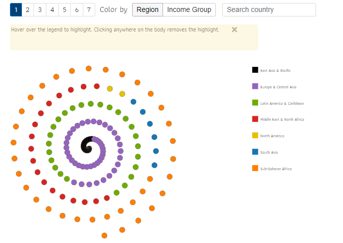
Data was organized by country, each country having an ‘indicator’ whose values were measured as ‘ranks’ or ‘indices’. Each country was also tied back to a region and economic group. Four income groups were identified; “high income”, “upper middle income”, “lower middle income”, and “low income”.
Gramener’s approach
Based on the finalized story, relevant indicators across technology, innovation, business, and entrepreneurship were identified across data-sets, and countries were grouped into regions as well as income groups. Each country was visualized.
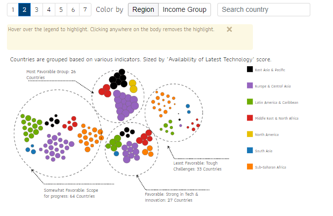
K-means clustering was performed on business, technology, and innovation indicators to identify four distinct groups; “most favorable”, “favorable”, “somewhat favorable”, and “least favorable”. The analysis was presented in the form of a data-story, with each pane showing a scatter-plot visualizing two indicators. Relevant insights from the plot were highlighted and summarized.
Scatter-plots were created to identify relationships b/w the various indicators, and relationships that stood out were expanded on. These scatter-plots could be viewed by region as well as income group. Finally, the entire analysis was collated and brought together as one compelling data story.


Visualizations in the story were interactive, and the user could select a custom list of indicators to visualize on the scatter-plot.
Benefit to the Client
Cause and effect relationships were brought out from the analysis, and the entire analysis was represented visually in the form of a compelling data story. The final data story was published on the World Bank web-site.