On 16 May, we pulled off an interesting technical feat: serving 10 million pages worth of election results in real-time, staying ahead of many channels or websites.

The latest results – specifically whether a candidate is leading, trailing, has won or lost is fed into an SQL Server database at CNN-IBN’s data centre in Noida. During the early stages of the election, only the status is known. Later in the day, the actual vote counts start streaming in. This database is the single source of data across all CNN-IBN properties (including ibnlive.in.com) and Bing elections.
We took an old Windows laptop perched on a ledge at the (rather cold) data center and installed the Gramener counting day ETL scripts. The Python script pulls the data every 10 seconds from the SQL server (0.25s to pull all the data we need) and converts it into 2 JSON files: one storing the candidates, and another storing their status / votes.
These files are copied via rsync every 10 seconds to ibn.gramener.com, which is an Azure VM in Singapore – a 4 core 7GB RAM Ubuntu system.
This server has a copy of the Gramener visualisation server installed. These are HTTP servers that have built-in analytics and visualisation capability. 4 instances of that were set up in a stateless round-robin load-balanced configuration. That is, when users request a file, they would be sent to any one of these servers to balance the load.
We wrote a visualisation template that takes the data from the two files and renders them in real-time into the visualisation that you see.
To reduce the load further, we set up nginx as a caching proxy in front. Repeated requests would be cached by nginx and served directly. Again, we set up 4 worker processes.
You probably have several questions at this point on the choice of technologies. Here are some of the answers:
Why just one 4-core system, 7GB RAM system? For the election campaign phase, we expected less than 100,000 hits every day. Further, the visuals were based on historic election data and would not change –making them highly cacheable. This configuration could (and did) handle that load with less than 1% CPU utilization, which gave us a huge margin of comfort.
For the counting day, however, the Bing team encouraged us to have another server in the US as a backup. We’d set that up, but never switched over the load-balancing, thanks to last minute running around.
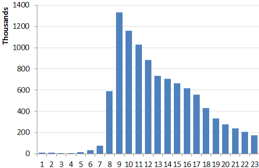
But at 9am on counting day, we were very worried. The average CPU load was 50%. All 4 cores were maxed out periodically. If the traffic grew the way it did, we were in trouble. But thanks to the decisiveness of the results, most people started losing interest by 10am. (Here’s the hourly traffic.)
Why nginx? Because at the moment, it appears to be the server best able to handle a large number of concurrent requests. (We chose 4 workers because we had 4 processors.) Ubuntu was a logical extension of that choice: nginx runs best on Linux distribution. (Having said that, we have a number of instances running on Windows server, both with and without nginx. But Microsoft, to their full credit, encouraged us to use whatever technology would give the page even the slightest edge.) Azure was easy – it was cheaper than Amazon.
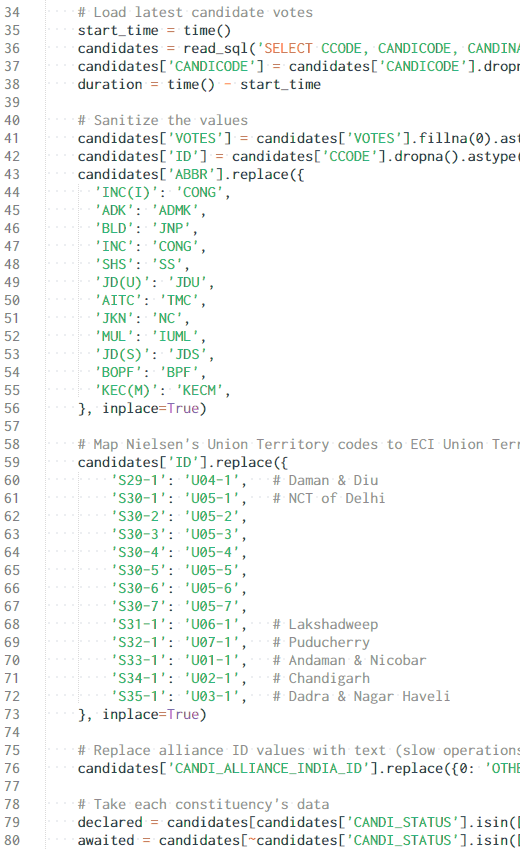
Why Python? Mostly because we know and love Python. It also has a fairly efficient set of data processing libraries that lends itself to compact and readable code. The main function in the ETL script is under 150 lines, most of which are data mappings. Here’s a sample of the code.
Why every 10 seconds? We initially got this wrong. We thought 60 seconds would be fast enough for everybody. But while we tested the feed from Nielsen and compared it with TV, we found that a lag of even a few seconds was jarring. Since the script took under a second to run, we brought the frequency down to 10 seconds. After that, we were even ahead of the TV results periodically.
All of this was the engineering that went into the back-end to get the data to the browser quickly. On the front-end, another series of interesting engineering choices were made to ensure that the results stay fresh as much as possible. We will follow up with a blog post on that later.


Nice. Thank you for the post on how you scaled things.
I was very impressed with the visualization used on the page.
If you share which visualization tool you used to create this page/dashboard ?
Arun, Punit, these are all created using the Gramener visualisation server — a product that we have created.
Hi,
I am an reporting associate and curently working in one of the consulting firm. I have seen you page on election results and was very much impressed with the way it was designed.
I would also like to know much about the technique used to design the page including the reporting tool, If possible
Thanks