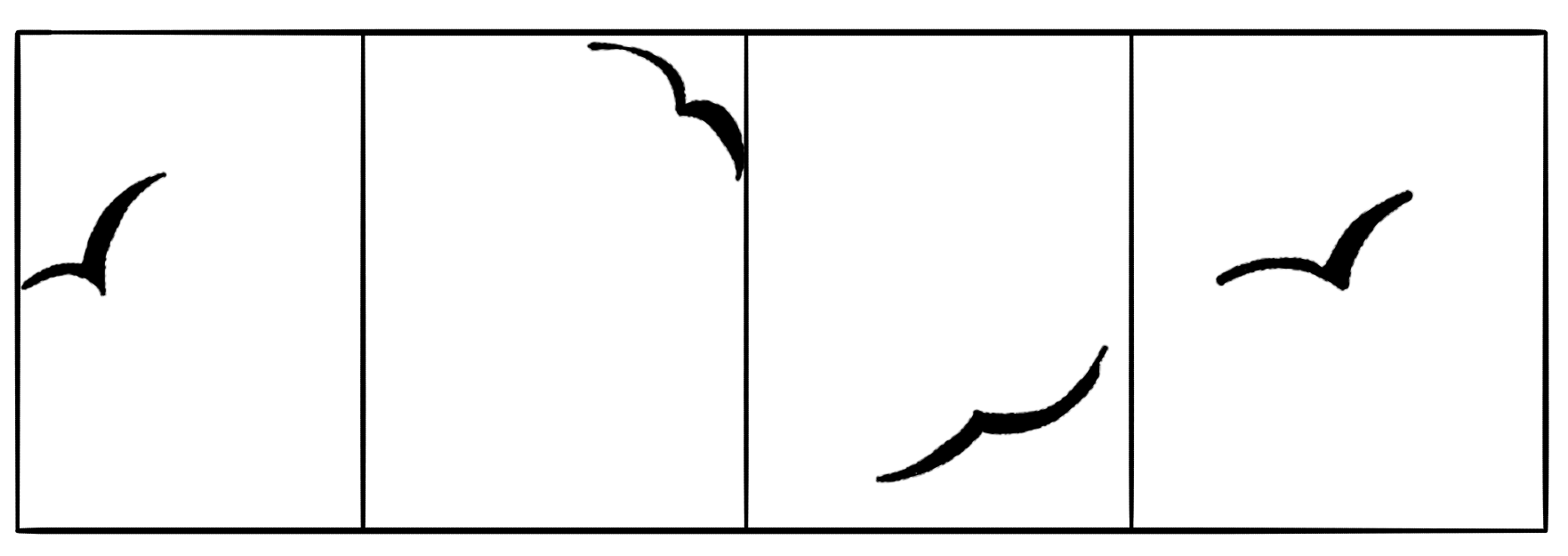
Let’s assume that a person is tracking the flying pattern of a bird. He considers two scenarios.
a. A bird flying inside the box
b. A bird flying without the box.
Let’s take the bird inside the box scenario. The bird is flying but it’s always inside the box. This makes it easy to track it’s flying pattern by the observer.

If we take the same principle and apply it to any art work or design, having a bounding box or separator to the art will help the user to understand and allow him to slowly absorb the contents which are inside the box.
To make it even more easier, the art or illustrations inside the box can have proper annotations. This increases readability. Best practice for writing an annotation is to maintain short and crisp statements. Provide the insight first. This helps the user to concentrate only on the insight. Many times, when a user reads the insight or annotations, he tends to imagine the situation. Thus, supporting the annotation with a rich illustration will help the user to remember and connect to what he reads.
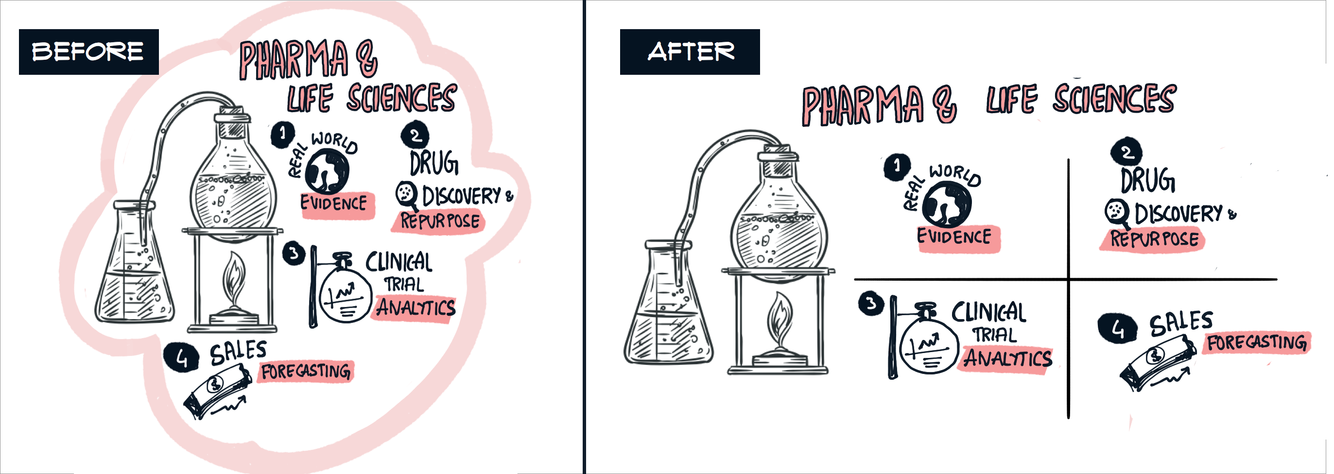
For example, here we want to show that one of our Industry focusses is Pharma and life sciences and the focus areas under it. Having a bounding box/ separators, helps our brain to absorb the tiny details step by step.

Some best practices – I
- Have the content first approach. This helps us to think and plan designing the art work better.
- Once the content is ready, check for the sequence. Sequence of how do you want the flow to be present.
- Have a bold header. This helps the user to understand what the art work is about.
- Start with a crisp insight or message.
- Support the content with illustrations.
Now, lets take the bird without box scenario. There is a high chance for the observer to miss tracking the path.

This is because there is no confined box and we tend to have a free flow structure. Good thing about the free flow structure is we get a lot of space for minute details in the art. But again, the art will lose its essence when the user cannot understand the sequence or when he is lost in the middle not knowing what to read next.
To make it easier, the free flow structure can have a thin line separator or a connecting path which helps the user to see and understand the sequence.

Any artwork which depicts timeline, history etc can be added to this free flow scenario.
Lets take the same example as above.

Here, in the first design, even though there are numbers attached to the sub categories, still it is slightly difficult to read and understand. It will take sometime for the brain to process the design and read it.
In the second image, although we are repeating the same free flow structure, having separators in the middle will enhance the readability.
Some best practices – II
- Have the content first approach. This helps us to think and plan to design the artwork better.
- Have a bold header. This helps the user to understand what the artwork is about.
- Start from any corner of the artboard irrespective of left to right or top to bottom approach.
- Identify the starting point and give a bold mark or illustration so that the user will notice where to start reading.
- Have a clear path or sequence. Either a separator, or a dotted line, or a transparent path. This will ensure that the user will follow the sequence which you want him to read.
