Sometimes, just viewing a time series as a simple graph isn’t enough.
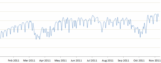
The graph below shows the daily visitors to a leading Indian website in 2011. The overall trends are apparent. There was a dip in Mar-Apr, and again in Oct, followed by a steady rise in November.
But what’s also apparent is a weekly cyclicality: the steady pattern of rises and falls several times a month, that disturbs this trend.
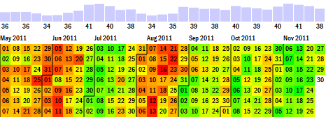
Yet, there’s considerable insight within that cyclicality, that a calendar heatmap can bring out. Here is the same data on a calendar heatmap. This is simply a calendar on which the values are plotted as a range of colours: red for fewer visitors, green for more visitors.
Calendar heatmaps provide a way of exploring information at a far richer level of detail than traditional line graphs or bar graphs do.
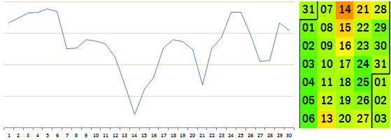
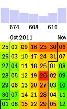
For example, they focus on weekly trends. In businesses where there is a weekly cyclicality, it becomes much easier to spot an unusual weekday. In the month of August (see below), it’s fairly obvious from both graphs that August 14th had a bad dip. But what becomes clearer from the calendar map (but not the line graph) is that August 13th was a relatively bad Saturday, and August 16th was a relatively bad Tuesday.
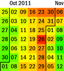
On the line graph below, you can see the major dip in October. However, mapping this specifically to Diwali is a far tougher task.
Below is another calendar heatmap – this time, showing the percentage of visitors from New Delhi. Consider the month of August. We saw from the earlier calendar map that there was a decline in traffic between August 13 – 16. If that decrease was uniform across cities, the colours below would be uniform too. However, New Delhi’s percentage share declines as well on these days.
Apparently, the people at New Delhi are more likely to spend the day outside on Independence Day than most other cities! In fact, they seem to spend the whole of August avoiding browsing. However, the same cannot be during of Diwali. Delhi-ites are as likely / unlikely to be browsing during Diwali as any denizens of any other city.
The next time you look at data with weekly patterns, where you need to figure out quickly when exactly the numbers rose or fell, do try out a calendar heatmap.
