How does one create new data visualisations? Apart from the art, is there a science to it?
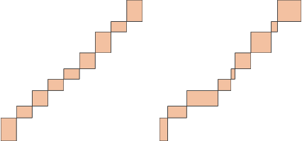
Let’s explore a few popular charts. We have the vertical bar graph
The first thing you’ll observe is that all of these are a series of rectangles. (We’re treating the dots on the scatterplot as little squares.) The only thing that varies across these charts is the position and size of the rectangles – and the colour as well.
That gives us a hint. Perhaps there are many ways of creating visualisations just by changing the position, size and colour of rectangles. For example the horizontal bar graph
Whereas, if we look at a horizontal stacked bar
Generalising this, we can construct a table like this that shows the structure of various visualisations:
| Chart | x | width | y | height | colour |
|---|---|---|---|---|---|
| Vertical bar chart | index | constant | constant | value | constant |
| Stacked bar | index | constant | cumulative | value | index |
| Waterfall | index | constant | cumulative | value | constant |
| Scatterplot | value | constant | value | constant | index |
| Horizontal bar chart | constant | value | index | constant | constant |
| Variwide | cumulative | value | constant | value | constant |
That leads to a line of thought: what if we tweaked this table? Would we get new visualisations that might be interesting?
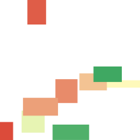
Let’s experiment with a few.
This chart can, for example, show the position and spread of two metrics. For example, if the X-axis were sales, and the Y-axis were price, each bar could be the distribution of price and sales in a branch, with the colour indicating growth of the branch.
Just using the combinations discussed above, there are 75 possible types of visualisations – many of which are meaningful in different circumstances. And this is just using rectangles.
What we’ve done here is mapped data to attributes of a visualisation. This is part of a generalised approach to graphics, similar to that covered by Leland Wilkinson’s Grammar of Graphics and implemented in libraries like ggplot2 or D3. Once we establish that basic concept – that a chart is a mapping of attributes to data – the variety of charts you’ll be able to create is unlimited, and you move from being a user of charts to a composer of data-driven visualisations.
The emergence of Generative AI (GenAI) is reshaping healthcare use cases and facilitating the rapid… Read More
The U.S. Food and Drug Administration's (FDA) stance on GenAI is clear: it's a groundbreaking… Read More
Executive Summary In healthcare, protecting patient information is not just a legal requirement; it's a… Read More
Demand forecasting in the supply chain is crucial for optimizing inventory levels and ensuring efficient… Read More
Hi, I am ChatGPT 3.5 Turbo. Do you know what my favorite number is? Do… Read More
After a successful webinar on digital transformation and sustainability, we organized a sequel titled “Data-Driven… Read More
This website uses cookies.
Leave a Comment