You don’t need specialised data visualisation software. Excel is a powerful tool in itself. For example, you could re-create and extend our When to Invest visualisations in Excel. Here’s an example:
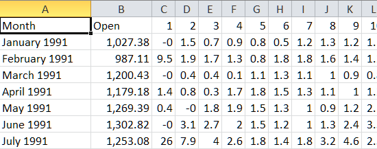
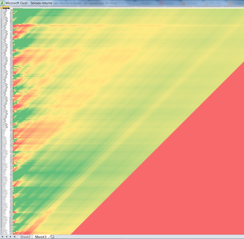
Each row indicates a month in which you’ve made an investment. The columns indicate how long you’ve held the investment for. For example, the 10th row, 10th column shows the returns you’d make if you invested in the 10th month (Oct 1991) and held it for 10 months (until Aug 1992). Red indicates negative returns, green indicates positive returns.
Here’s a tutorial on how you could do this.
First, let’s get the data
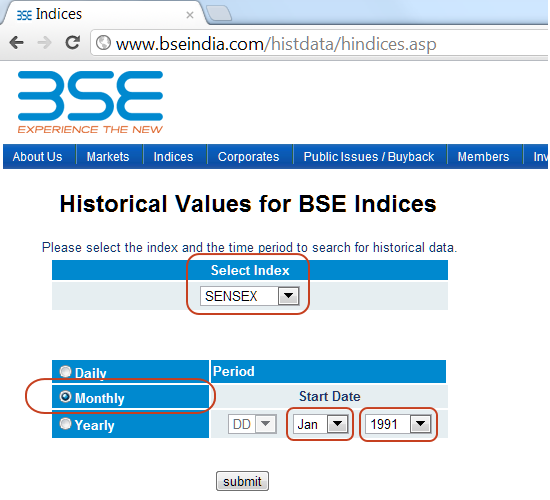
Let’s start by downloading the Sensex data. Visit the BSE Historical Indices page, choose the SENSEX and select a monthly feed for Jan 1991.
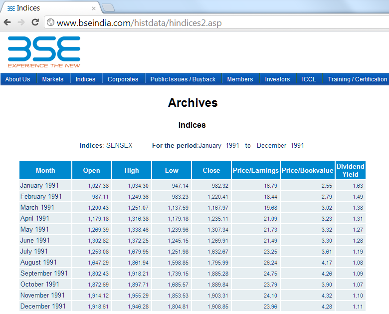
Click submit to see the results for the year 1991.
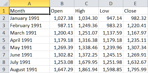
Copy and paste the table into Excel.
Now, repeat this for each year from 1991 to 2012, and you’ll have the full database of monthly Sensex prices. (It’s possible to scrape, copying and pasting 21 pages is faster.)
Next, let’s calculate the returns
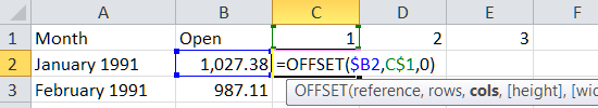
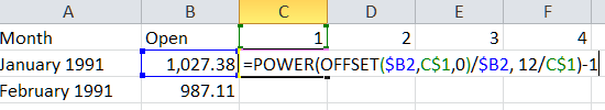
To find the returns after 1 month, 2 months, etc, we can use the OFFSET formula:
OFFSET($B2, $C1, 0) says:
As we copy and paste the formula, we’ll get the opening price 1 month, 2 months, 3 months after the starting month. (The 1, 2, 3… months come from the first row).
Now, we need to calculate the annualized return from this price. That’s done by the following formula:
=POWER(OFFSET($B2,C$1,0)/$B2, 12/C$1)-1
Put another way, this is the same as:
=POWER( Future_Amount / Initial_Amount, 12/Number_of_months) – 1
Copying and pasting this formula to all the cells gives you a sheet that shows the returns for every period.
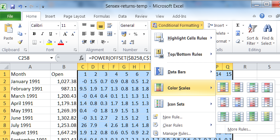
Lastly, let’s colour it.
If you want to see what the returns look like as a gradient, select the cells, go to Conditional Formatting – Color Scales and choose one of the scales there.
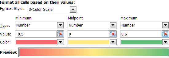
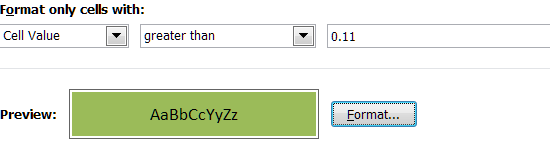
You may then want to tweak the colours for each value. Go to any of the cells, then select Conditional Formatting – Manage Rules, and double-click the “Graded Color Scale” rule. Then you can change what Red, Yellow and Green stand for. (In the example below, they’ve been set to –50%, 0% and +50% returns respectively.)
This will give you the visualisation below when you zoom out.
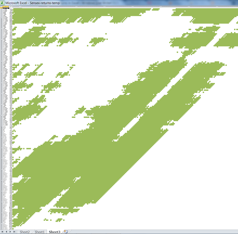
Another way of looking at the same data is to only show those periods where the return was more than, say, the average inflation rate (let’s say 11%).
… this is what the result will look like.
We’re not trying to endorse Excel as a product: We admire all spreadsheets. Excel is merely our abbreviation for “Excel and other spreadsheets”. The same principles would apply equally well to Open Office, Google Docs, or any other spreadsheet of your choice.
There’s a good chance Excel is already on your machine. You’re likely to be familiar with it. Why bother learning a new tool, or a programming language, when you’re already familiar with something?
The point is, most tools can visualize well. But you need to have the imagination.
1. Quick‑Start GidsHeb je ooit een bite‑size casino‑thrill willen ervaren die je in een koffiepauze… Read More
Chicken Road is de nieuwste crash‑stijl titel die de mobiele casino‑scene heeft veroverd. Ontworpen voor… Read More
When you’re looking for a game that delivers instant excitement in just a few seconds,… Read More
When you’re looking to jump straight into action without a long warm‑up, Slottio offers a… Read More
Si eres el tipo de jugador que busca acción instantánea sin una larga sesión, BetPlay… Read More
En el mundo de las apuestas en línea, la velocidad se está convirtiendo en la… Read More
This website uses cookies.
Leave a Comment