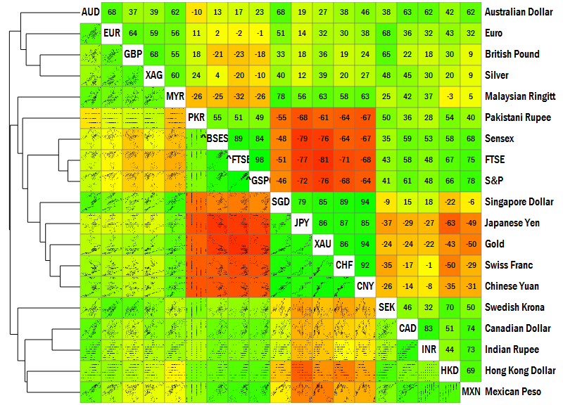
If you were wondering how the securities in the world move against each other, the picture below is the answer.
This picture shows the correlation various currencies, indices and commodity prices by linking together three powerful types of visualisations.
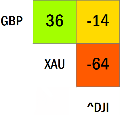
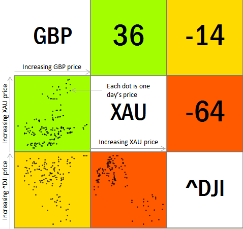
The first is a coloured correlation matrix. In this picture, we have three securities: the British Pound (GBP), Gold Price (XAU) and the Dow Jones Index (^DJI). The price of GBP and Gold tend to move slightly together, and have a correlation of 0.36 (36%). So the cell that’s between GBP and XAU is marked with 36. Similarly, the cell that’s between XAU and ^DJI has a –64 because Gold and the Dow Jones index are slightly negatively correlated.
The colour coding is based on the correlation. Red is -1, Green is +1 and Yellow is 0.
For example, compare Gold and the Dow Jones. It isn’t a straight-forward negative correlation. In fact, it almost looks like there were two periods: one in which gold was high when the Dow Jones was low, and vice versa. But within those periods, there appears to have been a mild positive correlation.
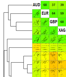
The third is the hierarchical cluster. The securities is grouped into similar ones based on their correlation. For example, GBP and Silver (XAG) and reasonably close to each other, and form one group. This group is most closely related to the Euro (EUR), and the three of them are closest to the Australian Dollar.
Arranging the securities by the hierarchy makes it easy to spot groups of securities that tend to move together.
For example, in the original visualisation, there appear to be a set of logical blocks
At the centre, four securities – the Pakistani Rupee (PKR), the Sensex (^BSES), the FTSE (^FTSE) and the S&P (^GSPC) – tend to move together, with each other; but move in the opposite direction to the next group of securities – the Singapore Dollar (SGD), the Japanese Yen (JPY), Gold (XAU), the Swiss Franc (CHF) and the Chinese Yuan (CNY).
Similarly, the Swedish Krona, Canadian Dollar, Indian Rupee, Hong Kong Dollar and Mexican Peso form yet another group that moves together, but in the opposite direction from the strong Asian currencies in the block above.
We at Gramener have named this visualisation a clusterplot. It’s a powerful technique when applied to time series of multiple (typically 5 – 50) variables.
Here are some cases you might consider using them:
1. Quick‑Start GidsHeb je ooit een bite‑size casino‑thrill willen ervaren die je in een koffiepauze… Read More
Chicken Road is de nieuwste crash‑stijl titel die de mobiele casino‑scene heeft veroverd. Ontworpen voor… Read More
When you’re looking for a game that delivers instant excitement in just a few seconds,… Read More
When you’re looking to jump straight into action without a long warm‑up, Slottio offers a… Read More
Si eres el tipo de jugador que busca acción instantánea sin una larga sesión, BetPlay… Read More
En el mundo de las apuestas en línea, la velocidad se está convirtiendo en la… Read More
This website uses cookies.
Leave a Comment