This is a guest post by Rahul Gonsalves.
About a week ago, Anand suggested that we spend a day some weekend working collaboratively on data visualisation. I jumped at the chance to spend a day working and learning from him and this is how we found ourselves at the Gramener office on a Sunday morning.
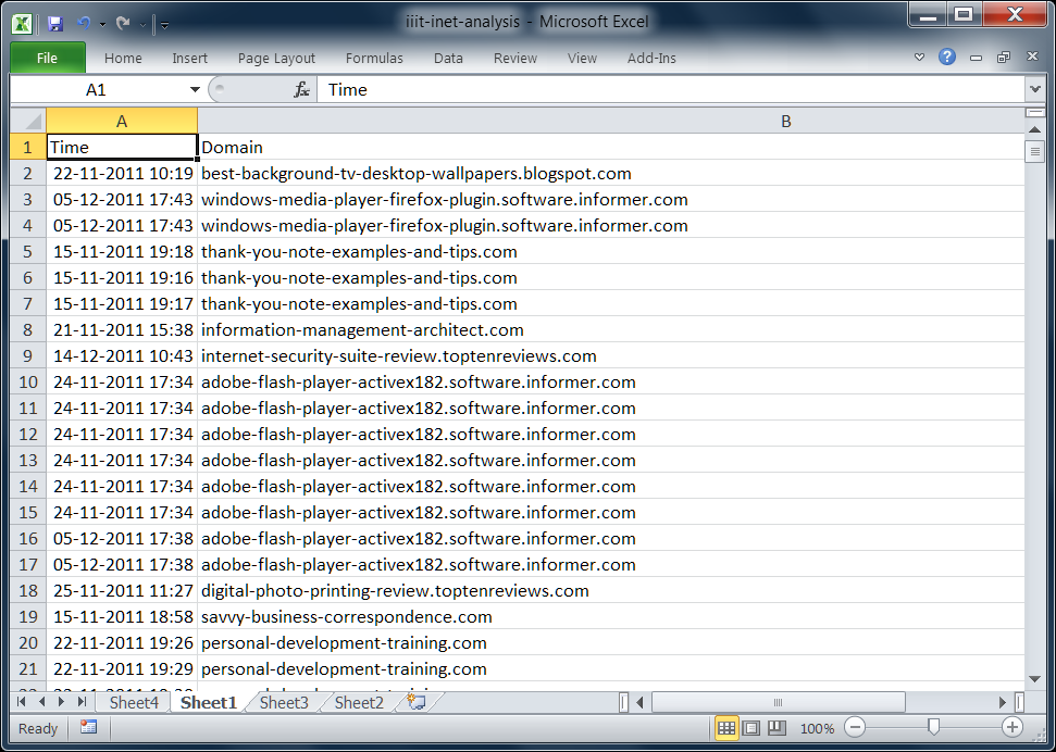
We decided to look at a dataset that Anand has blogged about before – computer usage of MSIT students at CIHL, a consortium of universities based out of IIIT, Hyderabad. Over a period of seven weeks, students’ computer usage was tracked. The data includes application usage and duration, internet browsing patterns, and even keystrokes, broken down by user. If this data sounds like a privacy landmine, that’s because it is! The only consolation is that all the students involved in the study consented to have their usage tracked, and so were presumably aware of what was happening.
We decided to look at a subset of this data – at their internet usage and to try and answer the following question: What websites do people browse at different times of day? Are there interesting patterns that emerge? Do “social” websites constitute a significant portion of their browsing time? etc.
We created an interactive visualization, as well as an Excel based one.
On Excel, the variables at our disposal included:
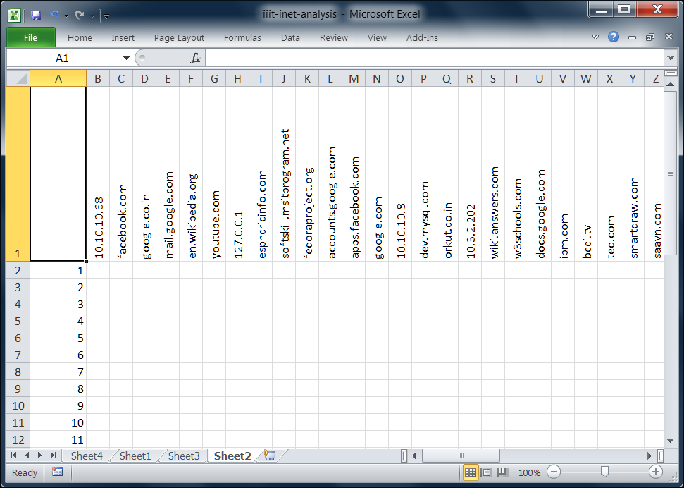
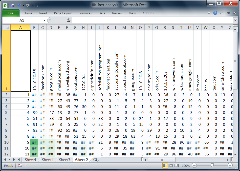
We pulled the data into Excel, and had the following table:
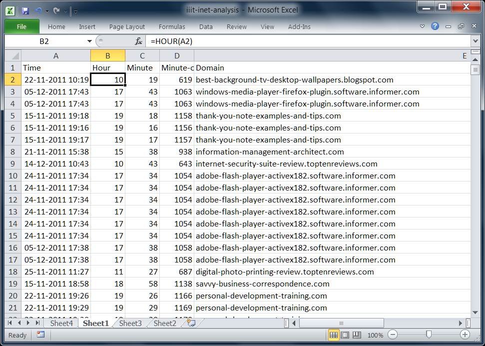
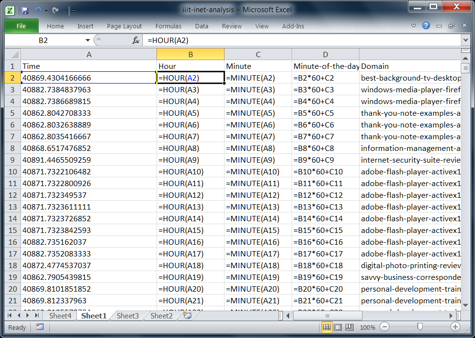
We then split up the time values in Excel into their component pieces (hour and minute), so that 22-11-2011 10:19 becomes:
You can see the raw data and the formulas used in the following screenshot:
We combined the hour into a value which we called “Minute of the Day”, which is merely a numeral value of the minute from 12AM. 1am is 60, 2am is 120, 3am is 180 and so forth.
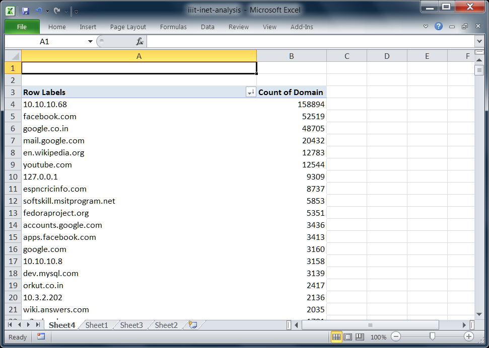
We then used a pivot table to plot the domain accessed by frequency, which allowed us to generate the top 10 most accessed domains (Facebook, unsurprisingly was 2nd, right behind a local address 10.10.10.68, which is presumably a development server.)
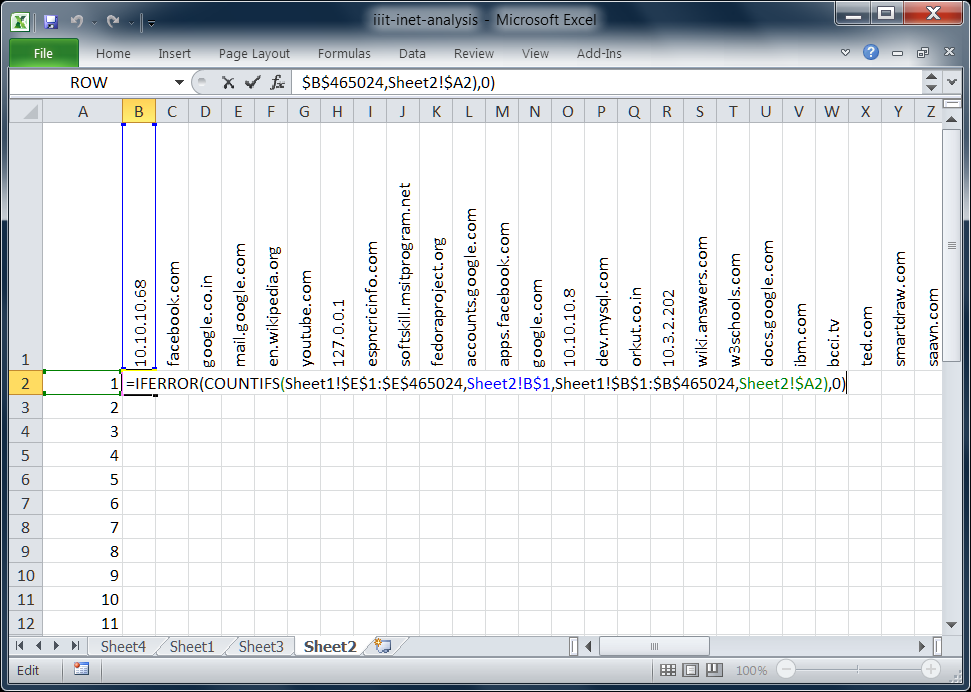
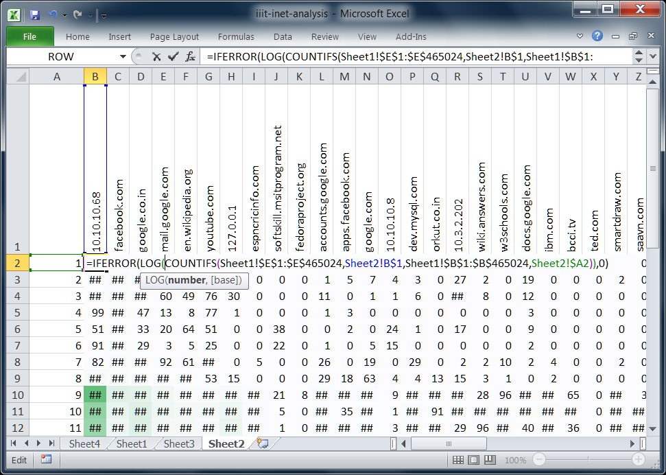
We arranged the domains on the horizontal axis, with the hour of day listed on the y-axis, as below:
At this point in time, Anand pulls out his Excel magic, and pulls in the number of times within that hour that a particular domain was accessed. COUNTIFS looks counts the number of times the domain was accessed at that particular minute. IFERROR ensures that errors are counted as zeroes. (This formula works only in Excel 2007 and later.)
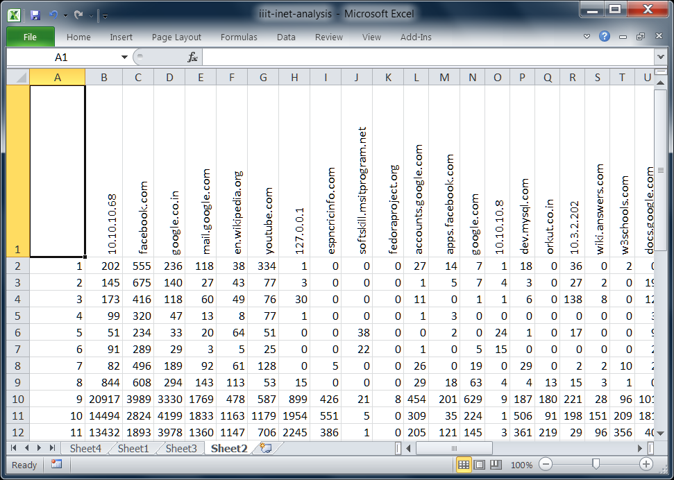
The results of applying this particular formula across the whole table is given below:
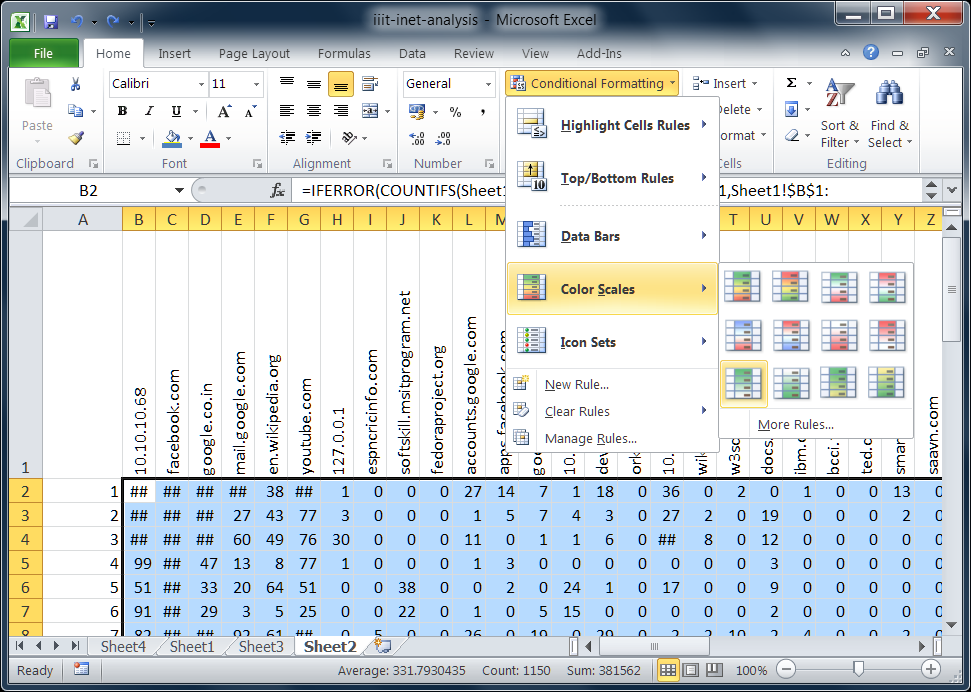
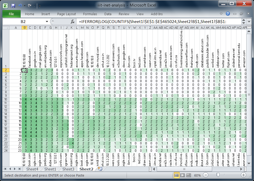
Using the conditional formatting tools, we are able to apply a colour scale that changes the cell background colour — a darker green implies a higher frequency while a lighter colour implies a lower incidence at that point in time.
The extreme preponderance of the top hit (the local dev server, 10.10.10.68) led to a not very useful visualization, with only the highest values being marked out.
Using a log arithmetic scale helps give a better heatmap, as can be seen in the following screenshots.
We finally arrived at the following heatmap, which offers some insights into the ways that the students at this particular course spent their time.
We talked about different ways of depicting this data, which resulted in the following interactive visualization of the way a student spends his or her time on an average day in Hyderabad. We hope you enjoy it!
1. Quick‑Start GidsHeb je ooit een bite‑size casino‑thrill willen ervaren die je in een koffiepauze… Read More
Chicken Road is de nieuwste crash‑stijl titel die de mobiele casino‑scene heeft veroverd. Ontworpen voor… Read More
When you’re looking for a game that delivers instant excitement in just a few seconds,… Read More
When you’re looking to jump straight into action without a long warm‑up, Slottio offers a… Read More
Si eres el tipo de jugador que busca acción instantánea sin una larga sesión, BetPlay… Read More
En el mundo de las apuestas en línea, la velocidad se está convirtiendo en la… Read More
This website uses cookies.
View Comments
The final interactive visualization doesn't load for me. Tried two browsers on my tab. If it's in Flash, Flash works on other sites. What gives?
@Kiran: That's strange... It's based on pure HTML/CSS/JavaScript. No HTML5 features, even. Haven't tried on a mobile device though... will check.