We took Karnataka’s ground water quality data from a 2004 Karnataka Rural Water Supply and Sanitation Agency (KRWSSA) report (via IndiaWaterPortal), and tried to see if there were any patterns.
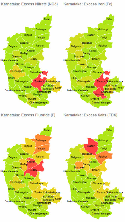
The executive summary of the report shows the number of villages in each district affected by problems of excess nitrate, iron, fluoride or total dissolved salts. We plotted those on the district map.
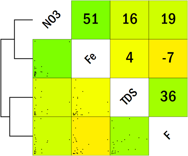
The interesting pattern that emerges is that the places that have excess nitrate (NO3) concentration are the ones that have excess iron (Fe) concentration as well. The places that have excess fluoride (F) concentration are the ones that have excess salts (TDS).
The correlation scatterplot alongside further demonstrates this point. There is a fairly good correlation between Fe and NO3, and between TDS and F. There’s little correlation across these groups however.
(From a glance at the scatterplots, though, it becomes immediately obvious that this is based on too few data points.)
We can also readily see that the bulk of the water quality issues are in interior Karnataka. The coastal areas are relatively fine.
Geographic visualisations are an extremely powerful way of inferring patterns when the underlying data is geographic in nature. At Gramener, we use our visualisation server to automatically create graphs such as these based on an underlying data source.
We have provided a sample of our tool at https://gramener.com/indiamap. You can enter your own data and see how it shows up on any district or state map. Happy mapping!
Il giocatore moderno ama la velocità. BDM Bet casino offre un’esperienza ad alta energia che… Read More
Bakit Perpekto ang Maikling, Mataas‑Intensidad na Mga SesyonAng Chicken Road ay ginawa para sa impatient… Read More
Når lysene blinker og trafikken summer, er det bare en chicken du trenger for å… Read More
Meet Methmeth – the online casino that’s built for players who crave instant thrills without… Read More
Welcome to the Sol Casino ExperienceSol Casino invites players who crave adrenaline without the marathon… Read More
1. The Pulse of Fast‑Paced PlayIn the world of online gambling, speed is often the… Read More
This website uses cookies.
View Comments
Nice one.. insightful
As an environmentalist I have been tracking publishings and seminars on levels of NO3 and Fluoride. Your mapping seemed interesting.
I may have results from hoskote and chintamani near Kolar. Will share the same if you send in your contact details for cumulative data.
Gulbarga, physical evidences of school children indicates flurosis. Lets see if simpler water treatment plants can be affordable by communities.
Devika Rani
Do you have data/maps where there is deficiency of Fluoride in Karnataka? Less than required quality of F also is problematic!
It is essential to have this data so that the excess fluoride at one place could be shifted to No-/low fluoride area!!! Any treatment plant would leave fluoride excesses that must be dumped somewhere!