An article on A guide to online data plotting by LiveMint carries this quote from Gramener’s Chief Data Scientist:
“Data visualization compresses information quickly,” says S. Anand, 37, chief data scientist, Gramener, a Hyderabad-based data-visualization company. “For example, in a chart, a bar can give you a data set with its height, colour and thickness, so you have already compressed a table with three columns into one graph,” he explains. “A 40-page report can easily be converted into a single page of graphics.” By doing this, a large amount of data becomes easily accessible, and trends and highlights are easy to pick out, compared to a table of numbers.
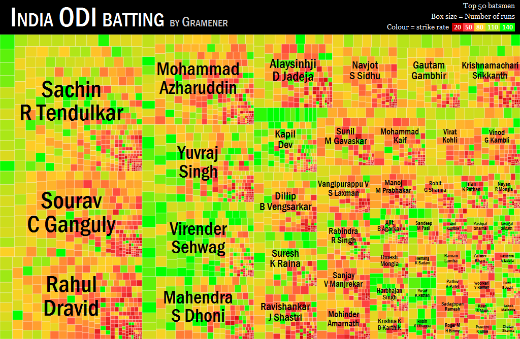
This is sometimes like this — converting a 40-page report into a single page of graphics — hard to believe. So here’s the proof.
This visualisation (and its interactive version), showing the ODI performance of Indian batsmen…
… summarises information from a 150 page report with over 46,000 data points, all into a single sheet without losing any information.
Industry 4.0 solutions originally had their genesis in manufacturing. “The Fourth Industrial Revolution, Industry 4.0,… Read More
Improvement in production performance can enhance supply chain efficacy. There is a continuous discourse around… Read More
Sshhhhhh, ChatGPT knows everything!! In 2023, Generative AI (GenAI) emerged as a major technology disruption… Read More
Generative AI holds immense promise for healthcare, leveraging large datasets to innovate medical imaging, treatment… Read More
NJBIZ has recognized Naveen Gattu, Founder and Chief Operating Officer of Gramener—A Straive Company, as… Read More
This website uses cookies.
Leave a Comment