At 10 million hits in a single day, the live Elections 2014 results page is the largest site that we’ve designed. This was served by a single virtual machine. This is the story of how the page was designed.
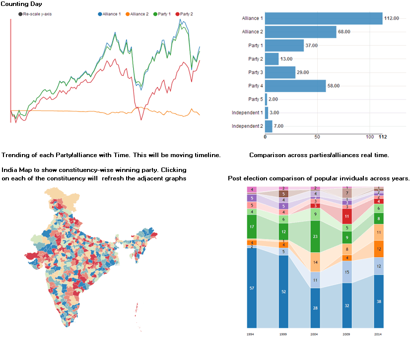
7 weeks ago at the end of March, when we were engaging with Microsoft and CNN-IBN to create the visualisations, we quickly put together this sketch to show what we might be creating.
The top half aimed at showing each party’s current as well as historical seat count. The bottom half would show the geographic spread and vote share.
Two weeks later, we revised the bottom half to show the vote share trend of popular individuals, comparing them with their rivals historically.
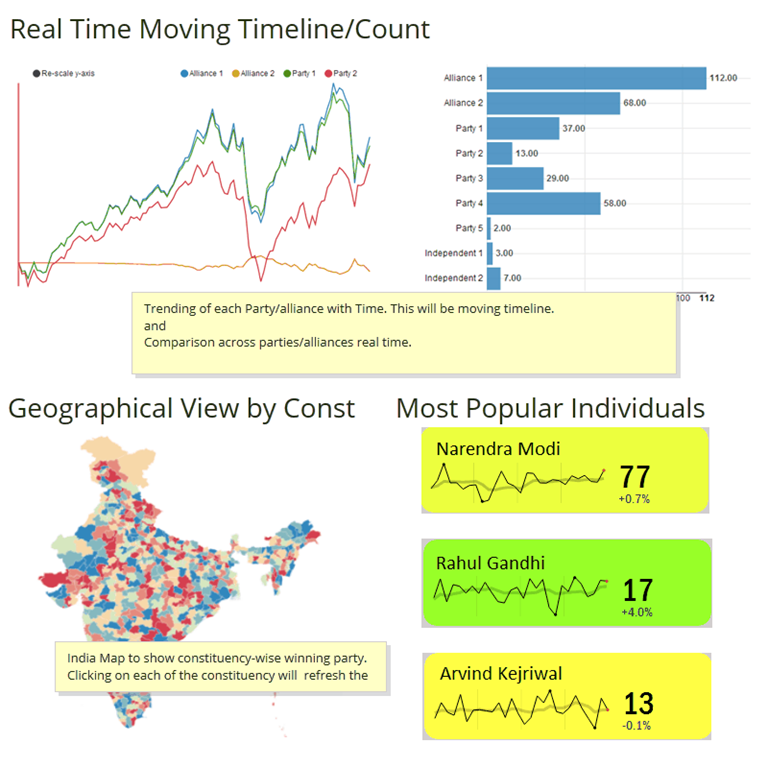
These designs were created at time when we were completely unaware of the data structure and feed that we would be receiving, and in some sense were aspirational. It was only on May 4th, about 2 weeks ago, that we got the actual data structure and feed format.
Two things became obvious. First, that there would be little point of displaying the vote share history. Parties that take an early lead tend to stay ahead most of the time. Secondly, this design was not addressing the key question: who would form the Government?
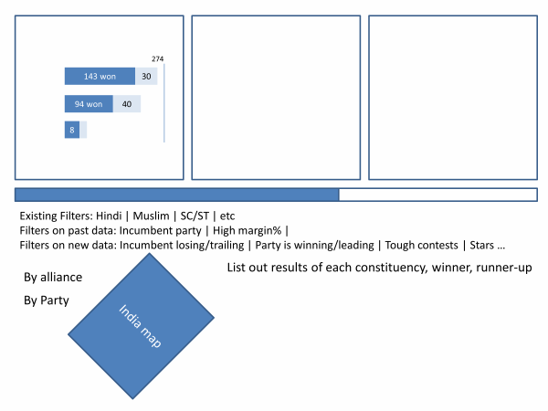
So, working with the CNN-IBN team, we quickly redrafted and put together this bare-bones sketch of the final visualisation…
… that eventually led to this visual representation.
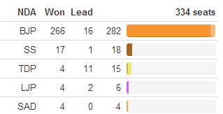
We originally conceived 3 bars one below the other showing the alliance positions, but decided instead in favour of a single horizontal bar, broken up, showing a race to the middle. The NDA and the UPA are the ones racing. Others occupy space in the middle and fill outwards. The declared results and awaited results are differentiated using lighter / darker shades of the alliance colours.
Below this, for visual effect as well as to show progress, we added a bar that shows the number of results declared, vs counting, vs awaited.
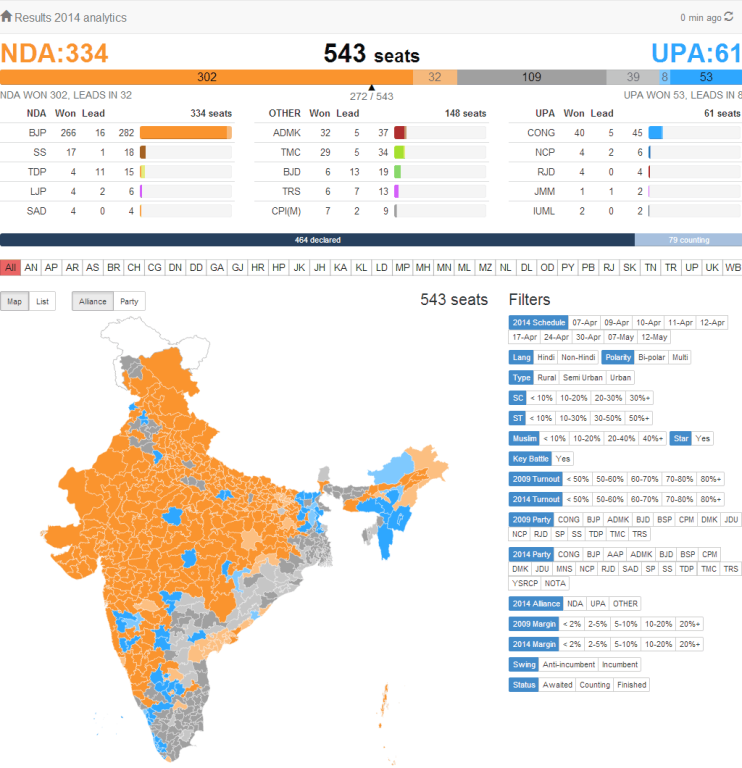
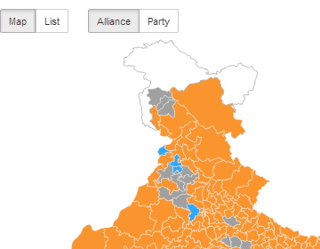
The bottom half of the screen was devoted to a geographic visualisation by constituency, coloured by the alliance that won the election. Users can also choose to colour by party instead. Again, lighter vs darker colours depict leads vs victories.
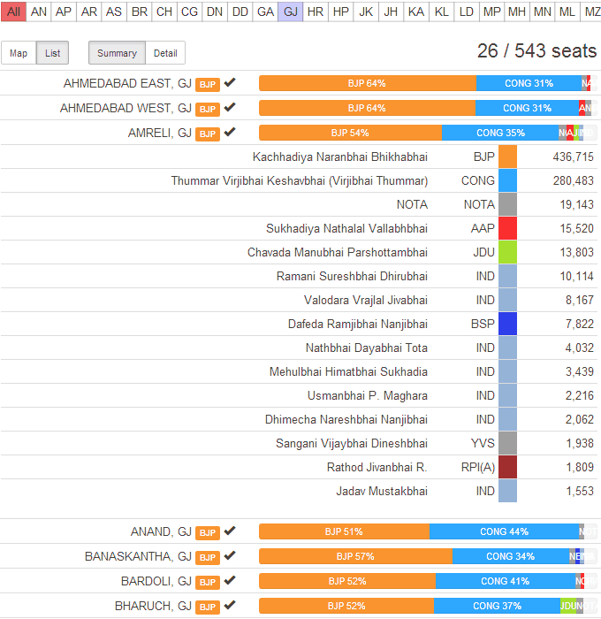
After we created this design, however, it was obvious that a few things were lacking. Firstly, searching for a constituency was not possible. A geographic search with zoom didn’t work well. It showed where the constituency was, and which party won. But at a constituency level, we need more – the vote share, the candidate names, etc. So we added a list view that shows the vote share of every constituency. When clicked, it opens up the individual candidates.
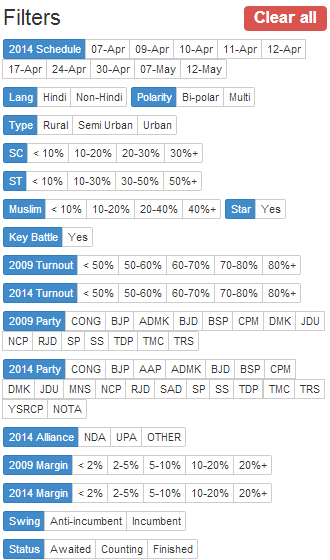
Each filter can show one or more options (multi-select) and can be independently toggled with other filters. While this adds complexity to the design, it places incredible power in the hands of the user to discover their own stories. We had no idea what would happen on Election day, so we left it to the anchors and online viewers to discover the stories as the data flowed in.
While this narrative is constructed linearly, the design process was far from that. There were a number of false starts, abandoned attempts, periods of stagnation, experiments that led to more ideas, and finally, last minute scrambles between 8am – 9am as the results started pouring in. In fact, we kept tweaking the design right up to 2:30pm, adding filters, adding columns, simplifying views, and so on. Delivering all of these in real-time was another challenge, but that’s the subject of our next blog post.
The emergence of Generative AI (GenAI) is reshaping healthcare use cases and facilitating the rapid… Read More
The U.S. Food and Drug Administration's (FDA) stance on GenAI is clear: it's a groundbreaking… Read More
Executive Summary In healthcare, protecting patient information is not just a legal requirement; it's a… Read More
Demand forecasting in the supply chain is crucial for optimizing inventory levels and ensuring efficient… Read More
Hi, I am ChatGPT 3.5 Turbo. Do you know what my favorite number is? Do… Read More
After a successful webinar on digital transformation and sustainability, we organized a sequel titled “Data-Driven… Read More
This website uses cookies.
View Comments
Gorgeous and informative dashboard with live feed. Intuitive approach.
I think Adding the picture of head of alliance may add human touch to the BI tool.
Really cool
I know you would have heard it umpteen number of times by now but I can't stop myself: This is absolutely amazing work guys.
I just came to know of you and am happy that an Indian company is doing such an amazing work in analytics and data visualization. Kudos!!
How did you come up with location base chart? Is it Power map?