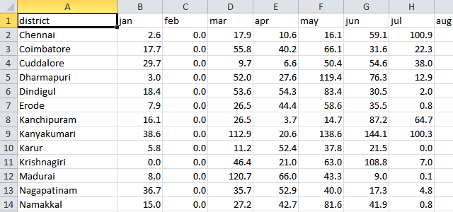
How many ways are there of looking at series of data? Consider this rainfall data:
We have rainfall for every district in Tamil Nadu for every month over the last 5 years. That’s 60 data points per district. How many ways are there of plotting it?
In this post, we’ll look at 10 ways you can represent a simple series – in a straight line.
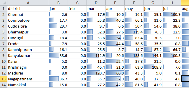
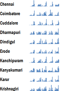
These are a quick way of plotting bar graphs within the cells. The eye is naturally drawn to numbers with large values. It’s an easy way of locating big numbers, and in particular, to compare data across series. But it isn’t very easy to find trends within a series.
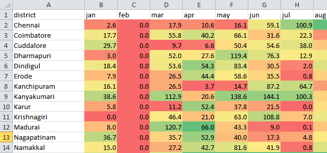
These shade each cell with a colour gradient. Red for low, green for high. While they’re much worse at exact comparisons, they’re much better at helping identify trends – both within a series and across.
This heatmap is a compact way of comparing information over time, and across districts. Reading left-to-right, the patterns of growth, decline or seasonality can be observed. Reading top-to-bottom, patches of high or low that cut across data series become evident.
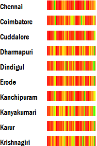
This is a simplified one-dimensional version of the traditional heatmap which typically shows data in two dimensions.
If being able to compare quantities within a series becomes important, one can use bar charts instead.
The bar chart shown here is a variant of the traditional bar chart. It does away with the horizontal and vertical axes, as well as the labels, and just shows the bars.
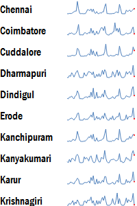
This is an example of a micro-chart, the most classic example of which is the sparkline. Microsoft has introduced a number of these micro-charts in Excel 2010. This is one of the significant upgrades in Excel 2010’s charting capabilities.
Sparklines are among the earliest microcharts, initially created by Edward Tufte. They are the equivalent of line graphs, but without the labels and axes.
These make it very easy to compare trends within a series. However, comparing across series may not be easy. In fact, it would not be possible at all unless the sparklines are drawn to scale.
Sparklines are, however, particularly effective in representing growth or decline trends in a compact fashion.
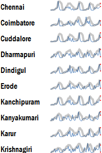
A trendline overlays sparklines with a trend. This may be a moving average, a best-fit line (e.g. linear regression), etc.
The high variability of sparklines can be smoothened out through the trendlines, making it slightly easier to spot long-term trends.
This is particularly useful when the data shows multi-seasonal patters (e.g. a weekly as well as a monthly pattern), and we want to bring out both effects in the same chart.
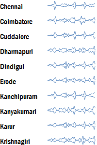
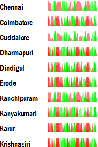
A streamgraph is identical to a sparkline, except that instead of the height representing the value, it is the width of the graph that represents the value.
These are also referred to as stacked graphs. They are particularly effective when visualising multiple series one on top of another. See Lee Byron’s Last.fm listening history for an example of effective use of this graph.
These are most effective in identifying which series is dominant at a given point in time, and how the series grows or dies around that point.
The horizon graph expands the resolution of sparklines. First, it uses an absolute scale, differentiating between positives and negatives. Negatives are coloured red, and positives are coloured green. These are then folded.
The chart is then folded repeatedly, and uses colour intensity in conjunction with height to show the value. Panopticon, who created Horizon Graphs, have a good introduction to the use and construction of these graphs.
Like heatmaps, these are useful in spotting horizontal and vertical trends, but using an absolute rather than a relative scale.
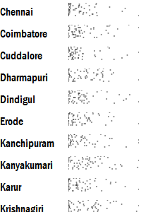
Jitter plots are useful ways of visualising the density and frequency of a data series. They plot the values horizontally, rather than vertically. That is, the x-axis is the value rather than the y-axis. The y-axis just spreads the points around randomly to minimise the overlap.
This is useful in comparing frequency data. For example, here, it is clear that no rainfall is the most frequent state. It can also been seen that Cuddalore typically has many months with little rainfall.
When the data density becomes too high, however, jitter plots are not as effective.
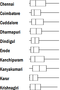
In such cases, box-plots make for a better display. Invented by John Tukey in 1977, these summarise a data series using just five numbers: the minimum, the lower quartile, the median, the upper quartile and the maximum.
The box represents the area where 50% of the observations lie. The horizontal line represents the full range of values in the series. The vertical line is the median. Half the values lie to the left, and half to the right.
While this plot appears simplistic, it often is much more robust (i.e. safe to use for a wide variety of datasets).
Building on this transformative potential, market trends indicate a significant rise in the use of… Read More
The emergence of Generative AI (GenAI) is reshaping healthcare use cases and facilitating the rapid… Read More
The U.S. Food and Drug Administration's (FDA) stance on GenAI is clear: it's a groundbreaking… Read More
Executive Summary In healthcare, protecting patient information is not just a legal requirement; it's a… Read More
Demand forecasting in the supply chain is crucial for optimizing inventory levels and ensuring efficient… Read More
Hi, I am ChatGPT 3.5 Turbo. Do you know what my favorite number is? Do… Read More
This website uses cookies.
View Comments
Adds rounded borders to the chart background. When the radius is 0, the background shape has 90° corners. Border radius of 100° produces a circular shape.